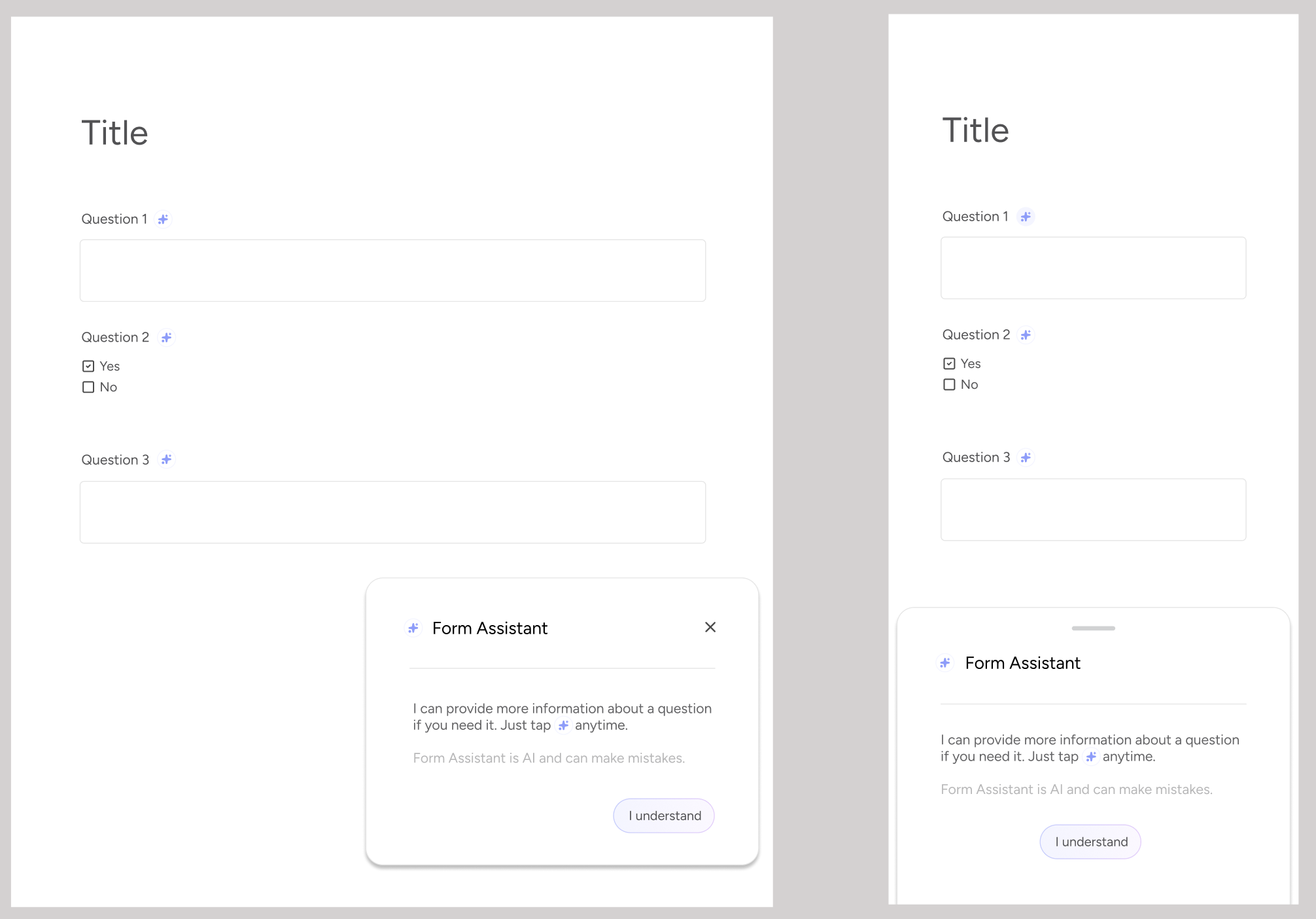
Improving personal financial health through non-predatory, transparent fintech.
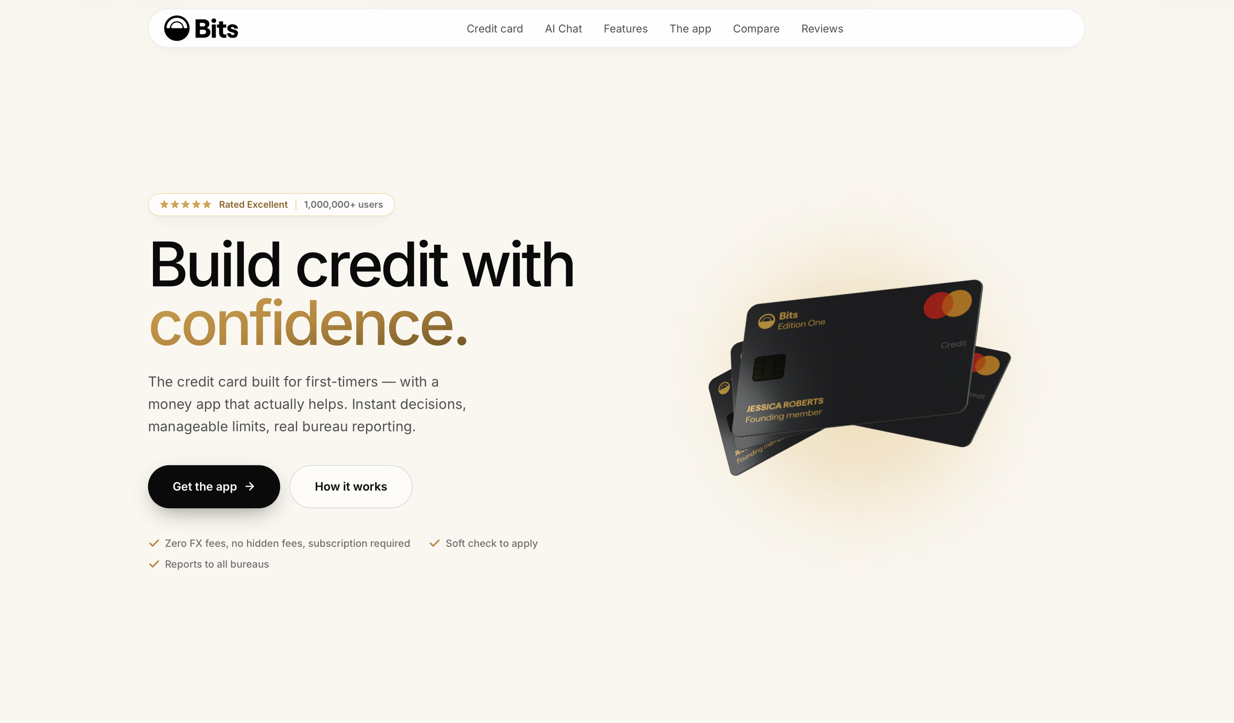
I’ve worked on Bits on and off for 7 years. I co-founded it back in 2019. Bits started from the basic problem in predatory finance which is - credit scores are discriminatory and entirely broken. They enable the inherent biases that exist in banking and global finance, and they compound massively on the bottom 50% of the financial customer base.
Bits set out to solve this by enabling consumers by improving their personal financial reporting, with the aim to create a habit forming environment of self-improvement through education. If finance purposefully makes it self opaque through jargon and arcane process, Bits provides the clarity that can deliver empowerment.
Bits is called Bits because initially, as an early stage YC startup, there was no capital to handle debt. To build - for example - a basic credit builder credit card, you have to accept the losses, even if the loss limit is $10. Compound that at scale, and you have a large required debt facility. As an early stage fintech, securing a debt facility is impossible. And securing even early credit models is very difficult - to build a model you have to lend, to lend you have to take on risk, to take on risk you need facility. So to lend someone $10, Bits needed to secure $5 (or a ratio that was suitably de-risked). This meant to get a bit of money you had to give a bit of money, and the ratio of that money lent was directly tied to your behavioural markers. Give a Bit, get a Bit. Bits.
But this debt conundrum is one reason why a lot of early stage fintech comes from large traditional lender incubators. Even securing $5 requires regulation and licensing, and the time the UK was seeing a boom in Neo-banking, which was causing severe backlogs in regulatory support. This was a major problem.
But a secondary problem remained - traditional lenders need new lenders. To acquire those new lenders, they need to derisk them. If you cannot derisk them at scale, you focus instead on the upward mobility of your existing borrowers. If you provide a product to those lenders which provides them potential new borrowers, those borrowers have to meet their lending criteria. But that criteria is reliant on traditional credit and behavioural markers, specifically those that are easily modelled through traditional, automated KYC processes - identity, earnings, expenses, assets, debts. You cannot adhere your own behavioural markers - even if proven to be derisked - as a proxy for the traditional KYC markers. There has to be - at some point - a reckoning between the ambient risk profile and the KYC markers.
I co-founded Bits to solve the problems of opacity, accessibility and broadened criteria. It did not directly resolve these problems. But here I’ll go through some of the product and strategy that I applied to Bits as part of this initial mission.
Start with a system.
Mapping the IA is the traditional starting point with complex systems, but with Formsflow the primary issue was that the IA was a variable. Depending on the instance, the IA could be drastically different - in terms of feature parity, look and feel, expected outcome and flow.
One big issue was the lack of consistent UI. Interactions, frameworks, actions were all a variable and broke the perceived IA in the various instances. Those instances were often on-prem or on private cloud, making QA additionally difficult. When your product is being utilized by the BC Government and the RCMP, getting access to what they physically can see on their screen, or how their data actively flows with the product becomes very very difficult, if not impossible.
The general UX (and to some extent the IA) was informed by a variety of different Bootstrap versions with developer-led workarounds. Icon sets were ad-hoc and developer determined. So I made the initial suggestion that we align the various product instances in a unified UI. This, typically, is a bad decision - enforcing feel before flow - but Formsflow needed, in this scenario, a baseline. A baseline that could be taken offline and discussed, improved and provide a single point of truth. A baseline that could run independent of the variant components and instances. A baseline that could build a user testing environment around it, validate it, and ultimately determine what the Public Cloud SaaS could be. Without consistency, there was no validation, no progression, no vision and ultimately no stakeholder/investor unity.
This felt like an inexperienced decision - to, in some way, put form before function. But without it, we couldn’t get the alignment - there wasn’t the sales confidence, there wasn’t the marketing touchpoints, there wasn’t a vision to get behind and actually say “this is what Formsflow actually is and does”.
And so we started with a modular design approach, which could provide the quantified foundation for a scaleable system. This was a decision full of risk and had large technical and design debt cost. But we also couldn’t just ‘start-over’ with active on-prem customers - to do so would have forked the product so massively that we’d be forced to support an endlessly variable codebase.
Given the design debt, I chose to unify the various Bootstrap versions into Material. This alone took significant validation and QA. Where Material won though was through it’s tabular libraries, something which the Bootstrap variants struggled in terms of legibility and it’s ability to handle mass-data in responsive environments. It won through also on its extensive developer documentation. It was not a light decision - the technical debt had to be costed and it was significant. But it became the first trust-leap with the stakeholders that provided some early velocity. Velocity was, in my mind, more important. We needed to move, or appear to move quickly, and to prove to the stakeholders and the product itself that we could decide change, execute change, and the world wouldn't end.
Sometimes simply moving from a place of paralysis, even if the decision is risky, is better than staying still.
Define Accessible.
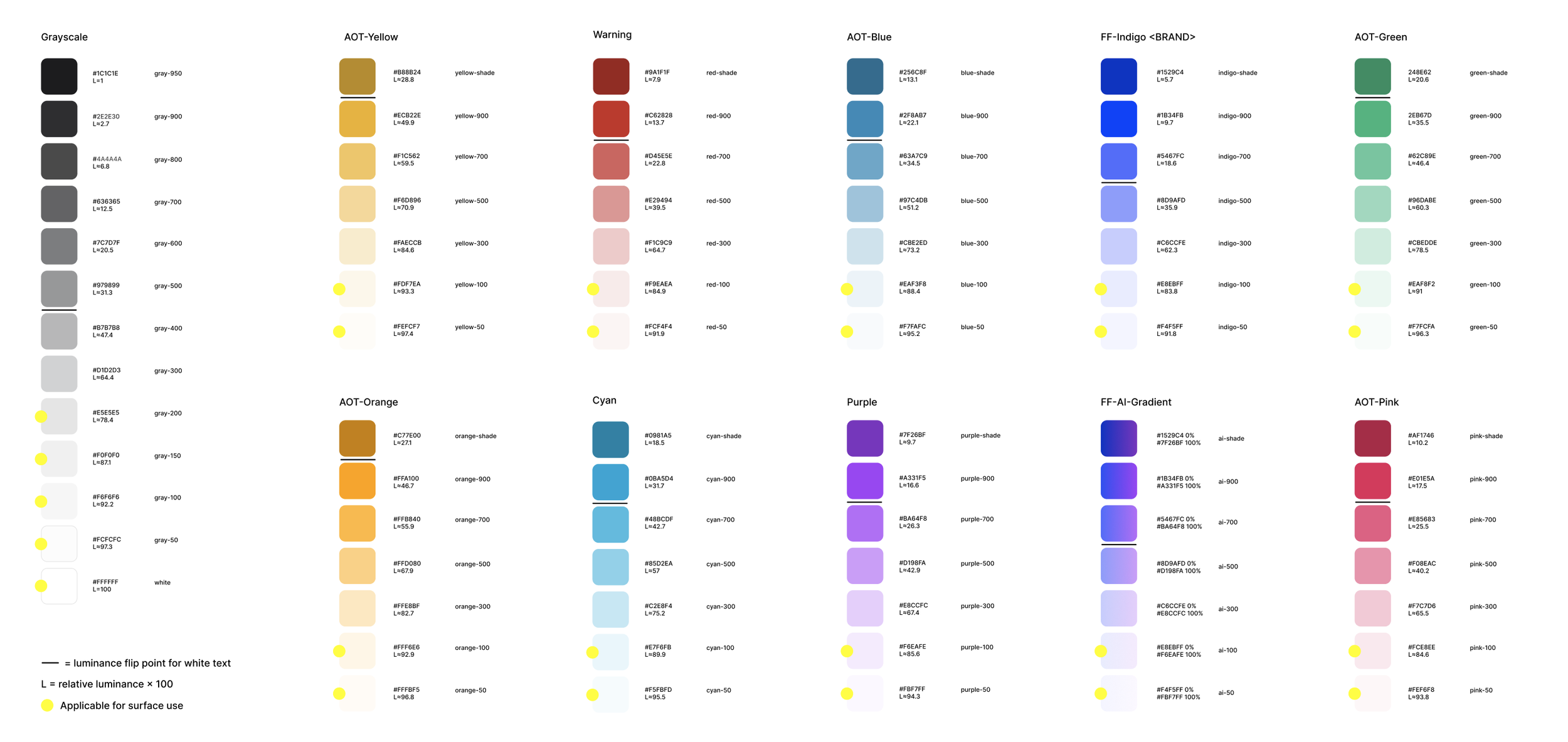
Formsflow was not accessible. Given the client-type, this was an important refactor. Additionally from type to colour to responsive behaviour, the product displayed inconsistency to the point of illegibility. With Material as the foundation and buy-in I moved quickly to deploy a token system that could over-ride existing style sheets to quickly deploy change.
This is basic stuff - 12px <p> moves to 16px <p>. But it makes sense also to alter the future component grid. If the token changes you are making cannot adhere to something concrete, you’re adding more variables into the mix. I implemented a responsive grid based on the quant we had, added mobile specific structures, and moved everything to an 8px grid structure with a 4px divisible.
This broke a lot of things. But what it broke provided clear prioritization. If the accessibility baselines broke surfaces or bounding, then this was the hot-fix priority. To allow this to happen we moved the product to a Staging > QA > Production environment, where previously Staging was missing. This added more process and cost, but it reduced risk.
The tokens considered scale, they considered consistency and they considered future expansion. The debt cost as calculated was tempered by the consideration that this is a ‘one big push’ - pushing the tokens and grids immediately allowed for less QA specific spend on component deployment going forward. Product could with some confidence expect the behaviour and edge case knock-on effects from a component or change deployed on each breakpoint, on a 8px grid with the tokened surface luminance.
Colour in particular was very considered. Formsflow had a long history of custom UI per-client install, often at the cost of accessibility. So tokens had to consider not only the correct surface contrasts, primaries and system needs, but it also had to consider how those various stops could translate into a client documentation environment when the client has a specific design system they wanted to apply to, override or compliment our own.
This forced a lot of research and trade-offs, but it also forced the colour theory into a more mathematical environment. By taking known design system luminance of the client base, I was able to calculate with Claude Code the best stop progressions that could match to hundreds of possible outcomes, and provide a solid progression framework that kept the accessibility guidelines in check - both on our own systems and with incoming custom systems.
The same was true of iconography. The longer I’ve been leading in design, the more I’ve found custom iconography to be a fools errand. They have their place in brand systems, and that intercept, but at scale, especially with the Enterprise scale of Formsflow, we needed to adapt an existing icon system into our own. I identified Lucide as having the lowest debt, aligned it to our grid, scale and future-proofing, and placed the token system into the development hand-off as a technical-heavy Figma Dev export. This ultimately made the handover minimal, but it expedited the buy-in from a dev team that was burdened by UX refactoring work (which was at this point universally hated by everyone).
Rebuild.
Given that the development team was starting to face mass-refactor, I started to move at this point towards components. Again, this doesn’t really make much sense. Typically from the IA you would move to flows, and from flows you would move to components. The danger I was facing here was being caught in a ‘re-skin’ scenario where the UX and IA gaps were being papered over. But to maintain momentum and gain developer buy-in we need to start building. Without development feeling like they were actively in a state of contribution, but rather ‘being told what to change’, I risked unmooring the developer appetite. This is change management 101, but this is also about managing expectation at the same time. I also needed to not only re-skill the development aspect into a new definition of what good looks like, but also begin the path of up-skilling the existing design staff in what the expectation is, and what levers they can pull. If the development team was unmotivated, the design staff become quickly handcuffed to micro-improvements.
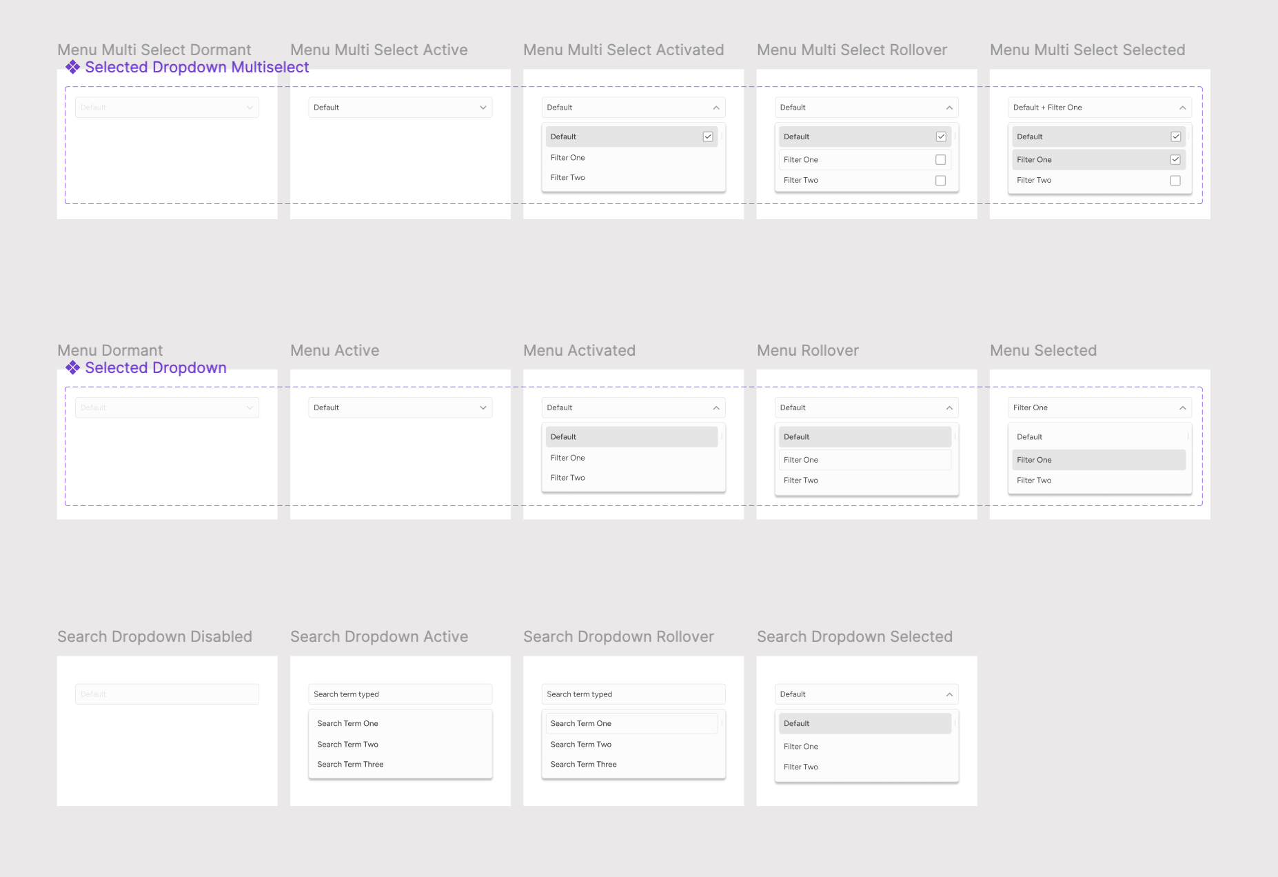
We began by identifying which heavy-use UI elements failed accessibility and token changes. A simple first task was calendars. Calendars are a solved problem, but only if they are consistently handled. Material gave us a low-stake approach out of the door, but Formsflow has some legacy feature needs that required customization. We tackled this, followed by dropdown behaviours, before moving to navigational tabs.
What this approach did was to begin instigating the IA shift in reverse. I do not recommend anyone does this ever. But the combined mass-change effect of tokens and systems, apathy and need for higher momentum politically made this the best path to take. What the outcome was here was an IA that changed per push, and blend of build and refactor, and a slow incremental QA that did not tax resources or worry the enterprise base.
Over the following 6 months we deployed nearly an entire incremental component system, which dovetailed with the grid, token and custom guardrails in hand.
This is not sexy work. It’s very slow, incremental and pseudo-political progression. But in my experience, it’s how in some environments things get done. You have to adapt to the needs of the customer, the org, the resources.
Reconnect.
With the system near-fully deployed, I returned to both Marketing and higher-level Product strategy. We needed funnels, we needed billing, we needed support. We also needed multi-turn AI form building and AI form submission features.
For Marketing, given the funnels were broad, there was a strong need for mass-landing page generation based on use case or search criteria. I started a sub-derivative of the Product Design System, presenting a reduced token and colour set, expanded the font abilities and redrew the primary logos and touchpoints to align. From there I anchored this sub-set in Figma and deployed MCP to allow Marketing a free approach to modular builds within structured brand guidelines, which I extended into hosted brand pages that could be accessed also by MCP.
This provided mass-consistency across the product touchpoints, while keeping complexity low. A Marketeer could spin up a landing page using a product of their choosing, or external web resource, and deploy via MCP into the active build. Likewise a customer could build a form via MCP (for example Claude) and access UI tokens from their instance. This kept design requests low and provided filter-down from the product strategy. If a component updated, and required a token change (or more commonly a icon addition), this could be commanded from the main Design System down to the Marketing sub-system down to the MCP and directly on the landing pages or agentic interface.
Agentic future proofing.
There is a sense that AI should be leveraged on the product surface as much as possible, even if it’s not directly solving a user problem. At worst this generates apathy and clutter.
In the case of Formsflow, the need was there. A user could semantically build a form instead of using a dated drag and drop interface, and there was a real gain in allowing that same semantic process to bypass the mass-complexity of BPMN workflow coding. Given that in a large organization the use case of the form designer was so vast, it made absolute sense to apply semantic processes where possible.
The big issue with semantic additions is cost. I first began working with semantic LLM products back in 2015, which was pre-cloud LLM. This was very costly from a hosting point of view - a basic semantic engine could leverage multi-EC cores and skyrocket your server cost depending on the mass data being parsed. With cloud LLM, the cost implication is moved to token renting.
When designing semantic / agentic flows, beyond the use case, I focus primarily on token burn. The industry is in flux, and the business models around the tokens are often unknown at scale. This means I tend to design cynically for token use, and presume that the preferred flow or system I want to impose is likely aligned to an increase in token burn. So this means that it largely makes sense to develop a design strategy which is angled towards low token usage, comprehensive prompt creation (ideally user generated) and the ability for human-in-the-loop QA (ideally user generated) that does not try to rely on unlimited multi-turn revisions. It makes little sense to implement a strategy that potentially maximizes token burn for a better outcome, if that better outcome undermines the products ability to function (or indeed the business to function).
While typical agentic users are used to token limiting in Claude, especially those used to free-tier casual use, it is implied in the subscription SaaS environment - and very much in the high cost enterprise environment - that token limiting is punitive, or seen as a cost-save measure. Effectively your tiered SaaS or costed Enterprise tier model in Agentic futures is stuck with a cost variable in a core feature which, if high-value, not only creates your retention, but also generates your highest capital expense.
So with this in mind I tried to approach the AI implementation in a way whereby usage metering was not a primary lever. It was also key to build feedback loops into the agentic offering early in the iteration so there could be human-in-the-loop validation at the metric side, but also trust markers on the user side.
The approach I took was building a Design System that contained Agentic components that could be used anywhere in the product where AI would be featured, while keeping those components separate from the usage metering. Usage metering would be its own component set and applied logic. In this way the Agentic components moved freely from business model constraint, removing 3rd party variables. In turn the business model could be iterated in the less-user facing usage metering logic.
Outcomes.
This is not a beautiful portfolio piece, nor is it particularly than dynamic to talk about, but Formsflow was one of the more challenging and comprehensive products I’ve worked on, simply because of it’s footprint and complexity. In many ways Formsflow is the sort of project that can be solved with experience - the solutions are often simple, often procedural, often deft and nuanced and involve deep thought. But these are the projects that typically become the most interesting to be involved in and the most rewarding to find solutions for.
Formsflow has now deployed to public cloud, private cloud, open source, on-prem and MCP environments with a unified language. Formsflow public cloud has since started taking on paying customers, and the public cloud has generated a much needed market signal that has unlocked additional enterprise revenue.