Do I really need an entire app to make a simple restaurant reservation?

A simple question with an overly complex answer.
Sean Rose at Slack raised an interesting topic recently. ‘Do I need an entire app to make a restaurant reservation?’.

It’s a topic that in many ways questions the dictum of ‘a good product does one thing well’ — which is a theory I’ve heard rolled out more than a few times in product discussions and pitches. I’ve been considering this topic for a while myself. I mean, surely if a good product does one thing well, then a better product does more than one thing well?
The rise of web and app products, focused on singular task focused user experience are on the increase — especially in the home delivery food category (and especially in London). Hungryhouse, JustEat, Dine In, Deliverance, Room Service, Deliveroo and recent grocery focused newcomer Hubbub (there are many more) are all fighting it out to become the easiest way to get the food you want delivered to your door when you want. But with the ubiquity of messaging apps (WeChat, Messenger, etc) and social network superstructures (Facebook, Pinterest, Instagram, et all) which users spend so much time inhabiting and communicating within, the question becomes, ‘Why do I need an app or web destination to order takeaway food?’. Or to phrase it without the reference to food: ‘Why do I need an app or web destination to perform a single task?’
Of course, as a user I should be able to just ‘do’ in any superstructure I care to use, device I happen to own or ecosystem I choose to inhabit. I should be able to use WeChat to order pizza, ask Siri to book cinema tickets directly in the iOS or awkwardly half-shout “OK Google!” to verbally book a cheap flight. This makes logical sense. As a brand or product attempting to do one thing well with the minimum amount of user inconvenience — why wouldn’t you focus on text or speech inputs within ecosystems that your users find comfortable and — more importantly — already inhabit? Placing services central to existing busy user environments ultimately makes for a better experience; but there is a cost. That cost is the removal of the function apps perform in the propagation of their own internal experiences and branding. From here the rabbit hole widens — with the removal of individual internal experiences we begin to see the homogenisation of experiences, the functions of user interfaces becoming unilateral and consistent based only on user demand, behaviour, deep linking requirements and SEO.
But is this not what User Experience ultimately strives for as a discipline? Hang on — let’s entertain this thought process for a bit: if the core of usability is to create an environment which completely supports the wants and needs of it’s users (and let’s suppose that deep-linking exists to primarily serve the user), then the homogenisation of design — the destruction of it’s variants, the individuality of the experience with it’s inevitable undesirable learning curve — is flattened into consistent default states and gestures. Extending this user focus, the ordering of a pizza should therefore be the same as paying a bill, the same as accessing insurance documentation, the same as booking a hotel, the same as commenting on a media post — and this lateral consistency will inevitably be built and propagated in a user environment that is most available, most accessible and most adopted as the default by the majority of users. This, however, suggests the sacrifice of individually designed spaces at the cost of improving access to users. It forces everything to behave the same because this consistency of behaviour is what the user craves in the efficient performance of basic daily tasks.
So what of design? In a possible future of consistent experience, where to create difference is to provoke unnecessary confusion, does the design control and design decision reside with the designer of the most popular superstructure, ecosystem or device? Does this make Apple your designer? Is the Head of UX at Facebook directly controlling your user experience? Is the ultimate attainment of the user centric designer to now create, as Le Corbusier expressed, “machines for living in”? The mention of Le Corbusier, by the way, is no pointless design-wank addition — the truth is Modernist designers have always strived for a machine-like aesthetic, of creating systems based in geometry and function. It’s a perfectly valid question to ask — can Facebook’s GUI guidelines or Google’s Material Design both be seen as “machines for living in?”.

Some focus on Material Design. It is a supremely functional and structured language. It is infinitely scaleable and proportional. It is also incredibly well documented and resourced — hard to question in it’s logic and easily adopted regardless of the design literacy of your team. It’s easy to communicate to others and quick to implement at the front end. It is very impressive in it’s scope. Yet there is certainly the feeling of the manifesto in Material Design; Google stating in their introduction, “We challenged ourselves to create a visual language for our users that synthesizes the classic principles of good design with the innovation and possibility of technology and science”. Of course there is a clear query about what qualifies as ‘the classic principles of good design’, yet the stated intention of the design being presented beyond this opening statement, focusing on the ‘possibility of technology and science’ is certainly a form of modernist trope. This is a design manifesto that looks to the machine and the user of the machine in synthesis, where ease of use is intertwined with ease of load and where reactions and decisions are influenced by computed animations and calculated movement. Time in this language is infinitely measured. Errors by the user are failures. Clarity of imparted information is the ultimate attainment. This is not a design language for the playful, the artistic or the inquisitive. This is not a design language to generate abstraction or to express emotion. This is, however, a design steeped in ‘the classic principles of good design’ — which appears to be a recently established shorthand for ‘Dieter Rams’s Ten Principles for Good Design’, a guidance famously, by proxy, attributed to Apple and therefore the creative direction of Jonathan Ive.
Rams is becoming the greatest known mid-century modernist (possibly via the sales of iPhones and Netflix documentaries) and it is well deserved, however it is worth considering that despite Rams reacting against “an impenetrable confusion of forms, colours and noises” by creating the ‘Ten Commandments’ (as they have come to be known), Rams was truly reacting against a more pressing and insular question that all designers ask of themselves — ‘is my design good design?’ The by-product of this question for Rams formed itself into ten self-facing principles which, many years later, seemingly by osmosis (and possibly via Dribbble) have developed universal appeal as a broad public soundboard for designers desperate for validation in an age of disruptive digital focus and vast technological change. ‘Good design’ in these terms however is forever an utopia, a perceived perfection of form and function, which, because of the imperfection of humans — is always unattainable (as anyone who has watched user testing will attest). Nevertheless, utopia is easier to digest and build with a code of conduct or blueprint — or manifesto. This line of thought has other problems too — we aren’t asked to consider if ‘good design’ makes people happy, or is what the user wants, or empowers the user, or if it builds communities, or educates. This is a design language that creates form and function but not emotion and reaction. This is a design language that excludes the messy nature of human interaction and replaces it with white space and order.
Should there be a reaction against this form and function? My suggestion is that it is inevitable. A good example of this reactionary movement is being seen in Editorial Design, which historically has been an experimental space, from the Bauhaus to the Avant-Garde. Editorial Design has certainly seen an increased injection of the post-modern and avant-garde over the past few years, to the point where trends have formed and been collectively followed. The work of Mike Miere (forging a beautiful/ugly aesthetic with 032c) M&M Paris (creators of the beautiful Missoni print campaign) and Richard Turley (creating chaos from order in Bloomberg Businessweek) have shown that function doesn’t have to be created through standardised templates and overbearing consistency.
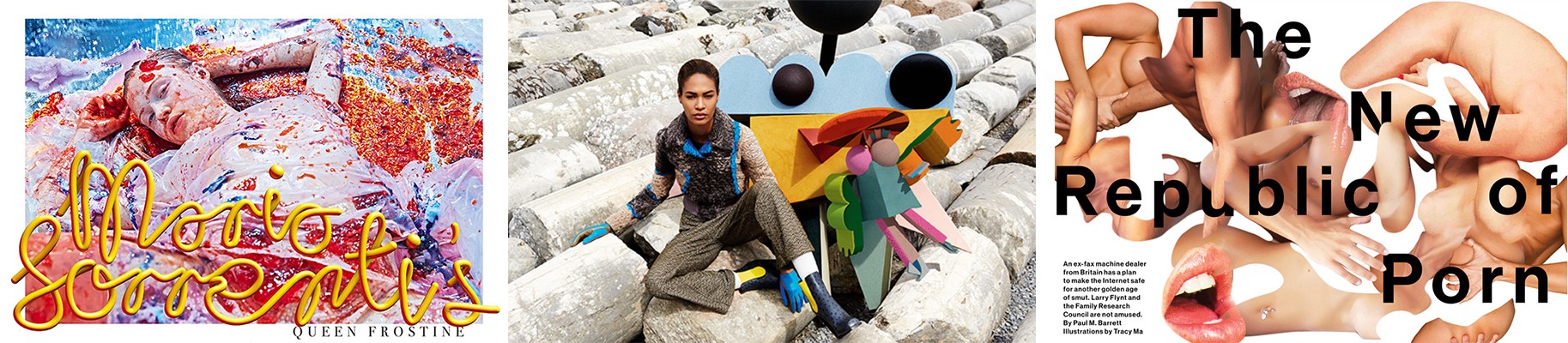
Left — Mike Miere for 032c Magazine. Centre — M&M Paris for Missoni. Right — Richard Turley for Bloomberg Businessweek
A communication can be complex and emotional. A design aesthetic can be disordered and misunderstood. Error can create beauty. Each example listed here (and there are too many more to mention) cause an emotional reaction. Each example raises the question ‘is this good design?’. Each example challenges the user in some way (as an example, here is Michael Bierut reacting to Mike Miere’s design treatment of 032c in Design Observer).
So, inevitably returning to the initial premise of ‘Why do I need an app or web destination to perform a single task?’ — the answer is, of course, complex. Sean Rose is right — for the most part, removing tasks from closed app environments and placing them central to social network superstructures, devices and ecosystems makes complete logical sense for the user. But this has to come with a caveat — to enable the machine at the expense of the human is to undermine the power design has as a human construct. A future design language should facilitate the humans that use it, not the machines that support and underline it. It should embrace human needs, build communities and enable education. It should entertain mistakes. It should be based in emotion. This is a Humanist design.