
Rob is a product and multidisciplinary design leader with over 20 years experience building things you’ve probably loved.


Talking Citymapper, Smartbus, China and IDEO at Hong Kong Design Week

I've spoken at quite a lot of conferences (and enjoy the design advocacy game in general), but I'm pretty sure that KOWD in Hong Kong wins the prize for best conference speaker host. I was in Hong Kong to speak about Open Data and design systems for smart cities with Citymapper, and while there got to speak with (and workshop with) some great minds from IDEO, the University of Austin and Ford Motor Group. Here’s a redux of that talk, with converted presenter notes and some key slides.

“My name is Rob I lead Special Project Design at Citymapper. My job at Citymapper is to not only lead Design, but to build global, scaleable products and experiences that make cities useable. Citymapper is in over 39 cities with millions of daily users, and the app has become known globally as the interface of choice in cities our users know well, and new cities they're just discovering.”
“I’m honoured to be invited by the Hong Kong Knowledge on Design Festival and the Government Hong Kong to talk about how we navigate complex cities.
In many ways this is a futuristic talk. Even a few years ago we wouldn’t be having this kind of open discussion. Citizens would use local knowledge to make sense of their city, and that would be that. If you were a visitor to a city, except for guidebooks, you’d never have local first hand knowledge of how to navigate a living, breathing complex city. Now we’re overwhelmed with the choice of ways to discover and understand our cities; from transit, to food, to taxis to hyper-local reviews.
So, with such a broad topic to talk about, I have to start somewhere. So I’m going to start with a fact.”

“Here’s what we know. Citizens are smart. They proudly, holistically know their city. They use apps to explore their city. They use social networks to see their cities in different ways, meet people, discuss things they love, date - and they also by doing so - change their city. Smart citizens make cities smart. Smart cities don’t exist without smart citizens.”

“Therefore if Citizens are smart - Cities are smart. Part of the user experience of smart cities - what actually makes cities ‘feel’ smart - is for the smart citizen to see the city change, but also to witness themselves change the city. Through using products like Facebook, Twitter, Instagram, Tinder, Foursquare, Yelp - and products like Citymapper - smart citizens use data to create experiences in the city, which in turn can make a restaurant successful, a bus busy, and following that logic - an area expensive to live in. This is a constant feedback loop, and a feedback loop is essential to create any great user experience. “

“This is important to note. We can build apps, we can add interfaces, but it is simply not enough to make the invisible visible. To make data visual. We cannot just provide a simple interface or design solution to a complex city - the city has to change and iterate at the same speed as the interface. How can do we do this? We can do this with open data.”

“Let’s take London and overlay the live open data.”

“Let’s add the tube network.”

“Now let’s add the rail network.”
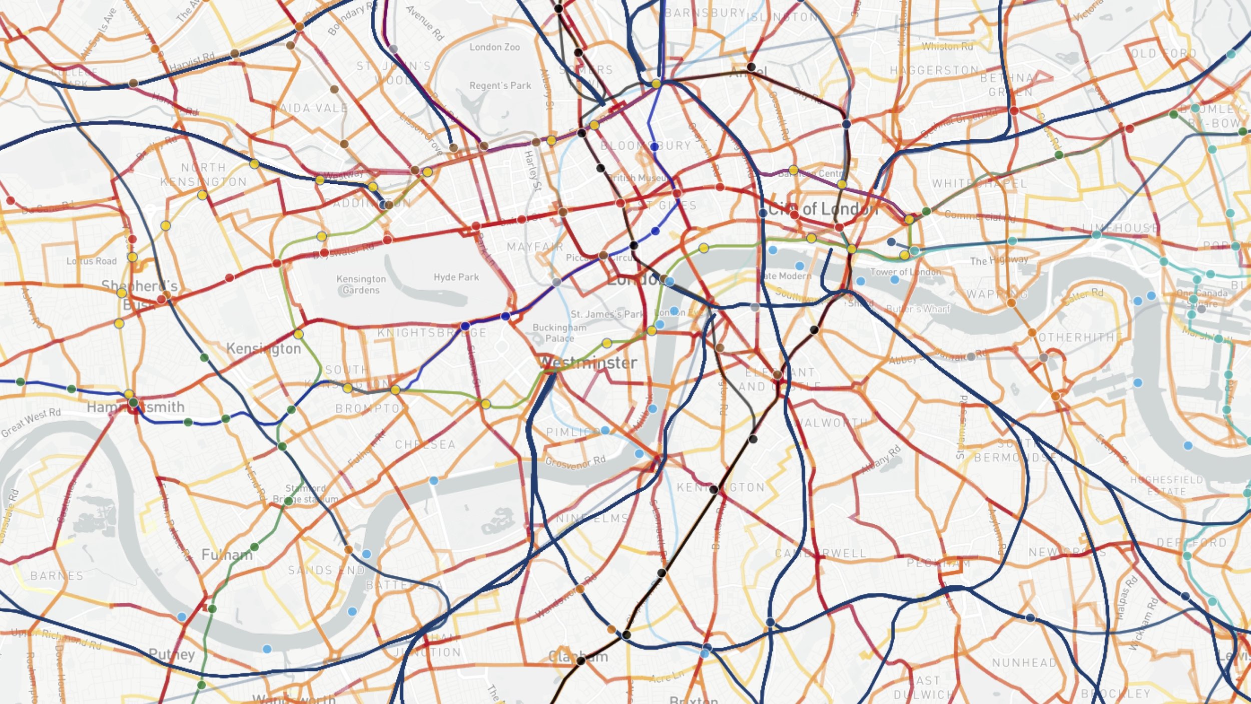
“Now let’s add the bus network.”

“Now let’s add the cab network.”

“Now let’s abstract that and play this live data over 24 hours. This is smart citizens in their city. This is their data. This is open data.”

“What open data does is allow the city to remain transparent. It allows the city to become an ecosystem in which the citizenship can build products. Products solve the problems of the city, which in turn makes the city more accessible, which in turn allows the citizenship to change the city.”

As I said just before - this is their data. It is not yours to own. It is owned by the citizen themselves - it is their data, their experiences, their interactions - but this data isn’t just ‘there’ for no reason. It’s there because the smart citizen wants and needs the city to react to them. So how does this stack up?

“Smart cities aren’t ‘Information Technology’. Nor is this an investment in infrastructure, servers and departments. Data is normalised now, and it’s been normalised by the citizen networks. Cities have to embrace this - a world of dynamic constantly augmented data and APIs - in order to embrace cultural change and the needs of the citizen. If they fail, they risk not being able to speak for their citizens, and fail to to adapt the city to their needs.”

“Unfortunately - sorry - it’s not enough to just ‘build APIs’. Or to build user interfaces for those APIs. As the smart city evolves, and as the citizens evolve, the products within the city must evolve also. An autonomous future of transit maybe inevitable, but the products that make sense of this automation, that interact with the human become more important. Autonomy and data solve the problem of the network, but they create the problem of human understanding, human interaction, and the need of the lizard brain - the default - the ‘do without thinking’.”
“Also, unfortunately - Change is hard. Allowing a change towards new systems and behaviours, such as automation - is difficult. The smart citizen wants change, but must learn how to interact with it. It is better UX to adopt existing networks - and using data - build feedback loops to allow for mutual innovation. It is not enough to just provide autonomous transit based on smart citizen data and expect the citizen to interface with it. Where is the trust?”

“Luckily we have an example of interfacing this change. The pop up has become a great form of validation in retail. It’s a way of validating business models, citizen acceptance, story telling, and a way to get the network of a city to try, test, validate and understand something. To feedback on it. To critique it. To discuss it. To see the resulting iteration. To tell a story. The citizens social network proof articulates and accelerates acceptance.”

And this brings me to Smartbus.

“Last month Citymapper began to experiment in mass transit using the concept of pop ups to validate a number of things. Theories, concepts, user experience, and user acceptance. This was a 3.7 tonne beta release that was designed as a giant feedback loop. This is because change in smart cities doesn’t happen with a big ‘wow’ product. It happens through these feedback loops and fear reduction - simplification, narrative and network acceptance. Who will get on this bus? Will they trust it? What will they think? What is it worth?”

“However, Smartbus was also a number of things. A full stack of experiments. We built tools to analyse smart citizen data, tools to manage operations, tools to aid driver confidence and communication, and tools to evaluate the vehicle performance. So…here’s what makes a smartbus smart.”
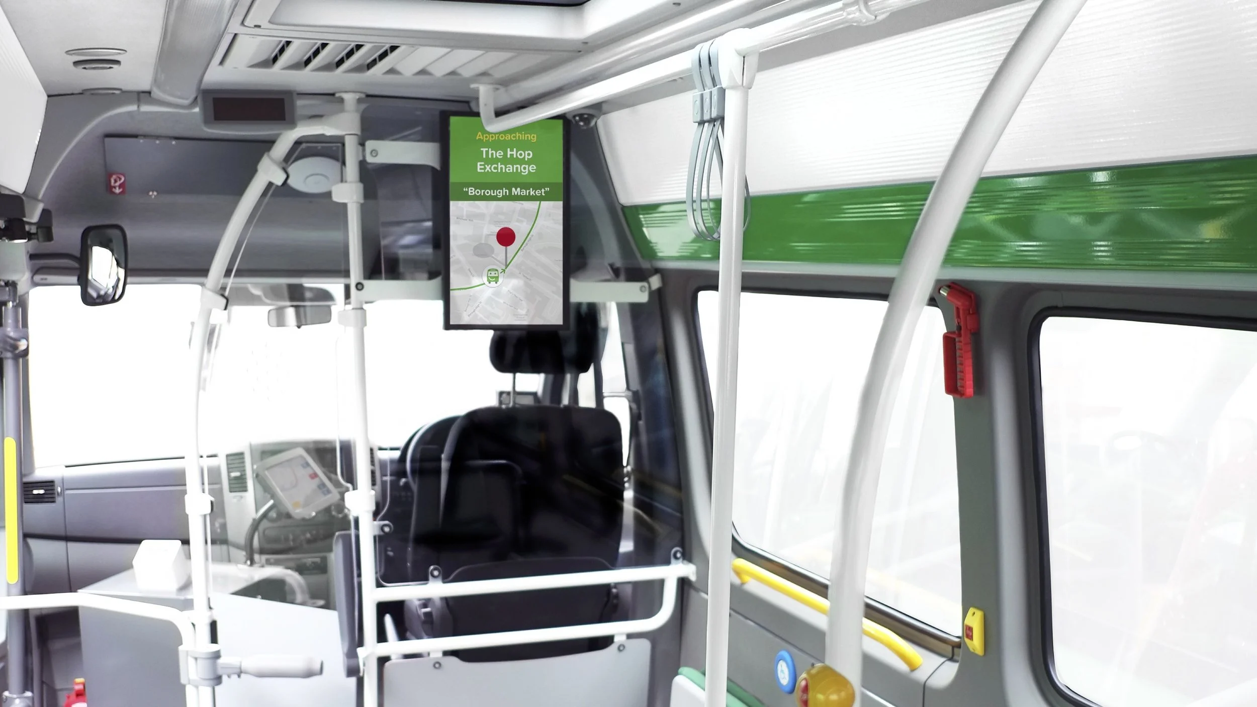
“We created interfaces to reduce fear and to inform.”

“We created interfaces to improve driver feedback, communication and customer experience.The driver is key in an non-automated world, they captain the ship, and they are responsible for the bus being on time, keeping people safe, and getting them where they want to go.”

“We showed where the bus was, where it was going, when it would get there - using live traffic data to calculate accurate ETAs. We showed the driver name, and this increased customer interaction.”

“We even were transparent when our buses got lost or weren't in operation. Honest is a great policy. If you’re using citizen data to create experiences, telling them when you get it wrong is important.”

“We developed personal interfaces for the smart citizen in our app, showing the buses in real time on a map, and giving real time traffic ETAs.”

“And we provided feedback loops for our users to suggest routes online. The reason we did most of this is because you can’t understand Smart cities with data alone. Smart citizens and products like ourselves can navigate with data, but we can’t understand the city or the unique users predicament, so we used Smartbus to begin a process of understanding mass transit better. What mass transit could be. What it could become in a smart city.
We learned some stuff too.”

“London is not a new city, but it’s one we understand best. If we had to design a future city, we could design it around transit and demand, but in London we began with a city with exiting infrastructure - in fact some of the best in the world. So if you begin with a city that has infastructure already - like you do in HK - then it is about optimising that exiting infastructure. Using the city itself and it’s citizens to develop human focused transit systems that are complimentary and are designed though human and data based feedback.”

“It’s important to recognise that cities already have a user experience, so it’s about working within that expected experience, the expectation of the citizen. Within this expected UX is the opportunity to optimise, to change, to iterate. This UX is a tangle of complex networks, nodes and varied user expectations.”

“But thats not to say that change of that user experience is impossible, it’s just hard. Transit *does* change in the smart city because of the smart citizens feedback, but infastructure cannot change or iterate at the speed of a digital product or interface - or the wants of the Smart Citizen. New roads, new metro systems, new stations - user interfaces change quicker, meaning the interface becomes more useful and adaptable than the infastructure. So what does this mean for the smart city?”

“It means that in a city where the interface changes quicker than the infastructure, that navigating and networking in a city becomes focused on the interface. And it means that the city becomes owned by the smart citizen using those interfaces. These interfaces become focused on navigation by destination. That means “Get me to there”, rather than the process of “getting there”. It means simplifying the city to destination, demand and the data.”

“But what does this change look like? We’re creating navigation, simplification, and we’re exploring on-demand transit within existing cities. If we place the smart citizen and their data at the centre of the smart city, as part of creation and execution of transit, how does this transit look? How does the city adapt?”

“This is not longer about interacting with a metro map, or trying to use interfaces to figure out navigation, or to work out where the bus goes. This is a user interface that adapts to the citizen, that takes you where you want to go. Now, I recognise there are some here thinking this is the description of UBER or similar, but UBER uses an existing system - the taxi - and layers new technology on it. But the smart city needs mass transit. Mass transit that adapts to the city and it’s citizens, not single occupancy vehicles that adapt to the needs of the individual.”


Do I really need an entire app to make a simple restaurant reservation?

A simple question with an overly complex answer.
Sean Rose at Slack raised an interesting topic recently. ‘Do I need an entire app to make a restaurant reservation?’.

It’s a topic that in many ways questions the dictum of ‘a good product does one thing well’ — which is a theory I’ve heard rolled out more than a few times in product discussions and pitches. I’ve been considering this topic for a while myself. I mean, surely if a good product does one thing well, then a better product does more than one thing well?
The rise of web and app products, focused on singular task focused user experience are on the increase — especially in the home delivery food category (and especially in London). Hungryhouse, JustEat, Dine In, Deliverance, Room Service, Deliveroo and recent grocery focused newcomer Hubbub (there are many more) are all fighting it out to become the easiest way to get the food you want delivered to your door when you want. But with the ubiquity of messaging apps (WeChat, Messenger, etc) and social network superstructures (Facebook, Pinterest, Instagram, et all) which users spend so much time inhabiting and communicating within, the question becomes, ‘Why do I need an app or web destination to order takeaway food?’. Or to phrase it without the reference to food: ‘Why do I need an app or web destination to perform a single task?’
Of course, as a user I should be able to just ‘do’ in any superstructure I care to use, device I happen to own or ecosystem I choose to inhabit. I should be able to use WeChat to order pizza, ask Siri to book cinema tickets directly in the iOS or awkwardly half-shout “OK Google!” to verbally book a cheap flight. This makes logical sense. As a brand or product attempting to do one thing well with the minimum amount of user inconvenience — why wouldn’t you focus on text or speech inputs within ecosystems that your users find comfortable and — more importantly — already inhabit? Placing services central to existing busy user environments ultimately makes for a better experience; but there is a cost. That cost is the removal of the function apps perform in the propagation of their own internal experiences and branding. From here the rabbit hole widens — with the removal of individual internal experiences we begin to see the homogenisation of experiences, the functions of user interfaces becoming unilateral and consistent based only on user demand, behaviour, deep linking requirements and SEO.
But is this not what User Experience ultimately strives for as a discipline? Hang on — let’s entertain this thought process for a bit: if the core of usability is to create an environment which completely supports the wants and needs of it’s users (and let’s suppose that deep-linking exists to primarily serve the user), then the homogenisation of design — the destruction of it’s variants, the individuality of the experience with it’s inevitable undesirable learning curve — is flattened into consistent default states and gestures. Extending this user focus, the ordering of a pizza should therefore be the same as paying a bill, the same as accessing insurance documentation, the same as booking a hotel, the same as commenting on a media post — and this lateral consistency will inevitably be built and propagated in a user environment that is most available, most accessible and most adopted as the default by the majority of users. This, however, suggests the sacrifice of individually designed spaces at the cost of improving access to users. It forces everything to behave the same because this consistency of behaviour is what the user craves in the efficient performance of basic daily tasks.
So what of design? In a possible future of consistent experience, where to create difference is to provoke unnecessary confusion, does the design control and design decision reside with the designer of the most popular superstructure, ecosystem or device? Does this make Apple your designer? Is the Head of UX at Facebook directly controlling your user experience? Is the ultimate attainment of the user centric designer to now create, as Le Corbusier expressed, “machines for living in”? The mention of Le Corbusier, by the way, is no pointless design-wank addition — the truth is Modernist designers have always strived for a machine-like aesthetic, of creating systems based in geometry and function. It’s a perfectly valid question to ask — can Facebook’s GUI guidelines or Google’s Material Design both be seen as “machines for living in?”.

Some focus on Material Design. It is a supremely functional and structured language. It is infinitely scaleable and proportional. It is also incredibly well documented and resourced — hard to question in it’s logic and easily adopted regardless of the design literacy of your team. It’s easy to communicate to others and quick to implement at the front end. It is very impressive in it’s scope. Yet there is certainly the feeling of the manifesto in Material Design; Google stating in their introduction, “We challenged ourselves to create a visual language for our users that synthesizes the classic principles of good design with the innovation and possibility of technology and science”. Of course there is a clear query about what qualifies as ‘the classic principles of good design’, yet the stated intention of the design being presented beyond this opening statement, focusing on the ‘possibility of technology and science’ is certainly a form of modernist trope. This is a design manifesto that looks to the machine and the user of the machine in synthesis, where ease of use is intertwined with ease of load and where reactions and decisions are influenced by computed animations and calculated movement. Time in this language is infinitely measured. Errors by the user are failures. Clarity of imparted information is the ultimate attainment. This is not a design language for the playful, the artistic or the inquisitive. This is not a design language to generate abstraction or to express emotion. This is, however, a design steeped in ‘the classic principles of good design’ — which appears to be a recently established shorthand for ‘Dieter Rams’s Ten Principles for Good Design’, a guidance famously, by proxy, attributed to Apple and therefore the creative direction of Jonathan Ive.
Rams is becoming the greatest known mid-century modernist (possibly via the sales of iPhones and Netflix documentaries) and it is well deserved, however it is worth considering that despite Rams reacting against “an impenetrable confusion of forms, colours and noises” by creating the ‘Ten Commandments’ (as they have come to be known), Rams was truly reacting against a more pressing and insular question that all designers ask of themselves — ‘is my design good design?’ The by-product of this question for Rams formed itself into ten self-facing principles which, many years later, seemingly by osmosis (and possibly via Dribbble) have developed universal appeal as a broad public soundboard for designers desperate for validation in an age of disruptive digital focus and vast technological change. ‘Good design’ in these terms however is forever an utopia, a perceived perfection of form and function, which, because of the imperfection of humans — is always unattainable (as anyone who has watched user testing will attest). Nevertheless, utopia is easier to digest and build with a code of conduct or blueprint — or manifesto. This line of thought has other problems too — we aren’t asked to consider if ‘good design’ makes people happy, or is what the user wants, or empowers the user, or if it builds communities, or educates. This is a design language that creates form and function but not emotion and reaction. This is a design language that excludes the messy nature of human interaction and replaces it with white space and order.
Should there be a reaction against this form and function? My suggestion is that it is inevitable. A good example of this reactionary movement is being seen in Editorial Design, which historically has been an experimental space, from the Bauhaus to the Avant-Garde. Editorial Design has certainly seen an increased injection of the post-modern and avant-garde over the past few years, to the point where trends have formed and been collectively followed. The work of Mike Miere (forging a beautiful/ugly aesthetic with 032c) M&M Paris (creators of the beautiful Missoni print campaign) and Richard Turley (creating chaos from order in Bloomberg Businessweek) have shown that function doesn’t have to be created through standardised templates and overbearing consistency.
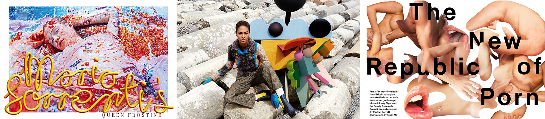
Left — Mike Miere for 032c Magazine. Centre — M&M Paris for Missoni. Right — Richard Turley for Bloomberg Businessweek
A communication can be complex and emotional. A design aesthetic can be disordered and misunderstood. Error can create beauty. Each example listed here (and there are too many more to mention) cause an emotional reaction. Each example raises the question ‘is this good design?’. Each example challenges the user in some way (as an example, here is Michael Bierut reacting to Mike Miere’s design treatment of 032c in Design Observer).
So, inevitably returning to the initial premise of ‘Why do I need an app or web destination to perform a single task?’ — the answer is, of course, complex. Sean Rose is right — for the most part, removing tasks from closed app environments and placing them central to social network superstructures, devices and ecosystems makes complete logical sense for the user. But this has to come with a caveat — to enable the machine at the expense of the human is to undermine the power design has as a human construct. A future design language should facilitate the humans that use it, not the machines that support and underline it. It should embrace human needs, build communities and enable education. It should entertain mistakes. It should be based in emotion. This is a Humanist design.

Apple, distributed media and the struggle to keep news content relevant

Apple’s newly announced News product seems to focus on design and ‘premium feel’, but it’s a product with the fight for relevancy at it’s core. Is it a concentrated distributed media play or just the democratisation of design tropes and a way to polish the usual recycled content?
Previously I talked esoterically about design in terms of distributed media strategies — specifically in terms of design existing within ‘superstructures’ (thankfully it was short in length). ‘Superstructure’ was used as an artificial edifice with architectural language to describe the reality of how content is presented by the major social networks. The Facebook ‘Timeline’, however, is a superstructure in the purest sense of the word — if the underlying structure of the Timeline contains multiple posts from multiple destinations, each with a degree of freedom prior to algorithm, the Timeline that most of us are faced with in our interactions with Facebook has a degree of freedom of zero. The posts within the Timeline exist within a time period and fall within this natural time coded hierarchy. But the Timeline itself sits as a superstructure, above the baseline of the reams of data, algorithm and product Facebook produces, with the single role of enabling consumption. My argument in terms of superstructure adoption was — why build a new superstructure to contain your content? The process of building new websites, marketing them to users, building communities, enabling tribes, all while attempting to elicit social network shares from them (via clunky APIs and modals) seems almost as prosaic as trying to accurately recreate a print magazine page on a tablet. There are counter arguments to this of course — some content should remain in a curated experience or branded space. There needs to be a solid brand presence to maintain editorial or brand trust. I get these counter arguments and indeed the products they produce are often highly convincing — the current app industry looks profitable and influential and by it’s nature encourages walled gardens and the proprietary control of users — the more we know about the user the more we can enhance the relationship with the user, therefore the more we can monetise the products. Yet I’ve seen very few content brands develop walled garden products with any significant level of profit or established user relationships. Walled garden products — unless they do one thing incredibly well or solve a broadly felt user requirement — tend to suffer from discoverability and (if a user ever finds it in a store or home screen) significant adoption. It’s worth pointing out that Apple in iOS9 seek to change this discoverability issue with app-level SEO, but the effectiveness of this remains to be seen (set your email filters NOW, however, for an inevitable plethora of companies touting to sell you access to that SEO ‘goldmine’).

American Trends Panel Results via Pew Research Centre
Jumping back to superstructures, we’re seeing specific news products loosing out to a growing Millennial and Generation X need to discuss and consume (in this illustrated case - politics) in a distributed media environment. This illustrated superstructure is Facebook, but delve into the demographic, alter the editorial topic and it could be any number of growing superstructures currently filling the home screens and being adopted by millions of users.
Famously at the back of the adoption curve is Apple, who have now unveiled a new distributed media channel which should be ignored at any brands peril. Not because of the design or the user experience, but purely on the basis of discoverability and sheer number of home page installs. Sure it looks pretty enough, and from what we can tell designers will get a few more tools to play with in the coming months, but this is a distributed media play at it’s core. Yes it’s RSS focused. Yes it’s lean. But it’s also a highly complex experience based in a Natural Language Product and algorithm that don’t prioritise search, but rather discovery through relevancy. Apple News brings distributed media directly into the iOS with all that entails — better discoverability and functionality, yes — but more important, user relevancy. Natural Language opens the playing field. Where once the distributed model relied on the opaque nature of Facebook’s News Feed algorithm or that of Google’s PageRank, with Apple it’s — potentially — more to do with language. The input in iOS9 of a keyword will display related contacts, web searches, apps, locations — and related News articles.

Apple News Producer articles via Apple
So in a distributed media model, we’ve gained another channel — but we’ve gained a channel with a robust user experience already in place and the promise of design tools and options to share beyond the walled garden. Will this become the gateway for editorial brands to begin to consider fully distributed media models? And will this create new tools for designers and experience makers that could influence the other superstructures Apple is now squaring up to? Of course we won’t know. What we do know is Apple’s want to create a ‘premium feel’ to it’s News content as shown in their recent Keynote - but how well this will sit with Millennials is an unknown. Apple News is an interesting development that creates relevancy, transparency, permeability and discoverability across news content and it’s operating systems beyond the basic algorithms — and that is a very Millennial construct, if not a worryingly iOS centric one. The Apple News articles themselves however, with their focus on animation, print hierarchies and page furniture look distinctly aimed at the Baby Boomer, and while Apple could create the democratisation of New York Times ‘Snowfall’-style experiential editorials, the question remains — ‘is there actually a user need for it?’.

Giving up control might just make you design better experiences

Publishers created branded websites to accompany their print offering with varying success. More recently we saw the rise of the web native publishing brand. Now the increased size and reach of social networks has lead to web ‘superstructures’ that bridge the gap between the open web and the closed app. What does that mean for design and user experience?
The touted phrase ‘Google is your homepage’ hasn’t generated a significant effect in web design or architecture. Complex navigation hierarchies still pervade, content models are still entwined with ownerships, brands and egos, unrelated and related content maintain their silos. User Interfaces, still apparently determining success, are discussed as if destinations, places users covet — a place for the user to arrive with a task, get lost in and digitally cavort through like a laughing model skipping through a field of corn selling dandruff shampoo. But what is ‘news’? What is ‘opinion’? What is a ‘feature’? Can a ‘feature’ be ‘news’? Can ‘opinion’ also be a ‘feature’? All relevant questions that in reality none cares about beyond legacy navigational structures — certainly not now share is becoming increasingly central to most user flows.
‘The share is your homepage’ has generated the need for a myriad of animated share buttons to be present on any given web page, along with relentless calls to action to ‘share this’ or ‘follow us’. These — for the most part — bloated share buttons cramp the users experience — at best they delay load times and throw the user to a clunky API login screen before the share can happen or the comment can be added. Sharing content can become a sub-standard experience — a designer can create a glorious responsive web experience that encourages sharing, a journalist can create beautiful narratives that everyone is desperate to discuss, but at the point of share or comment this experience vanishes into a mess of frames, windows and text input fields for any chosen social network. It becomes easier to share via copy and pasting a URL into a native social media app, which on mobile becomes a slightly fraught experience of tap gestures, selection dialogues and fine finger control. This newly shared content links back to the web page from where the share was actioned from, so that glorious responsive web experience full of beautiful narratives ends up inside a user interface web view (which you have no control over the design of) linked from a timeline structure (which you have no control over the design of) inside, say, a Facebook app (which you have no control over the design of — unless you happen to work for Facebook). So what is a good user experience in this scenario? Well, logically it would make sense to remove the copy/paste actions, sign-in forms and windows and let the user access the content directly — and use that platforms native share functions to do the share process. But this of course means to the designer that the user experience and the responsive layouts they’ve worked hard to build and test are redundant in the face of a default. The default for Facebook, for Twitter, for Tumblr — the default font, the default responsive behaviour, the default layout and hierarchy, the default player style, the default minimums and maximums that each network is built upon. To the journalist it means that the long form narrative might not work on Twitter, that mid-form text might behave better on Tumblr than Facebook and an infographic might have to co-exist as a still image, a GIF and possibly a video on YouTube. But none of this matters. What matters is the user can easily read the content they wish to read and share it using a default behaviour they are comfortable with within a network they wish to actively inhabit and curate. Should we as content creators and designers be trying to remove people from the networks they inhabit to impose on them our hierarchies of content and our user flows? Should we be disrupting a users consumption and imposing new behaviours just to register a click, a visit or a metric? Can we instead create experiences within the networks the users inhabit and focus instead on engagement — on experience? Certainly Facebook think so with Instant Articles. While the media industry wrings it’s hands over the perceived benefits of increased engagement compared to the loss of control it causes them, the user at the centre of it all doesn’t care. They still want to read, comment, browse and share without having to learn anything new. This isn’t the users fault, but their default. As Nir Eyal suggests, “products that require a high degree of behaviour change are doomed to fail” and he is correct. Design isn’t always about determining new behaviours, new frameworks, or controlling hierachies.
A loss of control is central to this and designers are often those who perceive that loss the most. In this new environment there is no style guide, no discussions over hierarchy, no discussion over user flows, user interface gestures, tested button styles and menu actions. This is an environment where the product is already built and you merely inhabit it — in design terms these are unstyled pieces of content, or as Koolhaus would have it, “orphaned particles in search of a framework or pattern…subsystems only without super structure”. But in this environment there is design, and it’s a design that matters. It is not a design of controlling behaviours but a design of embellishing the users experience. It’s one of imagery, movement and colour. One of pure communication within a rigid existing superstructure. A design based on the most stringent of briefs. A design that requires personality and strength to differentiate itself from the identical superstructure that surrounds it, frames it, supports it and enables it.
In a time of flat design, homogenised user flows, user interfaces and behaviours where everything faces the reality of becoming a doppelgänger, a copy or a pastiche, design now exists in the details. The crop of the image, the edit of the 15 second video, the animation that causes a communication, the simplicity of making imperceptible financial figures into a narrative that is easily understood. This is a lean design that focuses on communication and emotion, that accepts the superstructure that surrounds it but still strives to create something beautiful and useful within constantly fluctuating and strictly imposed minimums. This is a design that can really make a difference to the user, rather than building another superstructure, another waste of design effort, more junkspace. Koolhaus speaks of design as delivering results, of solving the underlying problem not just creating a surface aesthetic, “Design isn’t the veneer but the foundations beneath. Design is solving a problem at it’s core not re-imaging or re-designing”. As the behaviours and superstructures around our content become default, become broadly adopted and established, why build something on the same principals, the same behaviours, over worked with a thinly established and awkward veneer? We can embrace the superstructure yet design within it — and it’s here that real results can be found.