
Rob is a product and multidisciplinary design leader with over 20 years experience building things you’ve probably loved.


Citymapper Smartbus - the world’s first 5000lb 50mph beta release

I’ve written and talked quite a bit about Citymapper’s Smartbus project and my role in it - including all the ‘official’ writing I did about it on the company Medium blog and in the press. But I wanted to give an overview of the project / product in one space because it’s such a vast project / product - and one I keep forgetting the sheer complexity of. So while this serves as a nice portfolio piece, sure, it’s also a static reminder for me about what I did for the entirety of 2017 and why I should be constantly in awe at what we achieved - especially over the first 4 months.
Before Smartbus was SimCity
SimCity started life as a MapBox map with some simple data overlays. The idea was born of a hack in the FE team to figure out how to overlay some of our live app and open source data and make sense of it. We wanted to investigate transit products, but we didn’t even know if there was even an opportunity - mass transit dynamics are complex, subsidised and buried in policy. This means that even calculating a basic business model is complex as everything is in constant flux and renegotiation.

SimCity with Journey Duration data overlaid
We started building a basic web app that would allow us to overlay user centric data onto maps. If the business models are complex and subsidised by price, then you can always compete on the singular level playing field - quality of UX. With UX our main play we began to look at population density, A to B desire lines and where the black holes exist in a cities infrastructure - black holes though politics, restrictions, funding or lack of density. Mass transit is for the masses - this means its focused on scale and broad strokes. A smaller operation could exploit those gaps, compliment the existing network and still remain competitive.

SimCity with Journey Duration data cross-referenced with live transit links
We ended up after about 4 weeks with a product that did some pretty cool things in multiple city environments (not just London as shown here). Using various live data overlays and historical archives, you could choose a time, day and place, draw a transit route you liked the look of - and the product would auto route your selection via GPS, chose the best stops and stations for peak traffic at the time and date provided, and show you your competitors.

SimCity in action - a hyper powerful Saas that allowed route planning combined with live transit and app data
You could plot a route, save a route and analyse it using algorithmic processing of millions of known and projected data points based on known human movement. From this we were able to calculate projected passenger numbers - by stop or station.

SimCity’s brains - predicted route analysis could be then be calculated in minutes via algorithmic processing
Combining live and archived traffic data we could then predict the P&L - along with labour and machinery costs - of running any transit route it the city. From this we could rank routes by user need or profit potential, make quick changes and tweaks, and use the analysis tooling and infographics to understand the stop-by-stop dynamics in terms of passenger potential vs cost. A shorter route is cheaper to run in fuel and depreciates assets less - it also costs less in labour and has a higher frequency (which passengers love) - but it limits its profit potential and reach, while also reducing the chance of that route joining two areas of a city that actually need to be connected.

The SimCity ranking system
We build many data analysis tools and infographic overlays to our data. But this was an internal tooling system, not a commercial Saas - and as such it was allowed to be quick, clunky and navigated by feel. This was very much a service design led project with some limited usability considerations.


We had now analysed thousands of routes, and worked out where to throw our chips. We had a route. We just now needed to work out how to build a bus.
Project Grasshopper begins
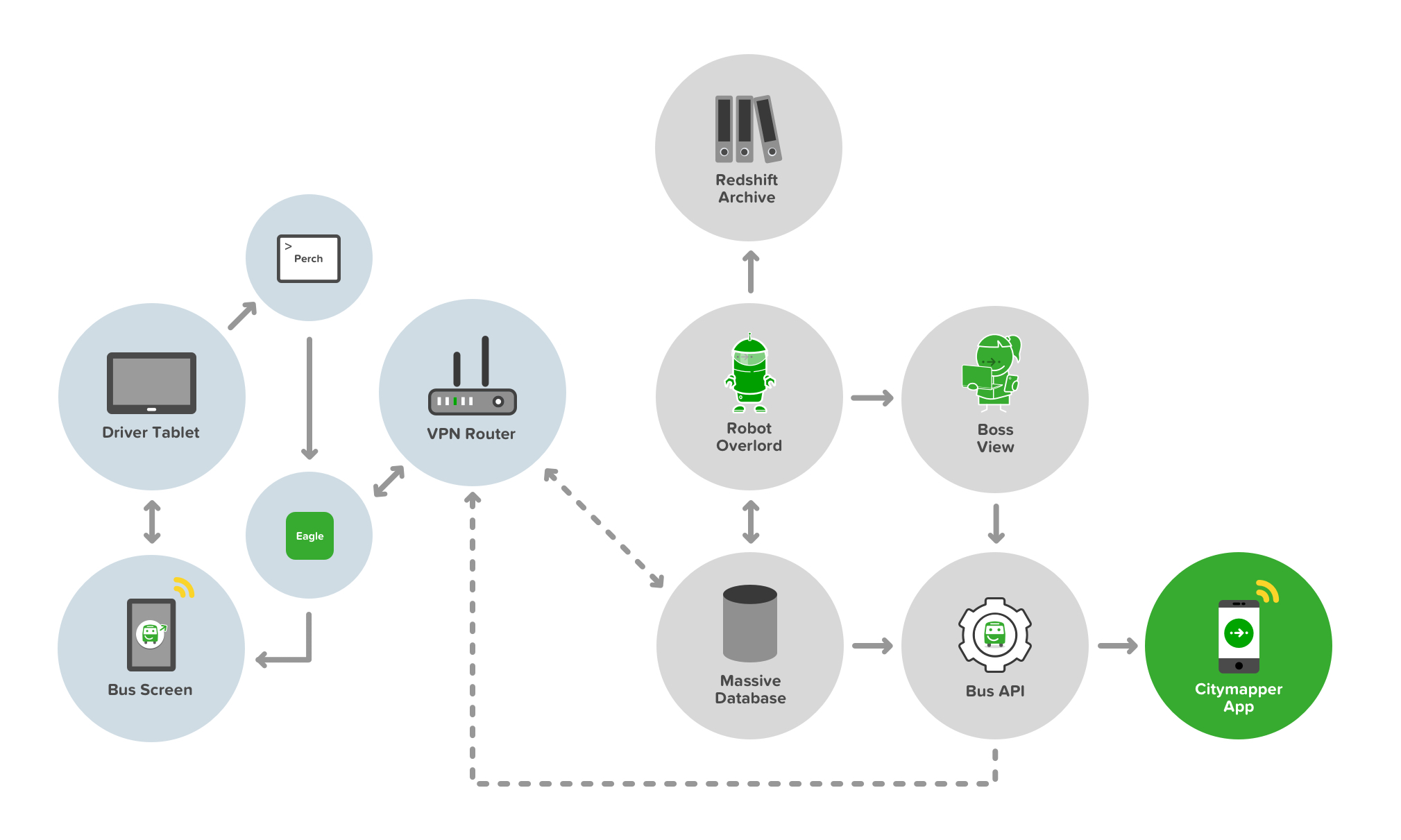
The full development stack of Smartbus from API to App to Bus to User
Building a Bus API isn’t easy. Neither is placing a server on a bus to facilitate that API. Buses are not really cutting edge tech - they’re cumbersome, heavy duty and - well - not a Tesla. We also wanted to deliver a Smart element to the buses. Sure, the bus was running on a Smart route thanks to SimCity, but we wanted to make the bus smart too. There are two key Smart innovations in this stack. Well, three - thought the third really sowed it’s colours later in the game.
The first is the concept of ‘Bus as a Platform’. The bus provides data of it’s whereabouts and behaviours, traffic and timings, passenger numbers and payments - in real time - to both the controller (i.e us) and to - and this is key - other buses. Smartbuses on a route are like an integrated mesh network - aware of each others status and proximity and able to self-predict their ETAs and passenger demand. This means they can talk to each other - and tell other buses to slow down or speed up depending on the current demand.
The second concept is the bus talks to the user. It shows transparent ETAs, location, other connecting nearby services, other Smartbuses, and even when to get off the bus (more on this later). The bus also talks to the driver. It shows the ETAs of other buses, how long to wait at stops, and it delivers simple information and two way communication to the driver about shift changes and start times.
The third concept is the bus talks to the Citymapper App, and therefore the user via their mobile screen and audible / haptic notifications. But it also responds to user inputs on their device too. It’s a personalised feedback loop, and one that benefits all the other buses in the mesh and therefore all other users of the network.

The first ever Smartbus rolling off the production line and straight into WIRED magazine
Other than the cutting edge tech, the bus needed an exterior and in interior refit. 3 buses in total and a lot of vinyl and signage. Most people know how to use a bus. It’s a lizard brain dynamic. But paint it green, change the payment terminal, add some screens…and it breaks something. The silhouette is changed. The UX shifts, the trust dissipates and new storytelling is required. Not everyone uses tech products, and mass transit caters for everyone - not just transit app nerds. The questions that were naive edge cases in development are no longer edge cases but massive critical issues. Should I get on this bus? Is it safe? Where is it going? Is this replacing my usual bus? How much does it cost? Will it tell me when to get off? How can I pay? Can I bring my dog on?


The integrated Smartbus screens providing live location and ETA data via live Bus APIs and app data
The driver UX is also critical in terms of usability and trust. Can they operate this bus safely? Is the screen a distraction? How do they reboot a Smartbus? How do they answer passenger questions? What does their uniform look like? How do they deal with platform bugs? What happens if the payment system fails? How do they communicate a problem? How do they change shift? Where do they pee?

Smartbus driver control systems delivered via Android tablet

The Smartbus driver control system user view
The bus controller ‘Boss View’ UX isn’t critical, but at scale it’s hugely important. Where are my buses? Are all my drivers on the road working? How can I contact my drivers? Are my buses bunching up? How bad is the traffic? Should I reroute a bus to avoid traffic queues? Who needs to go on a break? Has a driver exceeded their legal driving time? Is this route profitable today? How much am I burning in costs?

The Smartbus Boss View, allowing network controllers visibility over their headways
All of these questions are moot unless someone actually gets on a Smartbus of course. No passengers, no action. This meant using the bus to tell the story externally to potential passengers, making it look accessible, but also making it look trustworthy.

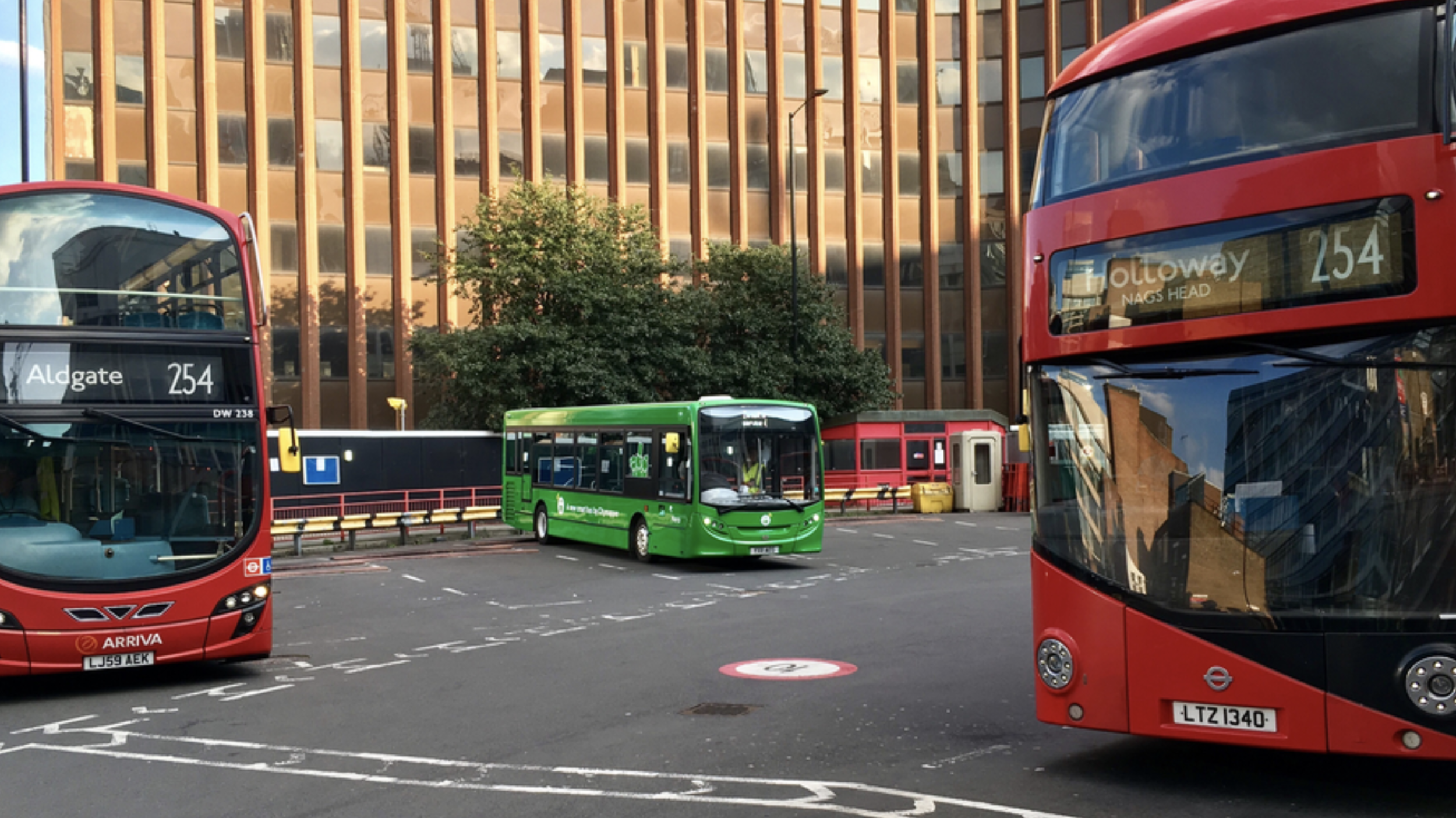
Smartbus rolls out through Southwark, London
Hark, Bigger buses!
Smaller buses are agile, but they also hold less people. Less people means lower demand routes, and lower profits. We spun up a fleet of six large buses with the goal of making the Smartbus scale.

A bigger Smartbus used to test a bigger revenue model

Smartbus interiors on a 5x scale
Smartbus rolls out on it’s new routes in East London
Higher frequency routes and more passengers means communications and payment UX becomes a critical part of the user onboarding flow. If the bus stops to onboard 10 passengers, to maintain the frequency of the service, the payment transaction process and boarding needs to be completed as quickly as possible. If it takes 10 seconds per passenger, each asking questions about how to pay and what to pay - that’s 100 seconds per bus stop, which totally derails the other buses frequency and schedules. It also annoys passengers being onboarded - and also annoys existing passengers with places to be.

Payment UX is crucial in transit, along with payment wayfinding

Transit payment communications and touch points are critical in passenger flow dynamics
Much like the smaller bus we needed the UX and storytelling to extend to the exterior of the bus - making it look accessible, but also making it look trustworthy.

External communications to aid with navigation, trust and passenger payment dynamics and flows
The bigger format of the larger bus allowed us to use large 40” OLED screens to expedite that communication and storytelling. However the time a user has to see these screens is limited - at the bus stop as they board, as it travels by at 50MPH, or if it’s stuck in traffic from the sidewalk.


We chose four in-flux screen states that allowed for a consistent narrative - location, payment, user benefits and at-a-glance plain language destination. The left side of the screen remained static, containing the crucial information relating to cost, route and route number.

Our internal UX also got an upgrade. We were able to improve on our Bus to User feedback loops and allow users to interact with the bus platform. With Busmoji we were able to give users a personalised experience - using the Citymapper App, the user chooses their route as they would normally. On boarding the Smartbus, the app signs them a Busmoji. When it’s their stop, the bus reminds them by showing their emoji on the bus screens. Great for drunk passengers - even better if you’re not sure of when to get off or have forgotten the name of your stop.


There’s so much more to talk about with Smartbus and it’s UX, but context is really key. Context of politics, context of legal limitations, context of public services. Here’s some other articles I’ve contributed to or written relating to the Smartbus universe:

Making student travel visually not suck and scale across multiple destinations

I never intended to visually design Spring Break. It just kind of happened. It’s not my normal design brief.
Student travel is a money-making beast. It’s a billion dollar market with a guaranteed influx of new users every year. But because every year this new influx of thousands of students hits campus with zero previous experience of what it is to ‘Spring Break’, student travel providers are pretty lazy when it comes to trying to move things forward. To progress. And as such, everything is just a bit…well…tacky.

And because it’s a bit tacky - no designer wants to tackle it. I love a challenge which others won’t touch with a stick. For more context, we’d recently acquired a millennial / student travel company, and we had three months to roll out live campaigns.
I’m going to go through the iterative process of tackling this project from start to finish, so it’s not all portfolio - there’s some duds here, and I’m going to show them. I should also point out that my role in this project was as Design Leader, overseeing Product, UX and Marketing, so many other talented people with specific skills worked on these over numerous revisions (hence I’m showing you process and not a link to some shiny Dribbble account).
A look at the current market

The current market in Spring Break world is pretty grim. It’s cartoon-y. It’s cheap. What’s crazy about that however is the cost of actually going to Spring Break - students are paying $800-$3000 for a one week vacation all-inclusive with flights.

An example of existing artwork for Spring Break Cabo San Lucas, 2018
There’s also the additional complication of Sororities and Fraternities - large family style travel groups who seem to not only have large amounts of money, but also transcend trends. Investigating trend within Greek groups opens up levels of inner hierarchy, and history - these are establishments where you gain societal status, not where you gain cool. To that extent understanding the current output of Spring Break providers makes some sense - cheap, quick, fun. But our research showed that whether it was Greek groups, Sports groups or just random large groups looking to Spring Break they were all unified around Trust, Transparency and Value for Money. Taking this into account we can begin to build our mood - it’s got to be clean, trustworthy and high value - and in the student / socially-led world this is an easy find. But while these students are driving the decision making and narrative, it’s not usually them paying for it - the decider is mom and dad. So if you want to scale the stories you tell, want to increase the experiences you offer and, by proxy, increase the cost of your packages - you have to get mom and dad onboard, because they hold the AMEX.
Beginnings

Early discovery into new textures

Early discovery into type
Normally with Marketing Design I’d begin with a moodboard, some brand analysis - but with this project we knew we were dealing with complexity. 50+ schools, 10+ destinations, merch, staging visuals - not to mention social media, UGC and below the line campaigns. A quick calculation early on revealed that per-destination a campaign might require 200+ assets for below the line use, including variants of those assets across an average of 10 different schools. That’s a lot of assets, and with a high-growth strategy involving HTML and SEO, this means multiple variants of variants, A/B testing and constant key word changes.
We’re a remote / distributed team, with the bulk between London and Los Angeles, and stakeholders in Las Vegas. This meant two things. Firstly we’d use an asynchronous tool to coordinate our design process. Secondly, with the complexity and timezones in play, we’d need to change our working practise to not require stakeholder approval for every asset variant.
We created a Campaign framework that presented parent key art to stakeholder, with cascading variants from the parent key art being asynchronously available and editable. For this we chose Figma, which not only allowed us to sync our critique with our Product Design and CX teams, but also allowed for asynchronous feedback from stakeholders along with shareable permalinks.

Our Figma templating for the Marketing framework - 10 destinations ready to export in multiple formats
Scalable Design - V1


To scale the design with the amount of variants in the brief we immediately moved away from bespoke illustration or specific key photography and began to look at montage styles and design frameworks based around core patterns, rhythms and devices. One clear device was gradients - they were flexible, allowed us to chose complimentary colour-ways per destination, would scale to partnerships and brand guidelines, and could be used across multiple brand touch points from web product to merchandise to CSS. Another clear device was emojis. Emojis allowed us to quickly add mood or a sense of social to the campaign. The reason this was strategically important was that with a new influx of students every year, and the average college student last only four years in their degree, the ability for us to re-use photography from the student trips wasn’t a long-game solution. Sure when you’re 22 us using you in a poster campaign is cute - you and your friends, drunk, enjoying the sun. It’s a slightly different story when you’re 25 and trying to lock down that finance job. This meant we were largely reliant on UGC and social imagery to fuel our content pipelines, and with that comes lower quality, shaky footage and ‘embellishment’ (be that Insta-Gifs or general LOLz). You can deny that reality by heavily polishing your content or having a high refusal rate - or you can lean into it and make your professional content look as accessible and as fun as the UGC. We chose the latter. By combining UGC with stock imagery you achieve an unusual look - neither appears what it was. The UGC looks punchy. The stock imagery looks relevant. It also most importantly looks truthful.
Another range of devices we utilised was a mixture of in-destination specific stock imagery (locations, buildings, mountains), in-country specific stock and vector imagery (flowers, tropical fruit, palm trees) and experientially specific imagery (pool floats, surfboards, boats, fruit). There’s a few reasons for these using devices which are beyond general aesthetic. We used experiential imagery to ‘shortcut’ the destination - what you see is what you get - if there’s a boat, there’s a boat party, if there’s water there’s a beach, if there’s a pool float there’s a pool. But we also used this imagery to bypass restrictions - the boat party supplier wasn't confirmed, so a cartoon boat fills in, you can’t advertise alcohol to under 21s in the US, but in Mexico you can drink it and it’s part of your holiday package - so we show cocktail fruit, ice cubes and bubbles.
We also introduced patterns into the designs, although they play a largely supporting role - this is a ‘unknown unknown’ scaling element. Do we need staging backdrops? What colour are the tote bags? These patterns were our backup if all else failed. A consistency in the framework foundation - spots, stripes, circles, squares - a bread and butter element that we treated like a Swiss Army knife in case the on-site experiential got tricky.
Scaleable Design - V2


Our designs were rating well in user testing, however our stakeholders wanted more options relating to ‘premium destination’ feels - with more a focus on the destination itself. We began by breaking down the framework approach to its components and simplifying our approach. Could we make an impact with UGC and without UGC? Could we keep stock elements as destination-specific triggers? How could we make this feel more tropical and more luxurious?
We began using less vector and more photography in our foundation to ‘luxe up’ the destination IDs, and we found that in doing so we validated our framework further through it’s flexibility. We also retroactively applied our tonal changes to our existing designation designs. We still kept the UGC focus, but we offset it with more detailed execution, and developed a pictorial destination ID and a ‘lockup’ that operated better on social video stories and web page headers.
Scaleable Design - V3
One of the limitations we discovered with our UGC framework style however was how it worked with artist imagery. During our discovery of the campaign we began to look more closely at the experiential execution and the events we’d be coordinating at the tail end of the campaign when in-destination. With that came headliners for events, and with that came artists bookers and agents. We began to adopt the framework for a more typographic led approach to allow for studio quality imagery which had IP limitations attached to them, such as crop, orientation and scale.
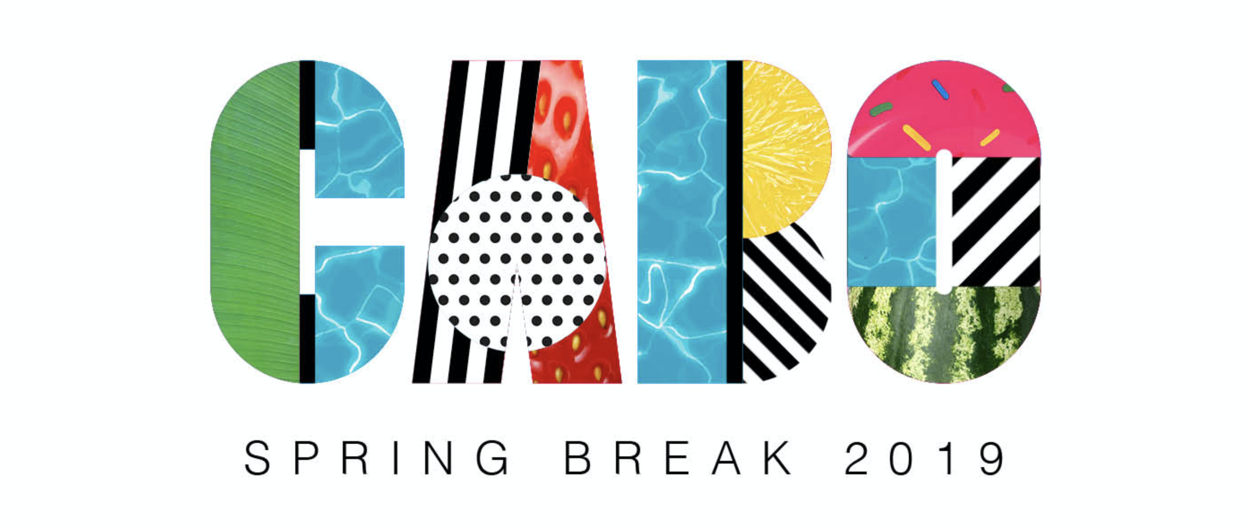

We took many of the elements and devices of the montage framework and applied them to block type treatments. This allowed us to - in a single type treatment - encapsulate a destination in a locked self-contained logo style, which made its application more scaleable across static and video backgrounds, and gave us clear options for animation.

We also began to play with other messaging, adopting the framework within other typography to experiment with storytelling, along with using it in the context of broader storytelling imagery.


Using a self-contained type-based framework allowed us to use more large scale imagery, and incorporate UGC as part of that on social with framing devices. The frames allowed us to take devices and use them to provide contextual impact while not interrupting the core imagery.
Most of our communication strategy was aligned to Instagram, and as such we had to operate between 1:1 and 9:16 formats, while also making sure that artist imagery remained uncropped and untouched.


So - does it scale? Yes it does. Does it make Spring Break cool? Not sure yet. Head to Cabo San Lucas in March to find out.