Rob is a product and multidisciplinary design leader with over 20 years experience building things you’ve probably loved.




























Launching smarter buses as a service with Citymapper

Since October of last year I've been at Citymapper, and I've been building a bus. Well - more accurately, I've been leading product design on a Smartbus. In that time we've built and shipped 2 productised Saas platforms, a full hardware stack, an Android framework and an App. We've also stripped down a fleet of buses and rebuilt the tech from the ground up and productised it all. We've even wrapped the interior and exterior, rebuilt the seats, and deployed a super-cute bus icon on everything.
I'll go into more detail about the whole product stack soon enough when I catch a breath, but for now here's some better writers than me talking about the launch:
There's also more product elements at Citymapper.com/smartbus for anyone who is interested and we're also experimenting with crowd sourced bus routes with a crazy beta drawing product here.
If you're a holistic product type who sweats the details, then I've got you covered - check out the blogs coming from the product team on Medium and some 'finely crafted' copywriting here that involved more than a few late nights. That's right - product is a full stack requirement.

How we built and exited a big data Saas using global remote teams

Sure it's a cheesy metaphor - but it is the actual sunset on my last work day in San Francisco
Leaving a product - especially one you've built from whiteboard to public release is a hard thing to do (and especially one where your desk has the above view). But that's what I'm doing, and as I leave Sonr - as goes the cliche - I've had the chance to reflect on what we've done, what we've shipped and the processes we've developed. This isn't a post about personal failure and / or learnings - I'll be delving into that in a medium post at some point soon (lucky you) - nor is it a commentary on startups or being part of a founding team. It's more an overview of product creation - specifically from my point of view as a Creative Director / builder / shipper / strategist of product (i.e someone with a strong preference relating to pens). Anyway, here's a quick fly-by-night overview of my past two years in Sonr-land.

Breaking ground on the product in Potrero Hill with the founding team - the first sketches
We started the product design in San Francisco in 2014 after the initial pre-seed round had closed. We had a whiteboard, a development team and had time-boxed a few days. I'd had a few weeks before my arrival to get some homework done - I'd performed some business canvas workshops, we'd done our requirements gathering from the business and from our potential customer base, we sorted cards, and we'd created our first round of user personas (knowing that we'd end up trashing them within the month). What we came up with in that first office in Potrero Hill was a very basic product specification that focused on business and user verticals - in fact much of the technology at that stage was a relative unknown (such were the joys of social APIs in 2014) but the focus was very much on building a proof of concept. We did this by utilising existing frameworks - specifically Bootstrap - to build the basic front end and get the ball rolling. Using existing frameworks is a great way of bypassing needless development - we were using the framework to test UX hypothesis, but also to give the backend something to output to. That first iteration, those first pre-MVP versions - we excepted their inevitable generic bland ugliness because we knew we'd be throwing them away sometime soon anyway. Using a simple framework can give you an advanced front end in minimal time with minimal spend compared to bespoke front end noodling. It allowed us to take the whiteboard process above to the UI below in weeks rather than months, while giving us the opportunity to quickly iterate front end elements around without slowing down backend development schedules.

The initial Bootstrap mockup which raised Seed
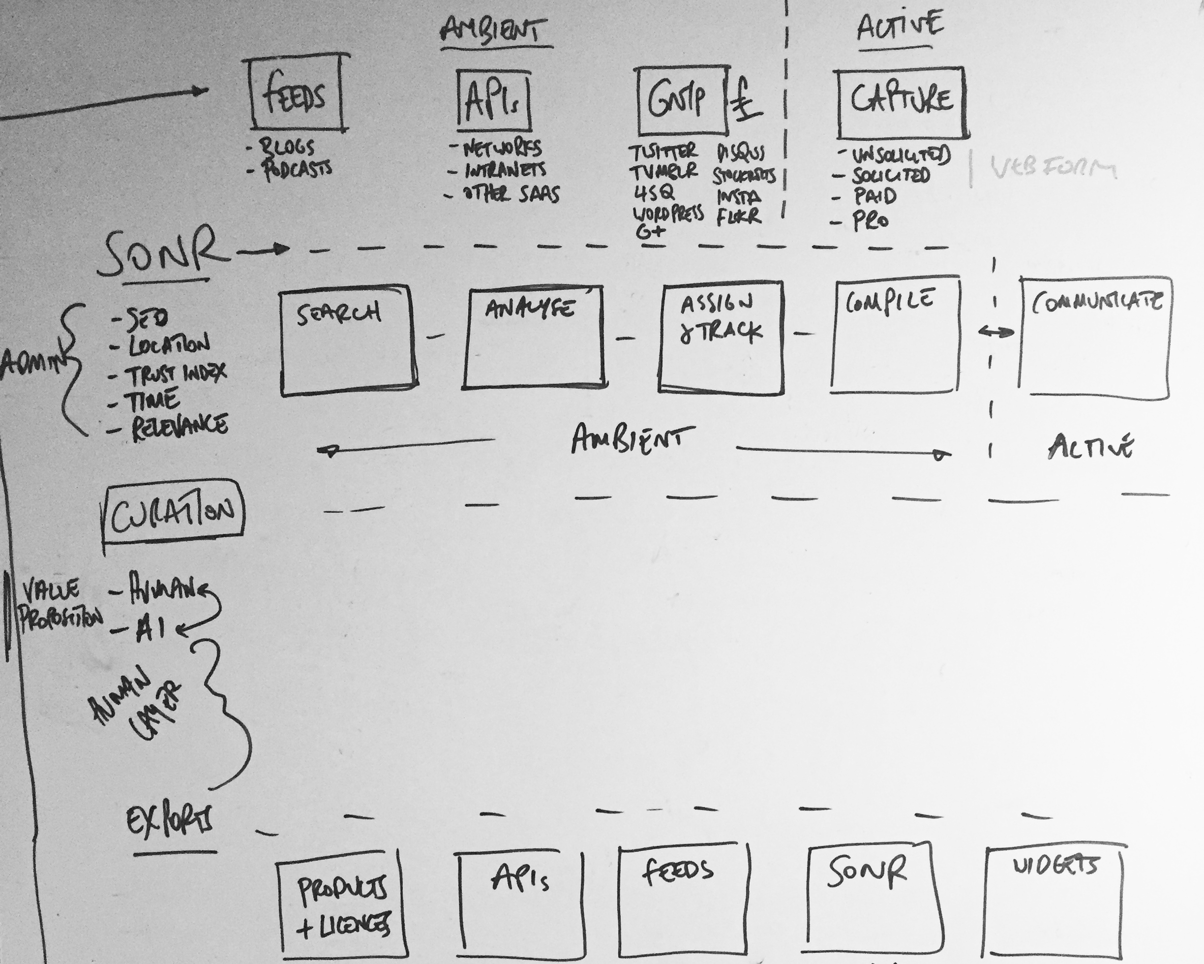
Active and Ambient states mapped out
From here we moved as fast as we could to prove hypothesis - I placed these early versions in front of as many possible end users as possible. This was quick and dirty guerrilla-style user testing, the type straight out of the IDEO playbook. We changed some things off the back of that. We - of course - also trashed our user personas and wrote new ones, and began to really figure out the structure of the data behind what we were now building. We deep-dived into API documentation, we attended conferences (see below) and spoke with possible partners, we scouted competitors, we tried to work out better user flows, oh, and we had to raise some significant money (which we did). I created user flows, overlaid with data architecture to try to break down and visualise the actions of the user and the impact on the product. This broke down the product into 'user intentions' (which were effectively collections of related user flows) and 'product reactions' (which were how the product would react to a 'user intention'). This gave us a high level overview of user and product intended behaviour, with both influencing each other. A user could be administrating, searching, curating or exporting - meanwhile the product could be active or ambient at any given time.

Visting Twitter Flock 2015 NYC

Visting SXSW 2015 Austin TX
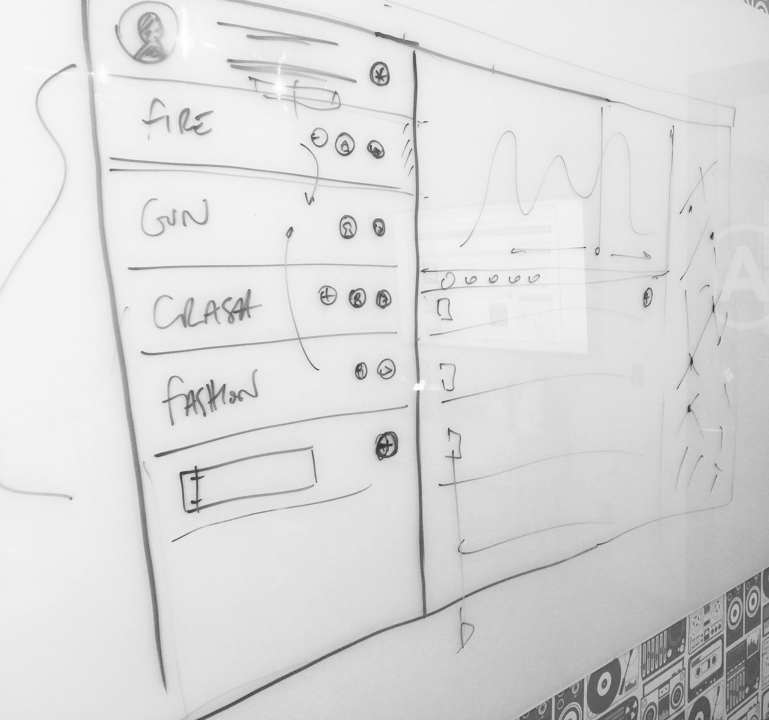
Iterating to v2 with our awesome new product team in Midtown, NYC
Around this time we'd begun to crystallise a product team in New York who were beginning to build out processes, set up Jira workflows and form QA schedules. We began to form more stringent user testing systems, and began to do one-on-one Google Hangout interviews. The distributed nature of these teams, between New York, London and San Francisco at this point began to place strain on product development, and marshalling it became a full time balancing act of clear documentation, scheduled Hangouts and constant Slack use. With this in mind we spent time in New York training the team there to become product design focused, allowing them more time autonomously working with the west coast team on product features. We also began to iterate the designs to fully incorporate our user feedback from testing. With new front end developers being hired we were now able to break away from our Bootstrap framework, and move to something more advanced and scaleable in ReactJS. Initially we kept the Bootstrap aesthetic (there was no rush for design beyond UX elements at this phase of the build) - icons, drop-downs, transitions - they were all defaults and generics. We were ignoring the details until we solved the bigger UX picture.


Distributed teams are *really* hard work and can 'jetlag' a product
There were also organisational problems to solve - distribution meant we had the problems that all distributed teams have - things fall through the gaps, and communication is hard. Being on hangouts across multiple timezones led to long days for those on GMT and deep investigations into the best conference calling and video calling tech (bottom line: there are no 'amazing' conference call headphones - but it's all about the microphone. We ended up with Sennheiser PC36's for group chat and the Jabra SPEAK 510 for portable conference calling - and always using Google Hangouts. Slack may change this space, but for now Google is the best).
I began work on two things at this point - mobile (which was based in London) and documentation upgrades for those on the west coast. Documentation is often seen as a failure to pair-code, but while pair-coding is indeed best practise, it becomes near impossible with a 6-8 hour time difference. Here is the 'Manual' that was produced (below). The 'Manual' is written with a group definition (say 'Search' ) which is defined by the user Action, Behaviour and the related user stories that created the Action and Behaviour to be defined. Within each group there a section of each element that combines to group, each element having precise schematics defining it's default state, basic behaviour and basic action. This level of precise documentation prevents any grey areas forming, but also focuses the UX and product into defining every inch of the product and it's intended action - and making sure that this action is being supported by at least one user story (here's an excerpt from the 100 pages it eventually ran to).


With mobile being in London, the need for such precise documentation wasn't so great. We could pair-code and whiteboard solutions. We still needed to define the actions though, and we used Flinto for the bulk of our prototyping. These prototypes were then user tested by the product team and with our user groups for feedback. The feedback was then incorporated into the wireframes (see below).


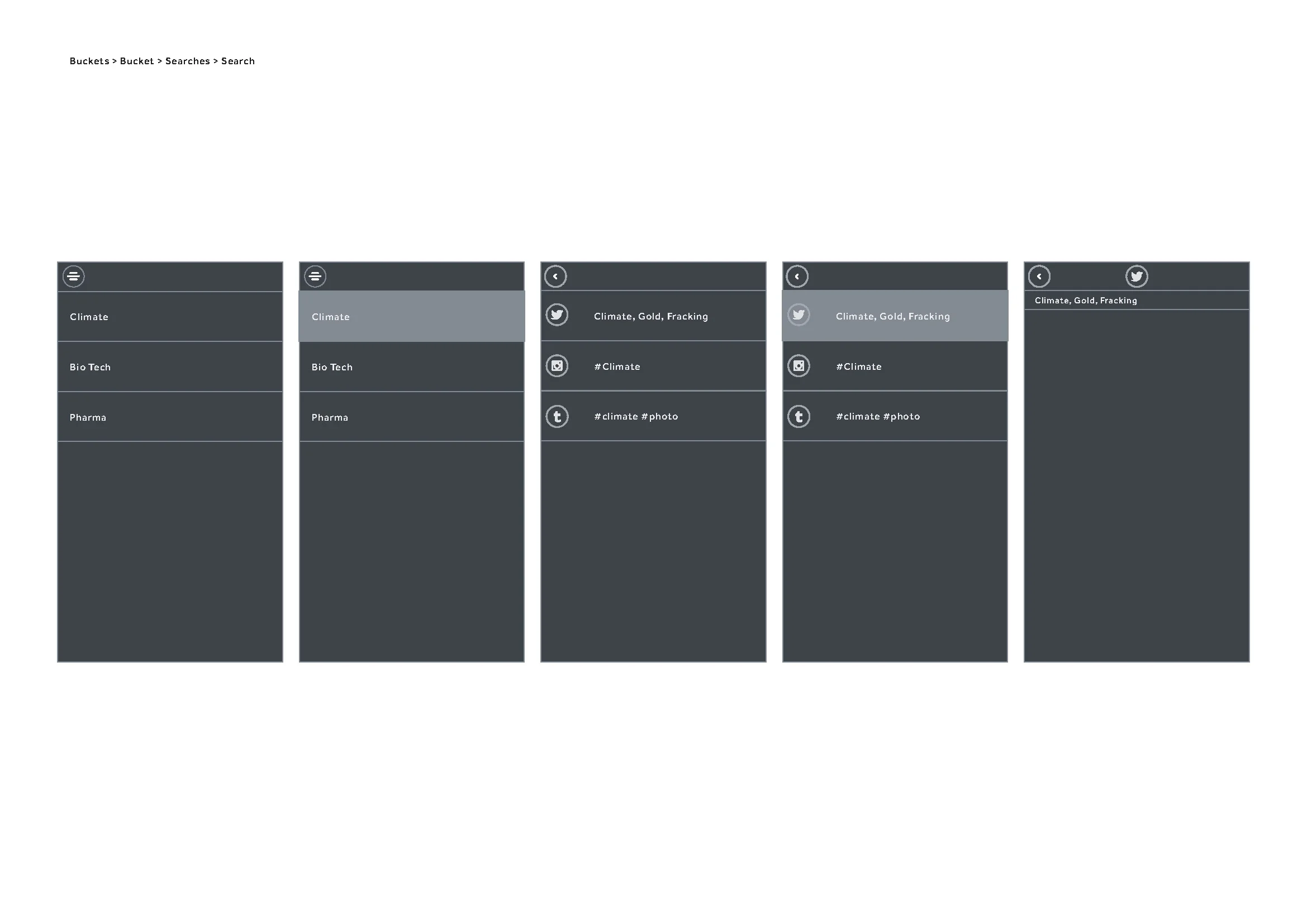

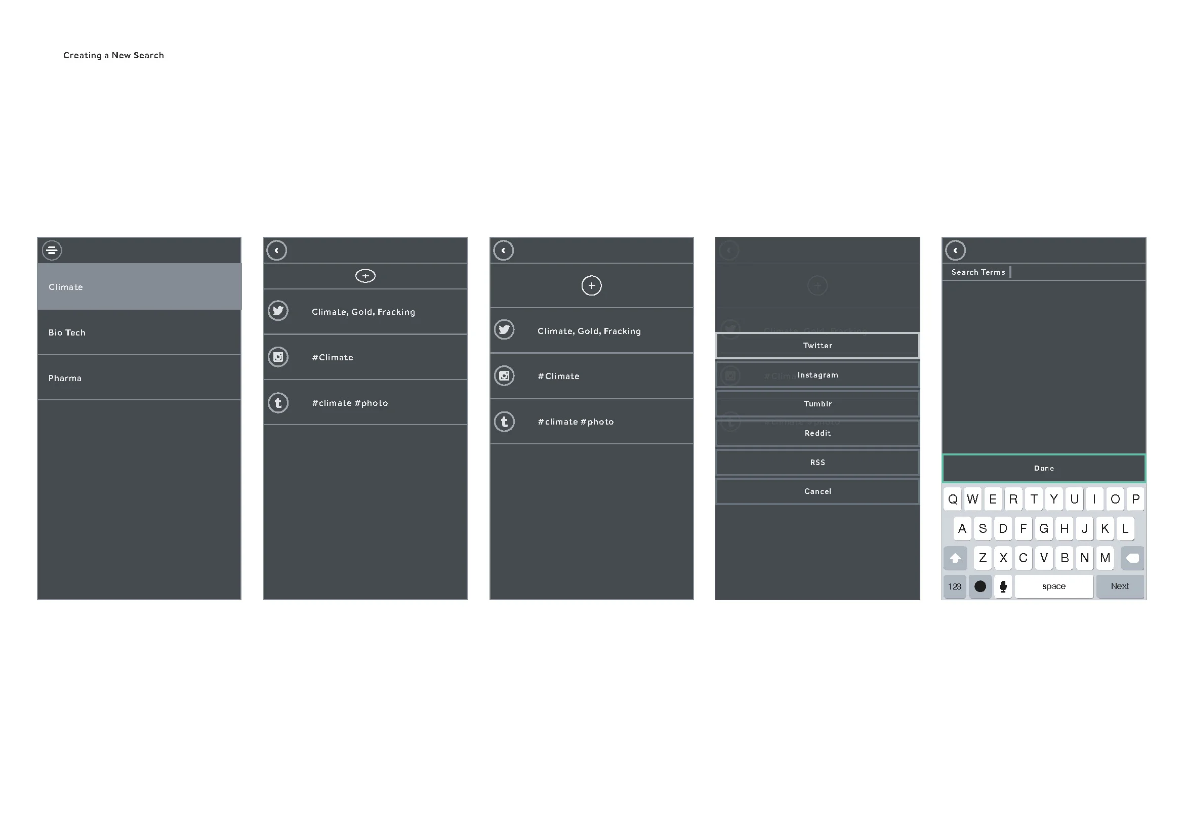
At this time we were getting significant feedback on the web side of the product, mainly about it's complexity. Now was the time to begin stripping away elements and beginning a process of reduction. Feature creep is inevitable, especially with diverse user testing groups, stakeholders and partnerships. The technology had also changed - our stack was nearing full development, but the partner APIs we accessed were developing at their own pace and changing. We also had ReactJS to consider as a framework - React works better in certain load scenarios than in others, and we were noticing lag in the front end performance. We began to simplify the design, but as we had defined and tested user stories we could focus more on the technological execution and making things more reliable, faster and economical.


Partner APIs are tricky beasts and by now, with large changes across most of the major social networks underway, some of our features - specifically the ones that attempted to unify some of the social network content - were becoming swiftly outdated (or worse - redundant). We were facing capping, call limits, sandboxing - the APIs were fluid and at the whim of their development teams. We soon realised we needed to simplify further. Like - waaaay further - and get to the core of the user stories that mattered and reduce the strain on the APIs. Some of the features were cool - some were 'wow' - but with the APIs in drift they would more often than not throw up an error or a time out. Effectively the experience we'd built was great when it worked, but was so prone to third party error we'd inadvertently built a frustrating experience that seemed buggy, but was in fact just feeding errors from APIs that we had no control over. This was a serious UX issue that needed resolving. We went back to the core ideas of the product and the subsequent research we'd done - along with all we knew about the APIs we'd been using. We chose to treat the APIs as individual elements which allowed for outages that wouldn't affect the UX as a whole. This also allowed us to prioritise individual network onboarding, sign-in, OAuth and sign-out.

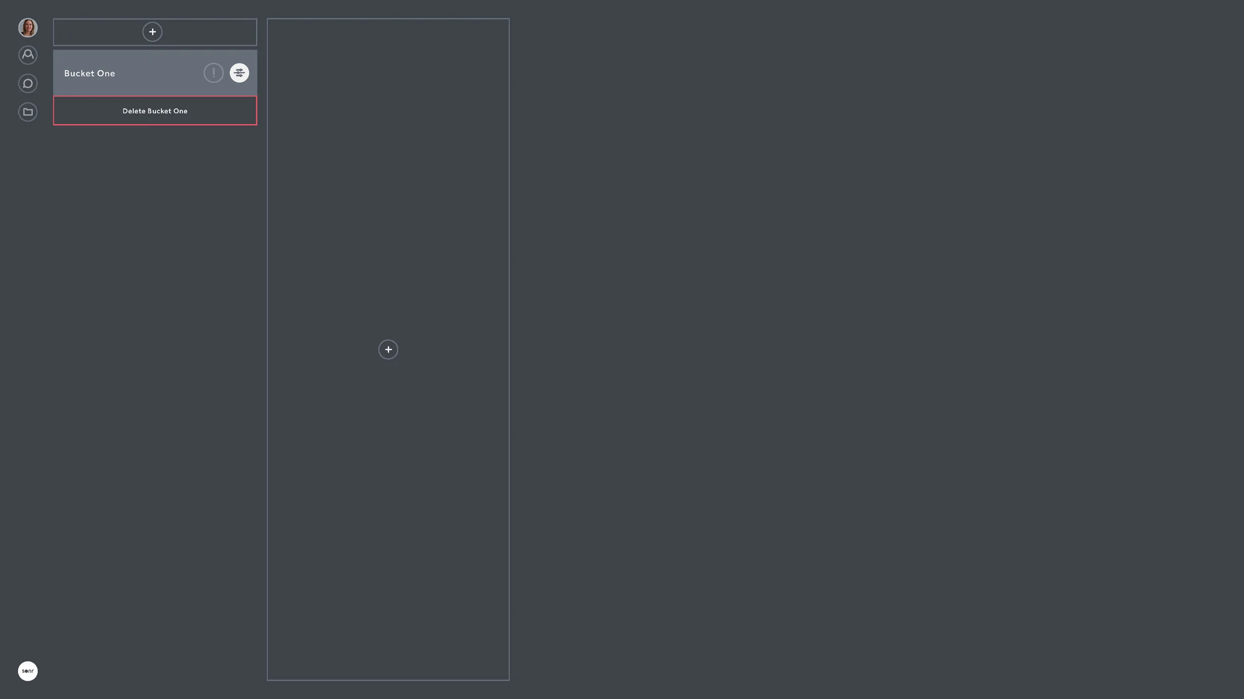


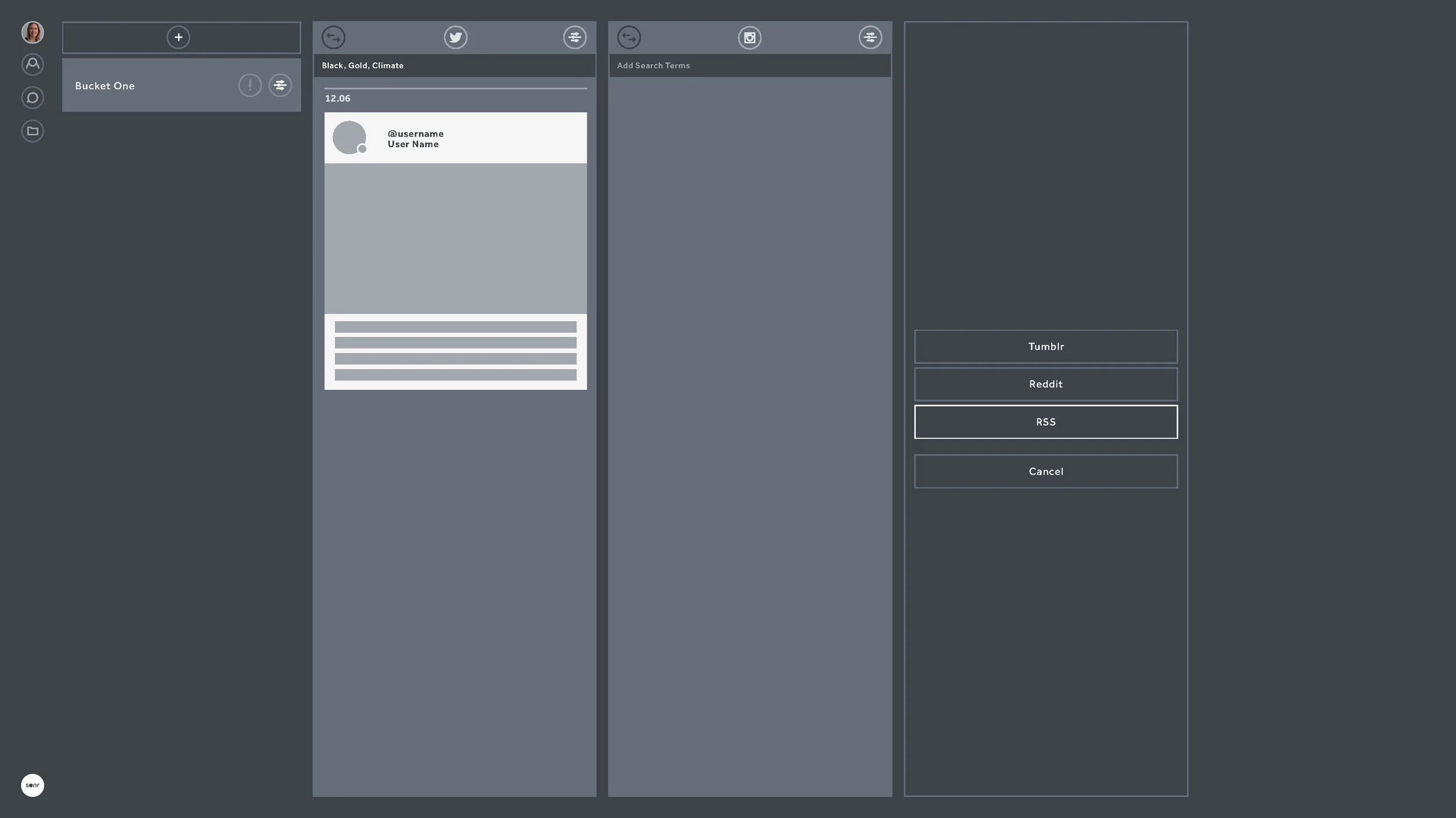


Onboarding became a big focus at this stage. We'd done enough user testing and design reduction to know the sticking points of the product. We were focused on simple, clear and progressive steps to getting the user to make their first actions within seconds of sign-in.


Focusing on making the APIs individual not only meant we didn't have to worry too much about outages, but it also meant we could develop API specific features which could be seen only when that API was being used. This allowed users to search certain networks for people, but for us to allow background actions within certain rate limits. Returning back to the days of us whiteboarding it all in San Francisco - we could allow action and ambient processes. And now the action and ambient processes were decoupled from the various APIs, we could now focus on making them stronger features in their own right.


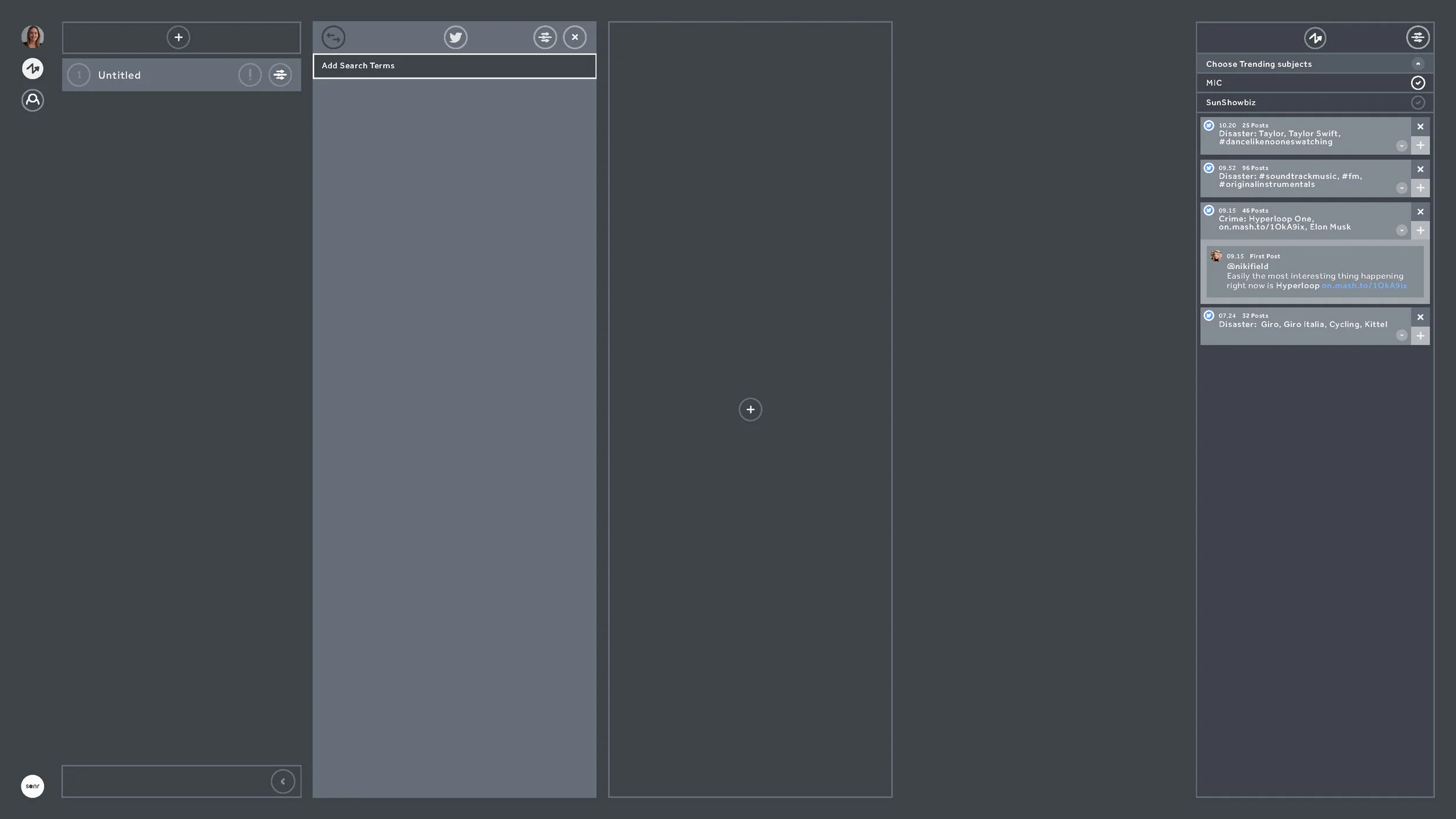

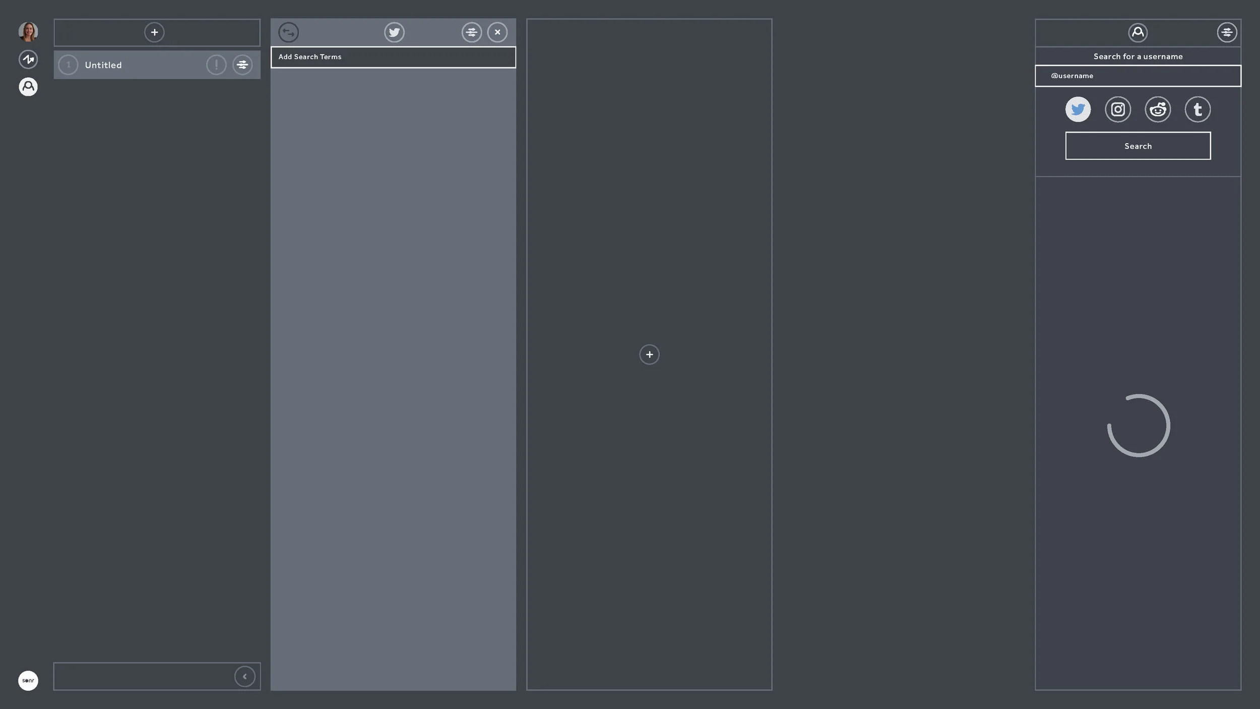


And with that - we shipped to public beta. We began some low level growth marketing around Medium (see here) and after getting some publication acceptance we quite quickly gained a lengthy beta waitlist.

When to Design - and when to *design*

I've been designing Sonr for about 16 months in total. We've built prototypes, raised capital, tested, prototyped, tested - and then began to build out the core product - which is now in private beta. In all this time I never actually designed any icons. I used UI Kit for iOS. I used a variety of resources like Noun Project and Iconmonster. I originally used whatever came with Bootstrap. It's not because these design elements aren't important - they are. But they are not important until the workflow, framework and UX is designed and tested. When we initially moved past whiteboards and paper at the beginning of the Sonr project and we need to build a solid prototype, I sat in a room in Potrero Hill 8 weeks before the first investment round presentation and delivered a paper prototype with boxes and attributed actions. I didn't care so much what it looked like, but I did care about what it did. We chose a low latency framework - Bootstrap - and using it's modules and components which looked like ***generic website template no.4*** began to flesh out the boxes and actions. This was a time to design rather than design.

Bootstrap-alicious
That was enough to do a few things - it allowed us to raise capital, test back-end architectures - and allowed us to realise quite a few things we got wrong with the product. Much is talked about technical debt - but design debt is also a silent killer in new products. Building a fully fledged front end too early inevitably means having to squeeze in features and newly validated workflows into an increasingly creaking - and expensive - architecture. Bootstrap got us around that. Much as it hurts to admit as a designer - no one cares about your icon set. Or your colour selection. Or your font. None of that is even noticeable if your product is weak or badly considered.

Colours finally making it into react.js
Spin forward 16 months and 50k airmiles later - and I've designed a v1.0 icon set (see above).
I have a hard coded set of colours. I have a GUI font in testing. Bootstrap has been replaced with a more scaleable and enterprise framework in react.js.
The icon set is a little complex as we run it as a font, allowing multi-state rollover / fill options to reside with the development team. This was a conscious decision as it prevents design slowing down product design and development. Design can be easily changed on the fly and through pair coding - not constant revisits to Sketch or Photoshop. Breakpoints can now influence icon behaviour. The downside is that we can't make cool interactive SVGs and GIF icons - but for a product in beta...it's just too much design for what users need right now. I mean I'd love to make 'em, but I know deep down it would be a waste of time.
In truth, the design in the product has moved on with the implementation of react.js - we now have flexible components, but these components have been simply assigned colour HEX and behaviours - they haven't been designed. This is sometimes a tough thing to communicate to stakeholders. Yes it looks sexy, but it's effectively still a lightweight wireframe - a really really nice one obviously - but it's still the product at its most basic. The design priority right now is load times, rendering issues, improving UX and architecture, testing, bug tracking, iterating quickly...not adding more design layers and slowing things down on the development side of things.

Now in react - with plenty of design, but not much design
When we set out on the road of designing a complex SaaS product, we wanted the design to scale with the engineering. I didn't necessarily want to design a flat UI. I didn't adopt an existing design framework. We just ended up here through research, iteration and product / engineering requirements. It will of course be designed one day in the near future, once the beta stage is cleared and the feedback compiled. The design layer is of course required. But when that will happen I'm not so sure - it's probably going to be up to the user.

Building a product for Creatives who don't really know what they want
In most of the interviews I've had for roles (and interviewing people for UX focused roles is tough, I sympathise), there are always two questions - or variants of two questions - that consistently crop up: 'Which product do you wish you'd designed?' and 'Which has been the best product you've worked on?'.
The answer to the first, if you must know, is Slack. Why? Because it solves a very complicated problem, and it does it in the difficult B2B space. It's elegant. It feels good. Yes - that's right - it has feels. Which is gold dust. It's a remarkable mix of bread and butter UX and magic. And the magic stuff - which is sometimes really simple interactions, manipulations or renders (like the way it parses HEX codes into the IM thread with colour swatches) is jealousy making. I love that product. It completely knows what it is. I'm jealous of a product that is so...product aware.
Ok, so Slack is awesome. But the answer to the second question changed for me about two years ago when I got to work on a wonderful - if intimidating - project, which I still think brought out some of the best critical thinking I've ever done. Not because the final 'product' was amazing and shiny. We didn't make Slack - we had 3 months - but we made a process which was validated, tested and used to impressive results. But answering that second question is hard in an interview, because we didn't produce a 'product'. It could easily be a product, but we didn't make it into one. Which means that if you ask me that question and want a response I'm probably going to need half an hour and a whiteboard - and maybe some playing cards. Because the best product I've designed was meant to be a 'product' - we actually did set out to make one - but we ended up designing a card game instead. And it was awesome. Like, Slack awesome.
Through random circumstance and Twitter I was introduced to Matt Locke. Matt is an interesting character, and it's evident the moment you meet him. Total energy, focus and hyper intelligent. Matt was Senior in BBC R&D before leaving to head up Channel 4's digital OnDemand offerings. Now he runs an agency called Storythings (among other things like The Story conference). And the team he had amassed was rather intimidating. Project Producer was Kim Plowright - an Emmy award-winning talent from the BBC and Dan Catt - original lead front-end technologist from Flickr. Unlimited Theatre - one of the first theatre companies to combine technology with experiential theatre - were there to lead user research. There was a lot of work completed on this project, and I'd hate to speak for anyone else about their processes, so with that in mind I'm going to talk through my perception of the project, and not really go into what others were working on in tandem. It's not really fair to do that.
Investigating the product
The product we were investigating building was based around the concept of aiding writers with writers block - or more broadly - aiding writers to develop concepts and narrative arcs quicker, easier and through collaboration. This is - as you may be able to guess - a pretty complex problem. It involves ego, creative fragility, personality, voice, networks and...so much more. A day into whiteboarding and card sorting and we were somewhat closer to identifying a focus and a hypothesis. The hypothesis itself here was important as we had a client - namely a BAFTA award winning client in the form of writer Graham Linehan and his production company Delightful.
Client focused product is different to internal stakeholder product in many ways - the client is paying and there is usually a time box as time is money. Clients usually have a varied interpretation of the 'definition of done' and the 'definition of success' that needs to be navigated. This isn't a bad thing at all - in fact it's one of the reasons agencies can produce such incredible work - but it's a different approach to an internal stakeholder scenario where these definitions are core to the company ethos - or at least they are in product focused companies.
Delightful is easily one of the most interesting clients I've ever worked with. Graham himself is incredibly clued up on product development. Oblique Strategies? Done it. IDEO Cards? Yep. Agile? Tried it. Kanban? Sure. *Name book about creativity, UX, design or creative management*? Read it. He owns a copy of Gamestorming. All of this was something of a first for me. We researched his tools, interviewed him about his work processes and had hours of notes and audio files. Then we prepared a workshop.
Workshopping the product
I've prepared and managed many workshops, but in this instance we were going to collaborate with an experiential theatre company. This was also a first for me. We had a theatre space, and we used all of it. Every wall, table and box was eventually covered in cards, notes and whiteboard sheets.

The experience was very interesting. Having a theatre company craft an experience around the workshop added a very unusual - even uncomfortable - sense of personal distance that is very difficult to explain, but seemed to really focus the process. It's something I'd certainly like to try again on other projects and products. It allowed the participants to fully investigate the user journeys they were trying to explain or imagine - the process of theatre seemed to provide an empathic element I've never experienced in a product workshop. The idea of applying a narrative (even music) to the investigation of a proposed narrative sounds overly-complex and bizarre - but it isn't - and it works. It forces the workshop group to forgo their rational defaults and the professional roles and look deeper into why things are important in a possible product rather than what is important in a possible product.
The research we gained was invaluable, and in particular for me the narrative tools that can be used in crafting stories - specifically the processes of Kafka and Neil Gaiman, plot processes and character arcs, mcguffins, and hide/reveal - all added to my toolset . I've used these since in other projects, but it was a rare chance to learn these things directly first hand from people who have mastered their craft.
From the research we began the sort process - breaking down the ideas into stories we could build, and from there we built out the tasks within the stories. The workflow was also starting to form from these processes. We'd identified the user flow but not the technology stack, however we knew that the product felt 'bot' like, so we created a temporary element in the workflow to mimic the stack - and we called it DelightfulBot. We also began some external user research, asking writers from a variety of backgrounds and disciplines how they write and how they collaborate.
Research

Copyright - Storythings 2015
It's worth pointing out now that I'm not going to delve into the stack. I'm only going to talk about the UX and design elements in the build - mainly as the stack is not of my making, is under IP and...I'd do a bad job of explaining it.
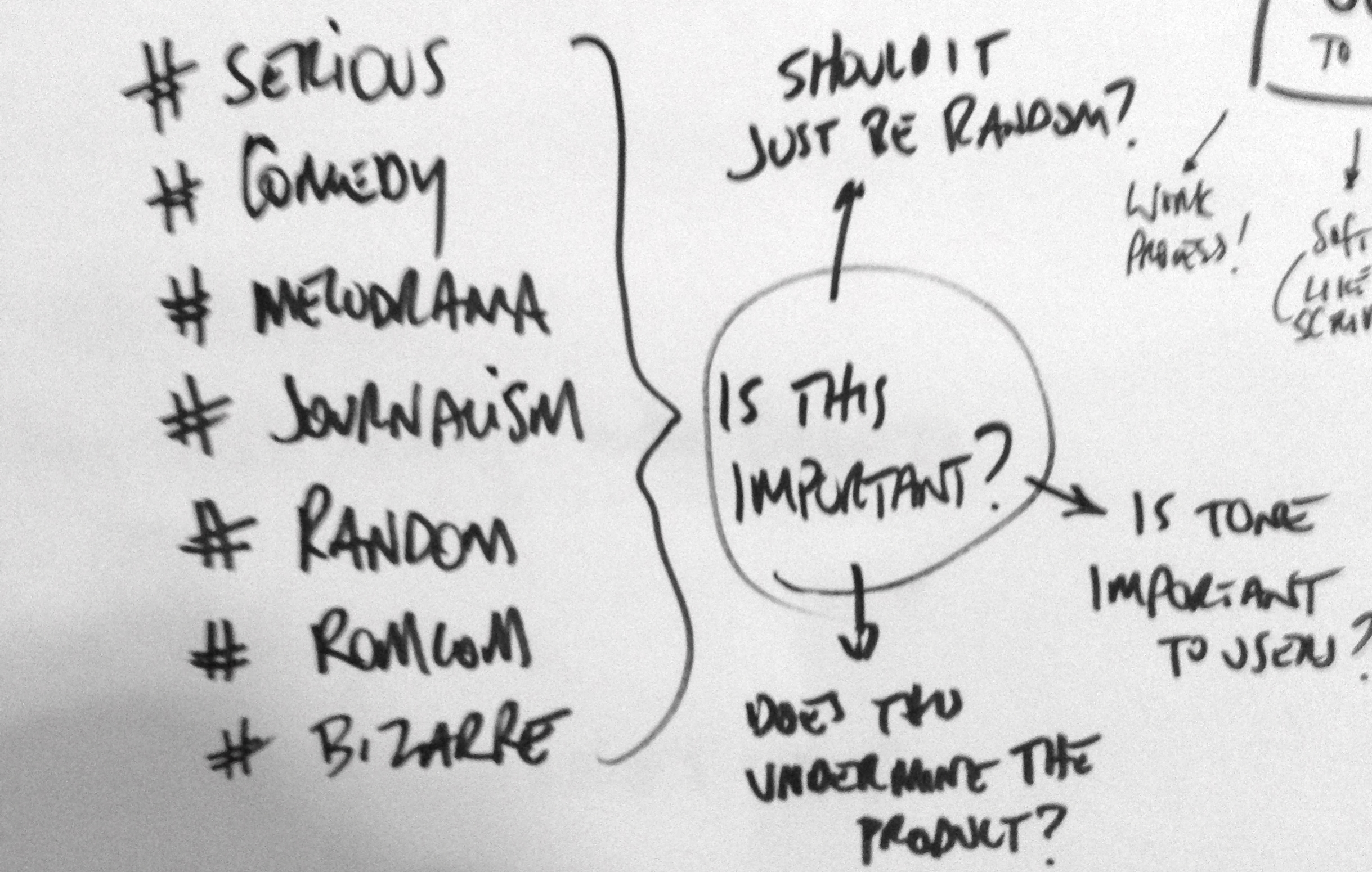
Identifying the need for a bot meant working out the interaction design around it. Specifically the bots tone and reach. We focused research on the the emotive interactions the bot would be required to interact with, along with the level of interaction it would be required to maintain. Around the time we were building this, there was little research being performed into AI and generic bot interactions - what would be annoying, what would build trust and what would form a preferable bot personality.
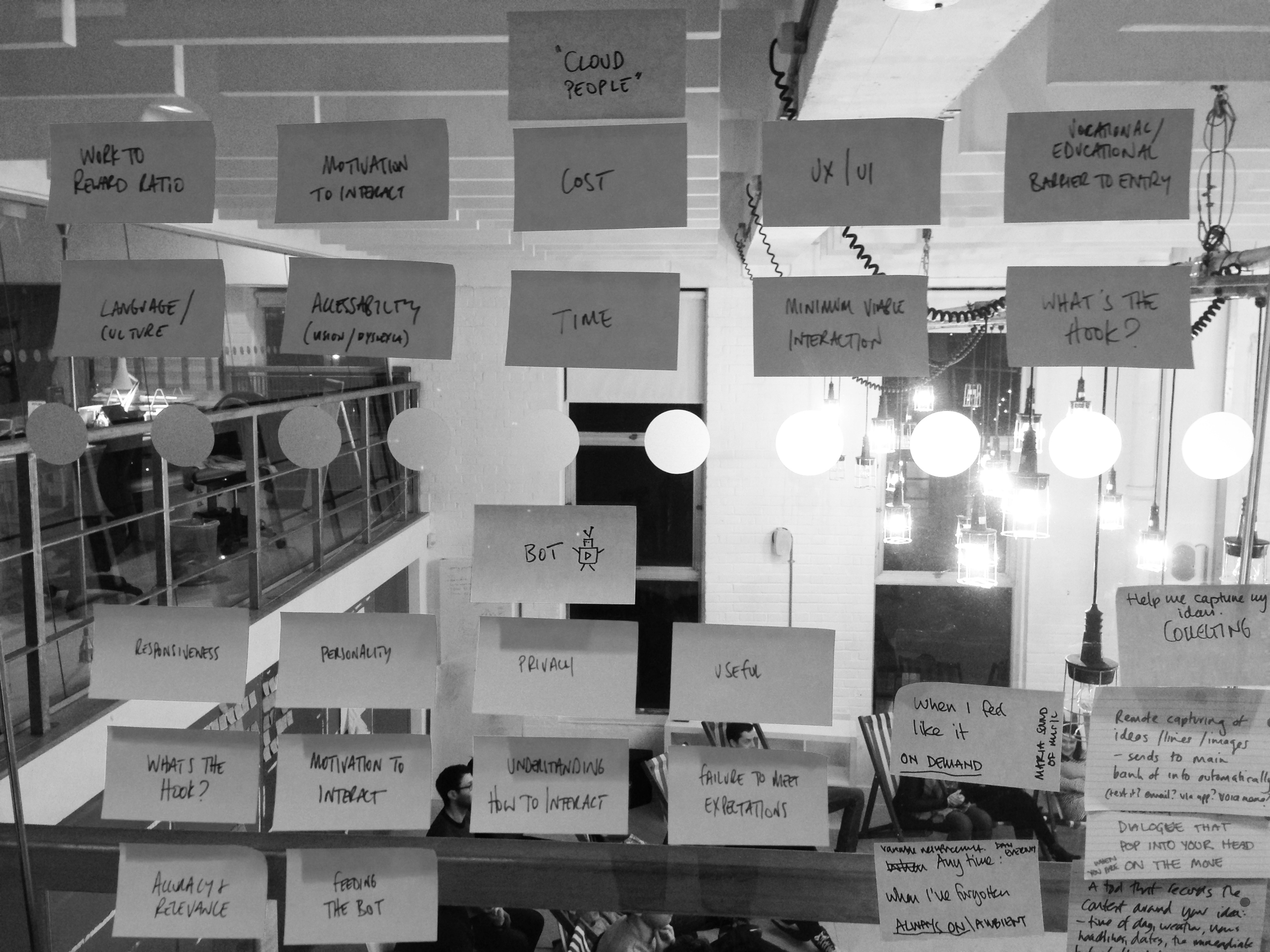
The result of this research was to create a set of principles for the bot, and to do this using the same structure we would use for a user story. So instead of "The user is..." we worked with the structure of "The bot is...". This allowed us to match up user stories with bot stories and allow a cross-pollination of interactions. So with this in mind, "The bot is..."
'Polite and clear. Not too cutesy. Says please and thank you. Is just intermediary - it goes and asks other people. It doesn't do things magically or automate creative processes.'
It has the following attributes:
Approachable
Helpful
Likeable
Responsive
Alert
With the following tone of voice:
Excited
Loveable
Friendly
Honest
The bot also needed to have a definition of reach. How intrusive would it be? What environments would it find itself in? From this we could begin to create a playbook for how the bot would begin to react in certain environments and situations (and designed a small bot mascot to begin humanising the playbook with users).

Copyright - Storythings 2015
With this we'd created a framework for both the bot and the user, and from here we could begin sketching product solutions to both factors. We also began to look at adding game elements into the product to increase user interaction with the product, and focused initially on habit forming processes which required the user to add 5 writing ideas per day (which was based on feedback we'd received around procrastination in some users). This would address the issue of re-engaging users in the bot network, and also hopefully aid writers in their ideation processes. The bot at this stage became a true go-between in the forming product. A user would add ideas, and the bot would deliver them more based on the ideas they generated - but the bot wouldn't be an NLP powered AI, rather an anonymous mechanical turk - as more ideas were added, so the bot distributed more ideas the human layer, and by proxy the human trust in the product would remain intact.
Realising the frameworks
From this I began to build wireframes to flesh out the user frameworks. I based my default interaction style on Twitter Bootstrap to aid modular building and known icon sets - this had the benefit of not slowing down product development prior to MVP with design related bottlenecks, which are so often icon or CSS related and have little impact in user testing. These were wires to flesh out the user interactions and workflows - nothing more. We also started to look at easier ways of ingesting the users ideas into the product, and began to sketch and test early prototypes of a capture app allowing words, images, audio, video and geo elements to be uploaded and categorised.

Copyright - Storythings 2015

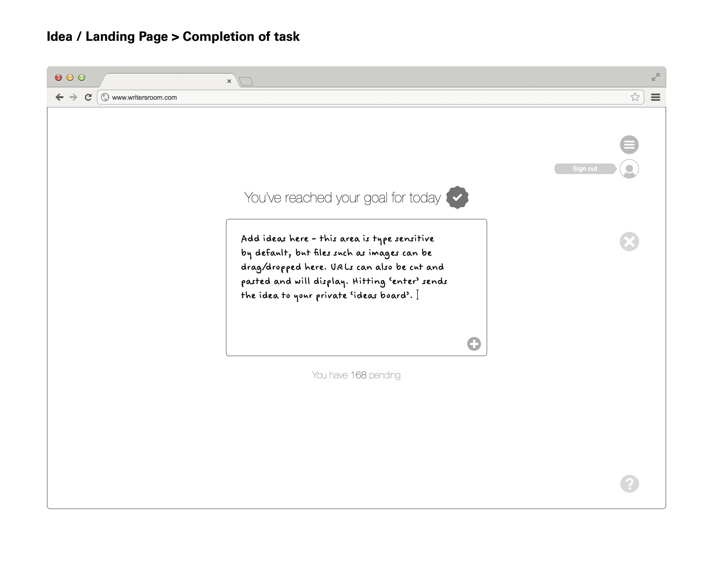
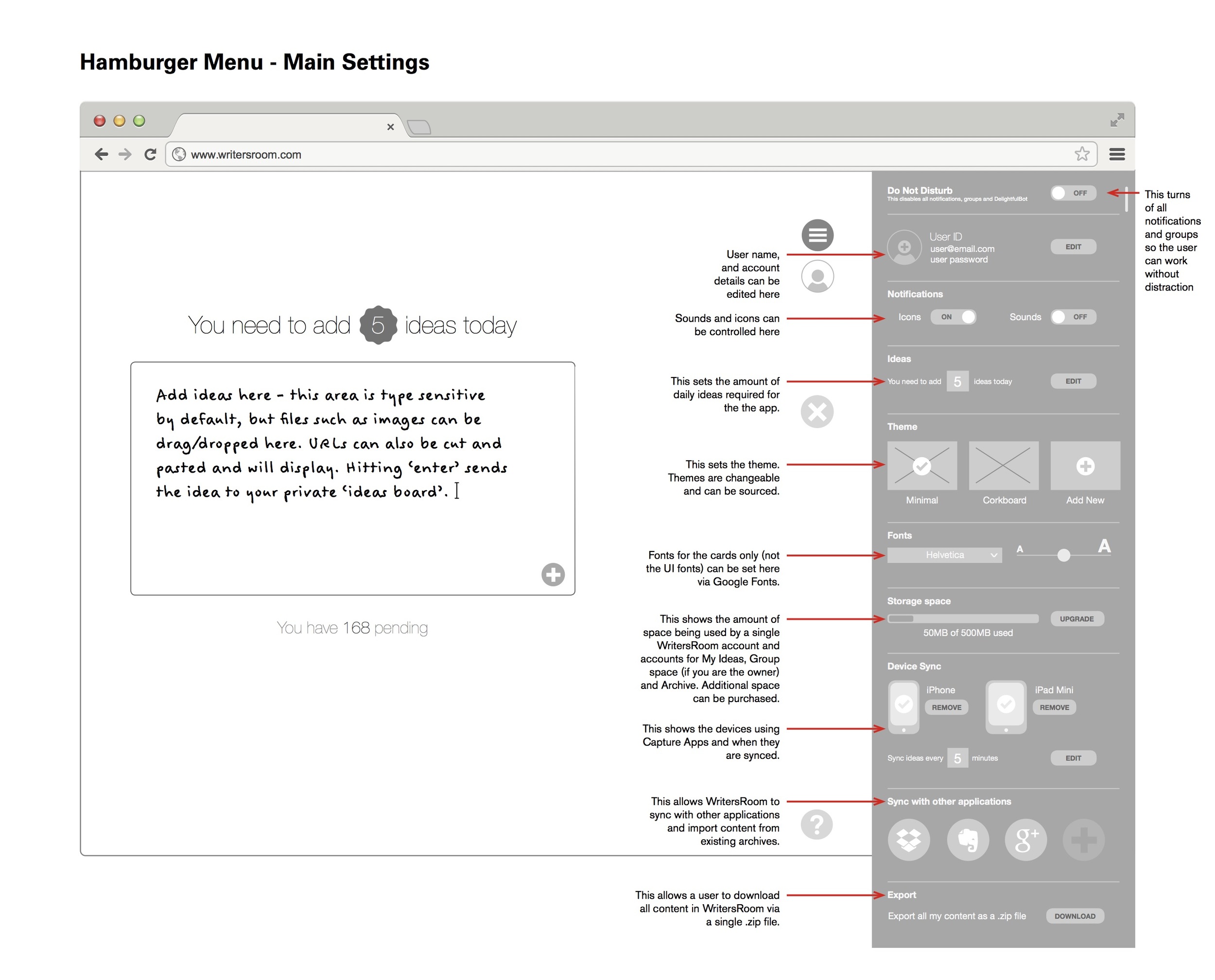


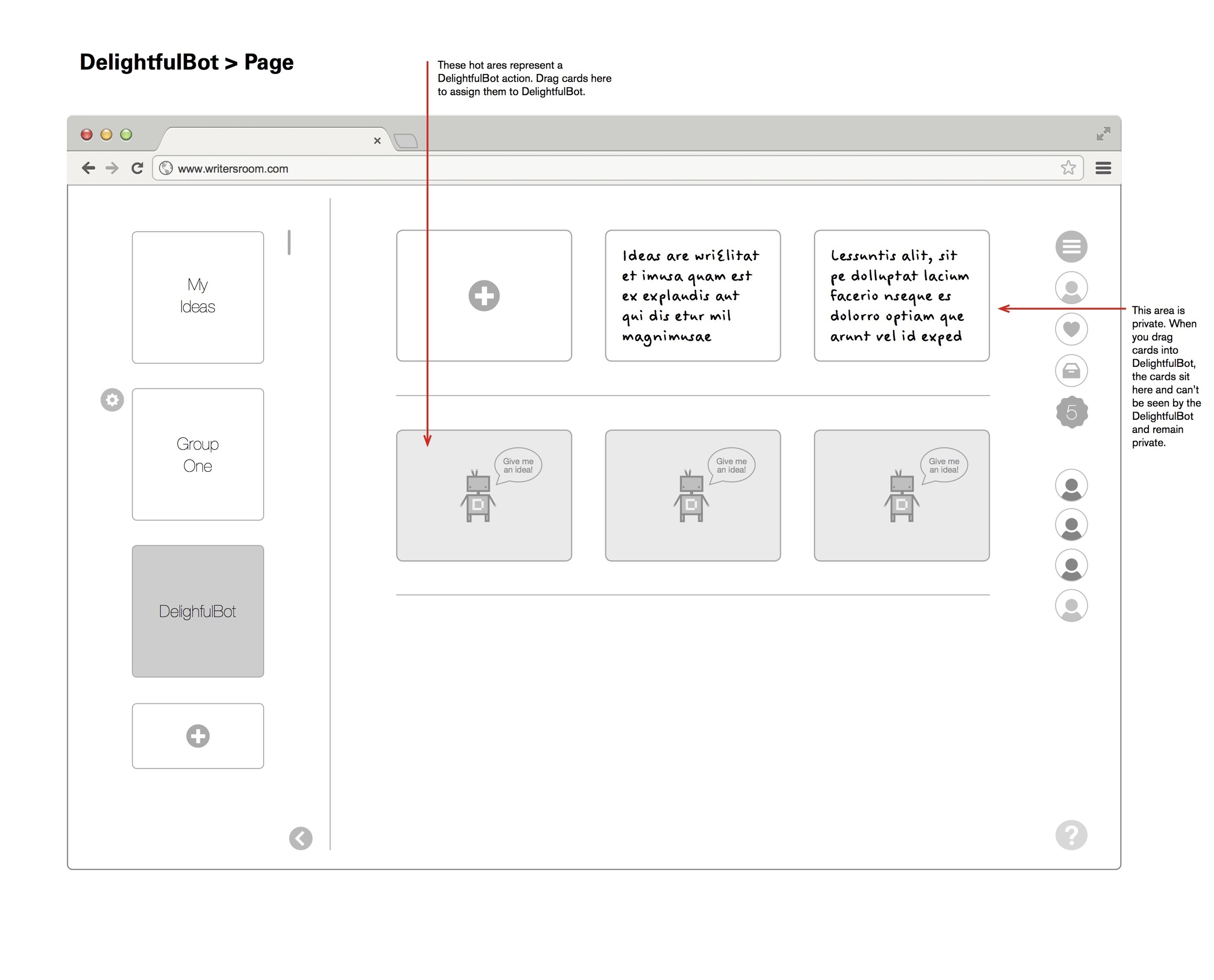
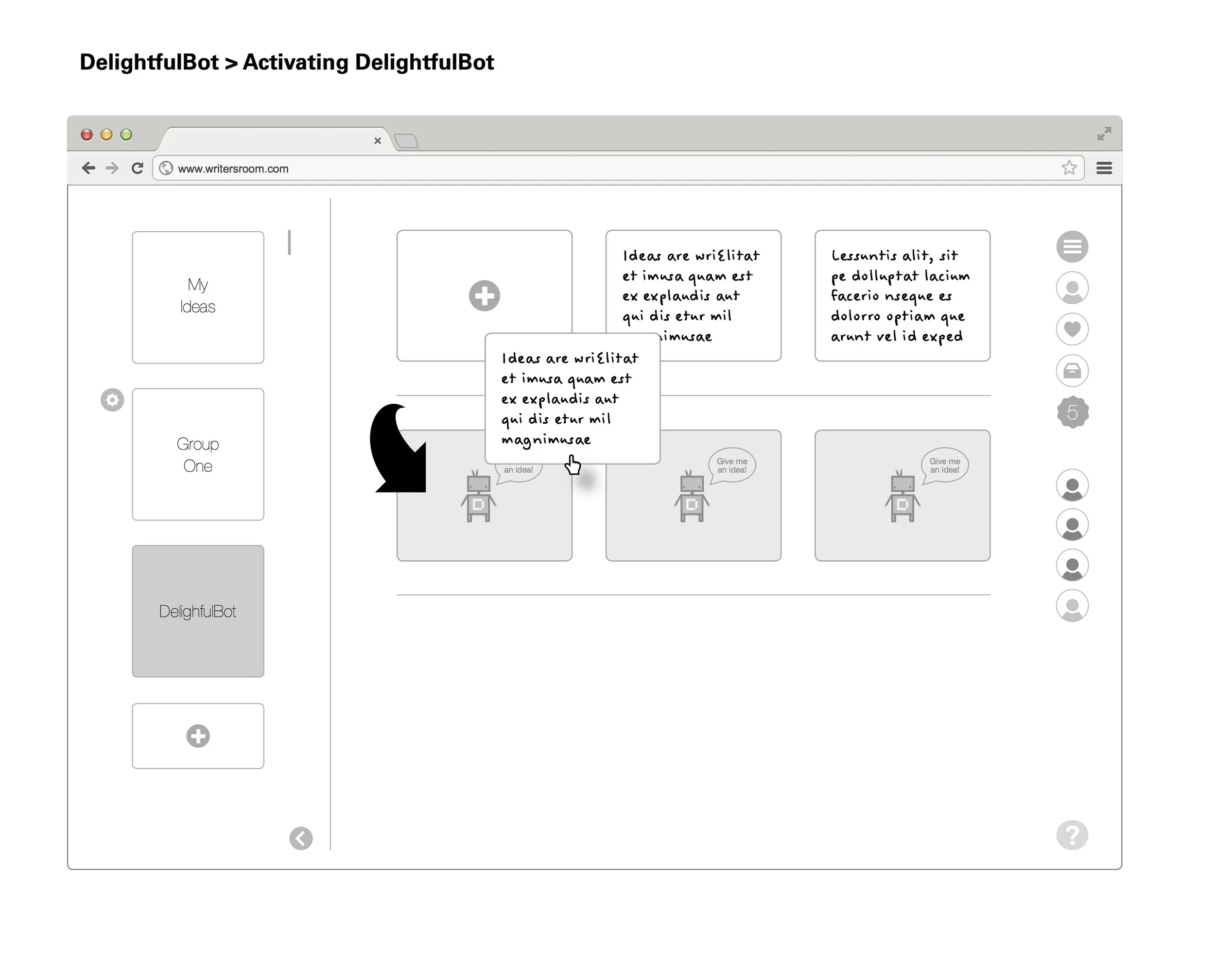


With the user framework realised, I now began to look again at the bot framework. The more we looked at the bot, the more we began to think that it could form the core element of a bigger game dynamic. The wireframes are just that - framing of interactions - but the bot could move more freely in this product. Yes it was a tool to allow anonymous sharing of ideas - and in effect it was a CDN in it's own right - but it was at the core of what the product was. We were looking at ways of testing the bot framework, and validating the wireframes prior to further development - we were also looking to expand the game element of the bot. With all this in mind, and user testing deadlines approaching it seemed a good time to remove the wireframes from the testing schedule and go back to focusing on the user workflow framework and the bot framework, and to increase the testing parameters, apply a game framework to it which would compliment the workflow.
So we made a card game. Here is the original game framework we developed. It's overly complex, but at the time we were effectively testing three games in one session.
The game
Game Setup:
Coloured cards - one colour for each player. (Or white cards with coloured stickers).
Cards have double sided writing ability.
A selection of cards with Stars on them to indicate a reward.
One archive box with a slit cut into it.
One external person is the Bot.
Writers sit on chairs facing away from each other. Each has some wall space to stick up ideas. Players do not talk to each other. There should be some indication that players are in a game environment of silence so they can exit it to talk. I’m suggesting a bell or similar - maybe a line drawn on the floor. Players must feel they transition from individuals to the workshop group at certain points - we will required them to imagine themselves writing alone. But then transition to talking in a group about the process of the game. It could be two area with different lighting or two rooms.
Game Dynamic:
The basic DelightfulBot concept is described. Introduction to the game environment and the rules required.
The players decide through group discussion on hashtag descriptors for the tonality of their writing. This is a group process. These hashtags are pinned up so they can be chosen and discussed. They maybe:
#serious
#family
#adultcomedy
#teencomedy
#melodrama
#romcom
#documentary
Ideally these would be debated from a larger list then broken down to 5-8 descriptors. Once these are agreed the players can be briefed on game dynamics. Players can use the hashtags.
Game 1: Individual Writer
Players are grouped into 3/4. Each group has a Bot who is a facilitator. One player is randomly designated as the Player by Bot. The others are designated as the Writers. The writers must not talk to each other or acknowledge the Player.
The Player is kept separate. The player produces 3 ideas or problems on cards. These ideas are numbered then pinned up by the Bot for the Writers to see. Each Writer must create an idea or solve a problem for each of the cards pinned up by Bot - and do so on a card numbered after the problem. The Bot then takes these back to the writer. The writer chooses the ideas they like and favourites them by starring the card. The other ideas are archived. A writer whose idea has been favourited receives a ‘starred card’ in return by Bot.
This process is repeated 2 more times. The Bot then takes the cards that are favourited and pins them up. The group then come together and discuss the process and the results. Focus on if the process of idea generation was fun, how people felt about writing ideas for others. Also to discuss the ‘hook’ or game dynamic - do they want to play it? Did they need to feel their ideas were well received?
Game 2: Write the Story (closed group dynamics)
Each player is to write a short 50 word story from scratch. They will use the group to do this. The story structure will be:
Beginning > Middle > End
Each transition between these structural elements will be group sourced for narrative ideas.
A player can- at anytime - ask Bot a question on a card. Bot will respond with a stock set of answers derived at random but this is very much like the Brian Eno card process - Bot will ask questions mainly such as “Where is this character going?” or “Where would the character go if they became lost?” etc. Bot to write these on the fly. They are handed back to the player in question.
Beginning (single player creates their own initial set up)
The player then hands this to the group by placing it in the box provided.
(The Bot then duplicates this idea 3 times. The three ideas are then randomly circulated to there players who write their development or idea on the back of the card). The players then deposit these cards back into the Bot Box and they are redistributed back to the original players. (NO PLAYER MUST RECEIVE THEIR OWN)
Middle (the single player takes their 3 group sourced ideas, chooses one and develops their story further until they need to develop an end to the story).
The player then hands this to the group by placing it in the box provided.
(The ‘Bot’ then duplicates this idea 3 times. The three ideas are then randomly circulated to their players who write their development or idea on the back of the card). The players then deposit these cards back into the Bot Box and they are redistributed back to the original players.
End (the player then concludes the story)
Each story is then presented by the player telling the story and pinning up the group sourced idea as they used it. They also pin up any Bot answers they requested.
Each player then explains the process of them writing the story and how they felt the idea helped them or hindered them.
The conclusion
The game was successful in testing all the hypothesis we had related to the user workflow, bot frameworks. The game dynamics needed simplifying certainly, but it was very successful. At this point however there is a need to 'define' success in this type of user testing - and the first stage definition of success we chose was 'does it help the writer solve a problem'. And it did. I can't tell you what that success looked like for various reasons, but I can tell you I watched a writer solve a problem in real time, trust the Bot, revel in the game dynamic, and receive a visible spark of inspiration - one that made their final draft some months later.
The question now is - is this the product? Is the user and bot framework wrapped in a game framework - now the conclusion? Does it need a technical solution? We'd certainly concluded the project as a whole - we had tested and validated frameworks and a solid game dynamic with the research to back it all up. Did we now need to build something more? Was what we had an MVP?
I think so.

How to make video user experience not suck

I've spend much of my career making products that publish content or try to solve problems relating to publishing content. I was preparing a new talk for a UX Conference, and as is normal for me this involved standing, staring into mid-distance, wondering what I was going to talk about. I wanted to identify a problem and discuss a solution. Three or four drafts in - and a week later - I had a talk completed. As it turned out, I really wanted to discuss one issue that I felt had never been properly solved - editorialising video and by association consuming editorial video. As part of the talk, I'd mocked up a really basic slide to explain the problem and what a solution might be. The problem it turned out was pretty simple: videos are too long and have no context - if you want to show me a clip of a single joke in a comedy show, you'll probably link to the entire comedy show via YouTube (unless someone has edited it for you) and tell me to 'check out the funny bit at 2.33'. So to boil that down to a user story: 'The user should be able to see a section of a video in an embed, understand it's context, and before watching it, decide if they want to actually watch it.' Here's that (really basic) slide:
That really basic slide
So for some context here; what I've mocked up is (from the top down) a HTML video component, underneath that - instead of a scrub bar - I've placed a SoundCloud music player with user comments, then below that - GIF modules from Buzzfeed which play scenes of the video, which in turn underneath them have editorial space, comments and share options in the style of Facebook. So the demo ran a bit like this - watch a GIF of a scene from the video which has some copy around it telling you what the context is, then if you tap it that scene of the video loads in the main HTML video module. It's a quick and dirty solution to a problem, but it was designed to show how problems can be solved with existing ideas and technology - that taking an element which SoundCloud uses for content navigation, out of context and repurposed - can be used differently while still keeping the elements core UX or USP intact. The feedback I got was surprising (considering how basic the slide was) - people loved this idea and many had opinions on how it could be implemented and other user problems it could solve. A successful talk.
The thing is - this idea didn't go away after the talk. I became slightly obsessed by it. The idea was kind-of solving the problem, but wasn't solving it in an elegant way, and this was itching something in me. It was too clunky. To busy. It was, in too many ways, pulling focus away from the content I was originally trying to uncover - so while it solved some problems, it actually generated more problems. I ended up working on it for a month around other work. I'd walk away and then come back to it. I'd apply knowledge I'd picked up on other products I'd worked on to it. I'd refactor the whole thing only to start again. I used Design Sprints to try and break out alternatives. I Gamestormed it from concept to business to find other perspectives. I made people who didn't care about my random obsession give feedback (and I bought a lot of people drinks until they did care). I was using guerrilla UX tactics to prototype and iterate - asking people their thoughts and almost pitching them it as if they were going to invest.
At the end of the month I felt I had something. Well - I'd found a solution anyway. Maybe not a final draft. Maybe not an MVP. But a solution. It desperately needed engineering minds to collaborate on it to move it forward, but with that cost insurmountable at the time, work pilling up on my desk and the itch scratched...it stalled. It became clear this was a product with more complexity that the engineers I knew could budget for. As an element of closure, I called it RPPLE - named after the process of 'ripple editing' I used to use when I edited video and After Effects promos. Also it felt nice to have an old Final Cut Pro reference in there somewhere. It was branded and sadly abandoned. But the learning, research and discipline I got from the whole process - I still use that constantly. Anyway, here is that solution.
The RPPLE concept
To solve the user story 'The user should be able to see a section of a video in an embed, understand it's context, and before watching it, decide if they want to actually watch it.' I had to look at the point of embed first. This player would need to be part of a distributed media strategy, so it would need to work within a Tumblr post and the Tumblr video embed, but also link back to a main core player experience. In the same way, that main player would have to export elements of itself into embeds with a distributed media strategy, and at the same time allow for revenue generation through standard metric driven advertising formats such as pre-roll and post-roll. The embed is a single scene that has been shared, except rather than it be a full video without context (or a full video with a defined start point in the timecode) it would be context driven: a headline and sell summarising why the video scene should be viewed, with a looped GIF of the scene being played - much like a GIPHY preview. This would then be used to draw the user into experiencing the main player and full video. The key to the embed however was not to generate a defined 'media card' style initially (which would involve a lot of support) but rather it would 'cuckoo' itself - adopting the style of whatever network default it found itself in. The next stage with embeds would be to define a more refined card style once user testing across multiple networks had been completed and evaluated.
The RPPLE player
The 1280 x 720 breakpoint for the main RPPLE embed player
So this is the basic solution at a 1280px breakpoint. The player is completely responsive, but I'm talking about breakpoints for ease of presentation (I find wireframing initial RWD solutions easier to plan and communicate using 4-5 breakpoints) . The RPPLE player is made up of some consistent elements, regardless of it's position or size. In hierarchical order these are:
A user avatar and <h1> global title
The main HTML5 media player component
A scene based navigation, displaying edits and basic heat mapping
An editorial 'carousel' that editorialises the scene selected with <h2> and <p> tags
A share button that exports the scene as a GIF for distributed media embedding
The user avatar displays the user who generated the video (more on that in a moment), and the title and media player component are self explanatory. There are two elements here however which require some clarification.

The scene selector - a new way to navigate video
The 'scrub bar' has been replaced with a selection of scenes shown in a ripple effect. Each scene shows it's length in time relevant to it's width in size. The wider the scene, the longer it is. These scenes are made of metric subdivisions of the total length of the video: 30 seconds, 20 seconds, 10 seconds, 5 seconds and 3 seconds. These metric subdivisions are there for a reason - 30 seconds is the maximum length of an Instagram video. 5 seconds under the length of a Vine (6 seconds) but with space for an end frame (if required for advertisers). 3 seconds is the minimum for Instagram. Additional to the width there is colour. The colours range from green to yellow to orange to red with green being the scene with the lowest metric of engagement and red the scene with the highest. This performs a few actions - the user can immediately see in a video which element of it everyone is talking about and sharing - it becomes a heat map of engagement. The producer of the video can see a breakdown of their edit and which part of the narrative gained the most engagement (almost as a direct feedback tool) to aid them in making better edits in the future. It also however shows the narrative of the video in a bare, visible metric. If this was a video of the new Star Wars trailer, the red section is going to be the really cool bit - the bit everyone is watching - but the orange bit beyond it is also gaining traction. This means that the user is more likely to browse through the video rather than just watch the 'bit everyone is talking about'. So it aids discovery through colour, it aids discovery as the video is broken down into scenes which are easily digestible. But it also aids navigation - scrub bars are notoriously fiddly on mobile, and these 'scenes' allow the user to simply tap on them to view them, knowing approximately what the engagement is on the scene - but also it's approximate length. It's hiding nothing from the user - it's transparent. Well - transparent except for context.

The carousel - adding context to the scene selector
The carousel provides this context. As the user plays the video through, or jumps to a specific scene, so to does the carousel below it. The carousel contains an <h2> headline and a
<p> body copy option which are completed by the video editor. The <h2> and <p> have - as shown here - character maximums. These are to allow the scene descriptions to accompany the video scene onto any social network regardless of minimums. 200 characters? This is a good amount to boil down what the scene is. 70 characters? The perfect length to form the basis of a tweet or Reddit post - and still give the user room to add some emojis. The carousel is also a navigation however - a user can scroll through the carousel looking for content in the same way they can use the scene selector, and they both move in sync through a simple flowing animation process. Hitting share in the carousel opens up modal dialogues for a variety of video enabled network APIs, and the resulting export is a GIF of the scene with the appropriate context copy depending on the character limits enforced by the API.
Editing a RPPLE
So they're easy to navigate and to share...but obviously they have to be created in the first place. For the end user, the experience is great - 30, 10 seconds chunks of content, easy to view and share. But what about the user trying to create these 30, 10 second chunks of content? And what if they have a two minute video? How do they consistently edit and cut varied chunks of content into a rippled edit? It's a tough ask. So I had to build an editor.
The trouble with online editors are they're a bit 'meh'. They give you too many or not enough options. And they're really expensive to run too - hosting video, streaming it to an editing portal and rendering the result. So what if you can do the upload somewhere else? What if you have video elsewhere already being hosted?
The RPPLE uploader
The uploader allows you to upload video - of course - but also pull it from somewhere else. Youtube, Vimeo - even Dropbox. All you need is a URL (and the copyright to do so of course). This allows a user to remix existing videos and distribute them in a different way. Once uploaded or linked, the user can then edit them.
The RPPLE editor
The editor is pretty slick. At the top you add your title and set your video to public or private - and we assign you a URL. Assigning the URL at this point is useful - it shows the video is uploaded (not in some partial storage or cache) and allows you to return to this page if you need to (say your browser crashed). The URL follows the video through the edit process through to completion.
The user can edit the video by clicking on the scene selector, which is all green and single width. By clicking they immediately create an edit with the option to choose the duration. A duration is chosen (in this instance it looks like 30 seconds is the right one) and the user fills in the header <h2> and body <p> copy. Then, going down the hierarchy the user can add comments, voting elements and metrics. Then they can choose an optional end board - for non-looped video this will be the bit that is freeze-framed at the end of the clip. For looped video this will be the pause before it restarts. This would allow you to add a note, small advert, or credit to the video.
The user can go back and change edits by clicking on the scene and changing the length, editorial copy, settings or end board, with the carousel below the scene selector scrolling to interact with the user interaction above. It replicates the process of watching the video - the two processes are purposefully similar. Editing the video should be as easy as watching the video which should be as easy as sharing the video.
In Summary
The player has many variants - voting modules, nested comment styles, proposed media cards, audio options...but these are all subject to any user testing. There are mobile wireframes. Flinto prototypes. But these are all 'nice to have' additions to this core player - in that the core player solves a problem. Hopefully one day I'll be able to return to it and make it better, refactor it again - and maybe finally release a working version of it.

Yes, hi-def prototyping is still important

I spent some time this year looking at framer.js and working out how it would fit into my workflows. Sadly it doesn't. Well, not currently. It doesn't currently because I'm quicker with other tools, and I'm a big believer in speed of execution - whatever it takes to 'show the thing' for initial feedback is the right tool to use. I use a lot of paper prototypes, but my normal workflow is:
Paper sketch > Paper prototype > InDesign wireframes (basic) > Feedback > InDesign wireframes (mid-def) > Engineered prototype (pair coded) > User testing
However, I've also started to add some tools to my toolkit for certain scenarios (usually visually lead stakeholders, AdTech people and content publishers). I'm a fan of Flinto for mobile mockups to demo transitions for example. I've used InVision before to mock up basic interactions for pitches and quick user testing (see here). For specific interactions I've even used After Effects - mainly because I'm pretty proficient in it after my time in broadcast design, but also as it sometimes has the nuances of actual interactions. By that I mean Z space, speed and time. The danger of After Effects prototyping is obvious - it takes ages to build and render and it's not 'hands on'. But sometimes it's a great tool to show the scope of interactions and it can be a great tool to bring designs to engineering when pair programming isn't an option (for example in multiple timezones). It's also a good way of breaking down animations and interactions into frame-by-frame elements. To give you an example, below are two videos. One is a high definition finished product I was working on at Dennis Publishing, which has been screen recorded with actual user interactions. Below it is an After Effects render of a mid-def wireframe to show proposed user interactions, prior to it hitting engineering. Sometimes interactions can make flat prototypes - well - make more sense.
Whatever it takes to 'show the thing'.

Hacking Google Venture sprints to expedite design discovery

Before the book was a thing, I did some workshops with Google Ventures - specifically Jake Knapp and Daniel Burka - about their new in-house process Jake had developed at Google called 'Design Sprints'. It was an interesting process being involved in GV Design Sprints, and it made me consider a range of challenges I hadn't really solved in my own workflows - how to involve stakeholders more adeptly, how to encourage teams of designers to move out of safe defaults, how to enable more junior designers to 'own' their concepts and pitch them into groups with conviction - and how to encourage 'mistakes' in the design process. Mistakes are important as they clear the way for stronger ideas, can inspire great ideas, and sometimes can just be great ideas incorrectly defined. Mistakes are the reason I don't use Moleskin notebooks anymore for my note taking; Moleskins make me nervous to sketch in - they force me to sketch in 'high definition'. Effectively they make me afraid of making mistakes, so now I use layout paper and sketch mistakes as part of my process. My desk is awash in pads of layout paper.
Anyway, Sprints are about sketching. And making mistakes. Which is great.
The full GV Design Sprint process boils down an entire product cycle from discovery to concept and test in 5 days. It's simple and effective. It engages stakeholders and the whole business from day one, removes barriers to communication (by getting everyone to draw their ideas and contribute) and forces a fifth day mandate to launch something. I'm not going to go any further into it than that - I'm sure Jake would want you to buy his book instead - rather what I'm going to do is focus on how Sprints can be done (or elements of them) to improve existing design team practises.
One of my favourite processes in Sprints is the use of Crazy 8s - a focus on drawing 8 iterations of something in 8 minutes. Crazy 8s is the 3rd process in the sketching part of the GV Design Sprint, relying on the previous process of generating notes on ideas, then doodling rough solutions. In the existing design structure I had, we already had notes and ideas. The notes were sometimes briefing docs, the doodles often whiteboard ideation sessions. But Crazy 8s was something new. It bridged the gap between the bigger picture looseness of the whiteboard and the more focused higher definition sketches. The problem we also had though was we'd discuss briefing documents in one meeting then maybe whiteboard it a day later. Crazy 8s felt too intense a process to just introduce it at random. It needed to exist within a framework of some kind. This led us to create micro-Sprints.
micro-Sprints
micro-Sprints are just that - smaller and more agile than Sprints. Much like Kanban, micro-Sprints can be called at any time by anyone to solve a problem. We found them useful for designing a new feature or module in an existing product. The team involved in a micro-Sprint should be as diverse as possible - ideally it should involve stakeholders from engineering, design, product and business. Oh, and ideally it should be in a single room with a visible timer. You should time-box the hell outta this.
A typical micro-Sprint involves:
A tl;dr briefing session - this is where the person identifying the problem explains the problem to the group that has assembled. It should be short and to the point. The team should then ask any questions they may have. Imagine it more as a kind of agile standup. (20 mins)
An ideation session - the team then uses a whiteboard to identify the problem and architect some immediate solutions. (20 mins)
Crazy 8s - the team then all take a sheet of large paper, fold it to produce 8 squares, and then iterate their solution 8 times from the previous ideation session. We used Sharpies to draw with - mainly because it helps people who can't draw communicate easily without trying to be neat, and also because you're drawing to communicate, not to win an art prize. (8 mins)
Solution Sketch - the team each take their solutions from the Crazy8s and focus them down to a single large sheet of paper. We used sticky notes to show the refined sketches and the paper to annotate around the sticky notes. (20 mins)
Show & Tell - the team then each individually present their idea, pinning it to the wall or whiteboard, explaining it and - most importantly - fielding questions and comments and then answering them. We found that the questions and comments worked best when they were critical as well as informative. At the end of the presentations we'd use small, brightly coloured circular stickers to vote on the ideas we liked. Each team member gets 10 stickers, and they can vote as many times as they like for whatever idea they like. (20 mins)
At the end of this process you should have a wall of solutions along with a clear heat map of team-led choices as to which is the best solution. And all of this is achieved in under an hour and a half. From here the team can either prototype the solution, or begin higher-def wireframing - depending on the scenario, and the complexity of the solution.
Problem solved.

Creating a simple framework for product design

'You're creating a framework for Product Design? What would that look like? Why would you do that?'
All valid questions. I did make a framework for *basic* product design (lowercase P, lowercase D), and I'll tell you why: product design is usually too complex. Now, before anyone shouts 'but product design IS complex!' - I know how complex it is. But imagine being in a workshop with 10 stakeholders, all with different understandings of what 'product' and 'design' is (as well as numerous variants on what 'stakeholder' means too) and having to stand there as the Creative Lead and explain the complexity of product design and why it's important. Now imagine you're not working at Facebook where everyone is mostly on the same page with the mission ahead, but you're in a room with divergent stakeholders - some of whom may never have met the other stakeholders - may not even understand what that stakeholders department might be or what it does. I've been there and it's sometimes great, and sometimes awful.
Workshops are a great way of quickly identifying the problem either at hand (which the proposed product will solve) or within the team (which is more complex to solve), and over time I've amassed a tool kit to aid communication. IDEO cards are great for discussing different ways of understanding problems, for example. Gamestorming is a great manual to have on hand to facilitate group discussion and break down departmental language barriers. A Business Model Canvas is a great way of seeing the impact of product decisions, and can allow a creative team to see beyond the wireframe or aesthetic into 'how we get paid' territory. I've even built discussions around Oblique Strategies (don't try this mid-workshop in a panic). They're all tools for aiding discussion, and they're all good at aiding discussion. They work. That's why they're popular.
The problem I've found with using these kind of frameworks in Workshops or in teams I've managed is exactly what makes them so strong. They inspire discussion, but they usually deliver less actionable results. The outcome of the discussion can be many ideas, but sometimes the important questions haven't been addressed - like 'what problems does it solve?' or 'can we actually deliver it?'. I love that Gamestorming can deliver moonshots, but when your team are whiteboarding a new product vertical to replace an existing one - the need sometimes for shrewd questioning becomes more important that big sky thoughts.
This framework is broken down into five core elements - five colour coded elements which are pretty straightforward for any existing product team:
Brand
User Experience
Concept
Commercial
Quality Assurance
Each of the core elements is designed to ask a series of 10 awkward questions that you'd expect a really exacting/mean VC to ask in a funding meeting. Yet the framework is asking the questions - not a physical person, so it's harder to get annoyed with the person asking the question and then get resentful or defensive. It's Cards Against Humanity for Product Designers, but YOU personally answer the awkward blanks.
The framework can be used at any time in the product roadmap. The earlier it is used in the product cycle, the answers to the questions generally are less passionate and more vague, yet a designer may become more aware of the commercial strategy. A PM may become more aware of testing complications. The later the framework is used in the product cycle the more hard the questions are to answer in honesty. They're tough. I'll give you an example.

"How will the product be iterated?" is a simple enough question. Yet it's always been one of the more divisive questions in workshops I've been in. Depending on at what stage of product cycle the question is asked in, it can mean any of the following, or cause any of the following to be asked:
"How are we going to support this thing once it launches?"
"Do we have a team big enough to keep this updated on an ongoing basis?"
"Who is going to be in charge of it after the launch?"
"Do we have to hire more people?"
"How are we going to handle legacy tech or product debt?"
"Does the development team feel they know the full requirements of supporting this code base?"
"How do we fit this product into an ongoing test schedule?"
"What is this products expected lifespan?"
Answering those questions in a group can cause conflicting answers, and sometimes can draw out seething issues, (to paraphrase a stressed and tearful PM I saw answering this question with their team) "I know it's going to be up to me to support this thing like it always is. I'm sick of products getting dumped on to my schedules after launch". In this case the team were shocked and tried to work out how their products were relying on one person so much - and the answer was technical debt. The PM in question was the only one in a new evolving team that understood the legacy CDN infrastructure.
I've used these cards by single suite to target specific issues, but I've also placed all 50 face down on a conference table and encouraged everyone in the group to pick a card at random and answer it to the best of their ability before asking the group to contribute their answers. Often we'll write the answers on a whiteboard too if there is confusion or conflict. Or sometimes we use them to draft a mission statement at the beginning of the product, using it like a backbone during production - allowing for quick and easy product goal retrospectives and requirement tracking.
So as I was saying earlier, product design is too complex. It's too complex as too often we don't ask the questions we need answers to make product design simple. This is a framework to help you ask the questions that you were too afraid / busy to ask.
And of course, once you have the answers to those questions, you can get on with the complex job of product design.
If you would like a copy of the framework documentation please contact me here.

Creating frameworks for gamifying experience design
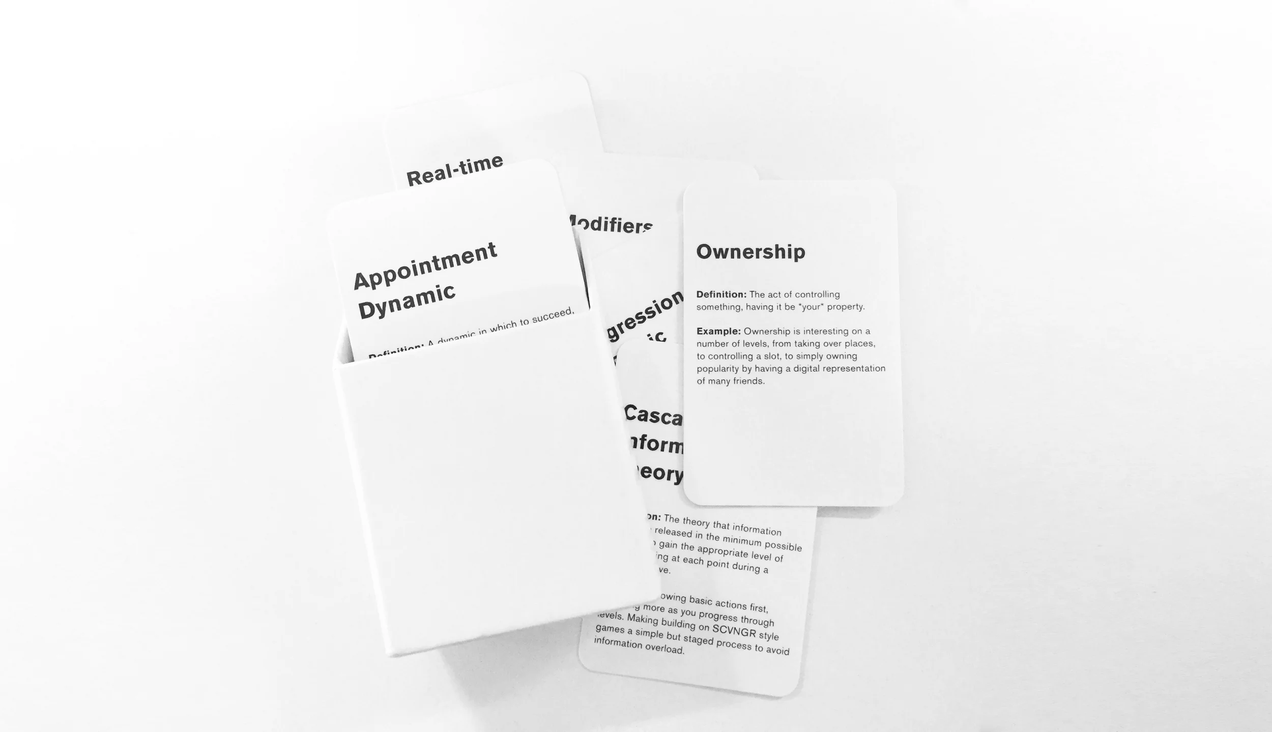
Much like a JS developer might use React, Ember or Angular to build quick prototypes and scale them, I've been creating a range of frameworks for my own use in relation to product design, execution, iteration and known UX behaviours. And just like the majority of developers I've worked with dream in full stack and their own applied language, so do I...but with, you know, design stuff. This framework is less authored and more curated than others I've created, but it came from a genuine concern I had about my own knowledge (or lack thereof) of game design. My knowledge was too patchy. I attended a talk by Nir Eyal and realised I was getting confused with my own applied knowledge and experiences - I was too concerned with getting users to return to the product, and not necessarily as concerned about keeping them engaged with the product. Keeping users engaged is hard as the tools at your disposal to manage engagement are often vague outside of 'real game design'. If you're developing a SaaS platform do you encourage your user to 'level up'? If you're building a B2B focused workflow do you offer jewels to the users who complete set tasks? (tl;dr answer: no you don't). To be clear - I'm not in any way a 'game designer' - but the process of game design itself, the behaviorism behind it's known tropes, the knowing about human reactions to game play - or even just the concept of 'play' itself - is fascinating. In fact I'd go as far as saying after the research I did into it that understanding the concept of 'play' is essential in any product concept or build process.
This framework takes the form of cards, with 46 in total. Why cards? Cards are cheap to make in small runs and easy to scale up. Cards can be pinned anywhere, moved around tables, handed to people, amended. Cards can be, well, played with. This is a non-digital framework that when used doesn't feel like scanning a PDF for research answers - it feels like you're in the process of already building something. Something like UX Lego (note to self: create UX Lego). What's on the cards is also proactive - each card has an actual game dynamic with a definition and a real-world example (as such this framework seems to have a lot to thank WOW and CandyCrush for). Each game dynamic on each card comes from an existing in-use game deck or published research of game dynamics from Zynga, Rovio, Disney, EA, a variety of TED Talks (such as Jane Mc Gonicgal) and a range of books (such as Nir Eyal's 'Hooked: How to Build Habit Forming Products'). 46 game dynamics in total - and I'm convinced I've missed or accidentally excluded some 20-odd more. But 46 seems a nice amount to work with in a group setting, workshop or on an applied project. It certainly covers the bulk of the dynamics that can be used or easily discussed (or at least are recognisable to the majority of people).
I've used this framework now in several products, including the latest product I'm working on, which is an enterprise social media SaaS. I've even used it in a product I designed for the Institute of Physics 'to show the history of modern physics in relation to string theory' (tough brief). It's a supplementary framework in that it doesn't determine the product, but rather informs the actions and interactions within it. It makes you and your team realise that every product is a playable experience at it's core. Every product is competing with the attentions of users. In workshops it makes everyone empathise with user boredom and UX ROI (return on investment). In applied situations it makes you realise the answer to the question 'why would a user want to return to and use this product daily' is a hard question that cannot be answered with a typical ego-fuelled response of 'but the product is awesome!'.
Sometimes your product has to do more than issue a numerical notification in a red dot (Pavlovian Response), verify a user (Pride Action) within a highly animated menu system (Achievement), or rely on the time the user is stuck using your products processes to achieve anything being the thing encouraging them to keep using it (Behavioural Momentum).

Balancing advertising and content in an age of fake news with The Week

A while ago I was invited to produce some designs and concepts for The Week - specifically their new online presence. I'd done work on their tablet and mobile app concepts - I'd even worked on some of their print based special projects - but this one was harder. Redefine new AD environments. Put imagery first. But hardest of all was trying to define The Week online. Here is a print title that defines itself by it's weekly retrospective on the previous weeks news. It's old news effectively, made new through considered and often complex hindsight. So how do you interpret that to an environment where the new, the immediate and the simple is encouraged? Grids, timelines and new AD formats? And before you ask - yes it was responsive. In fact the mobile views even had a daily podcast download ability that could be geo-fenced.


Building flexible online experiences for Somethin' Else

Back in 2014 (?) before I pivoted my agency, I was approached to produce a treatment for the broadcast agency Somethin' Else by the producer Kim Plowright. Somethin' Else are an agency that look after broadcast talent - and even broadcast production and programming for the BBC among others. It was specifically a web brief, but distributed media being what it is, a CMS driven flexbox site - while looking nice - probably wouldn't scale and adapt to a media landscape increasingly dominated by distribution networks, embeds and timelines. Well - it had to go beyond 'cards' anyway.

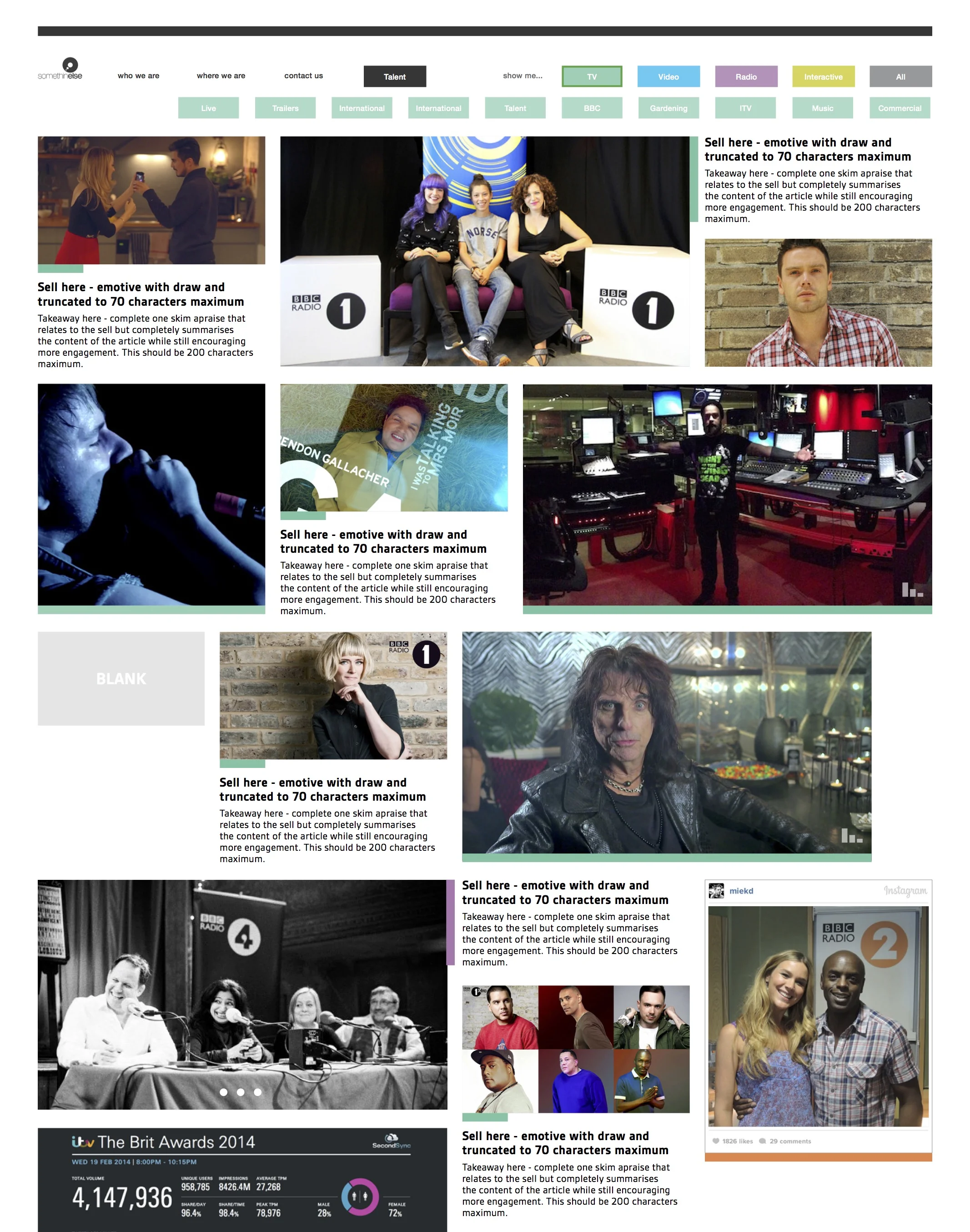


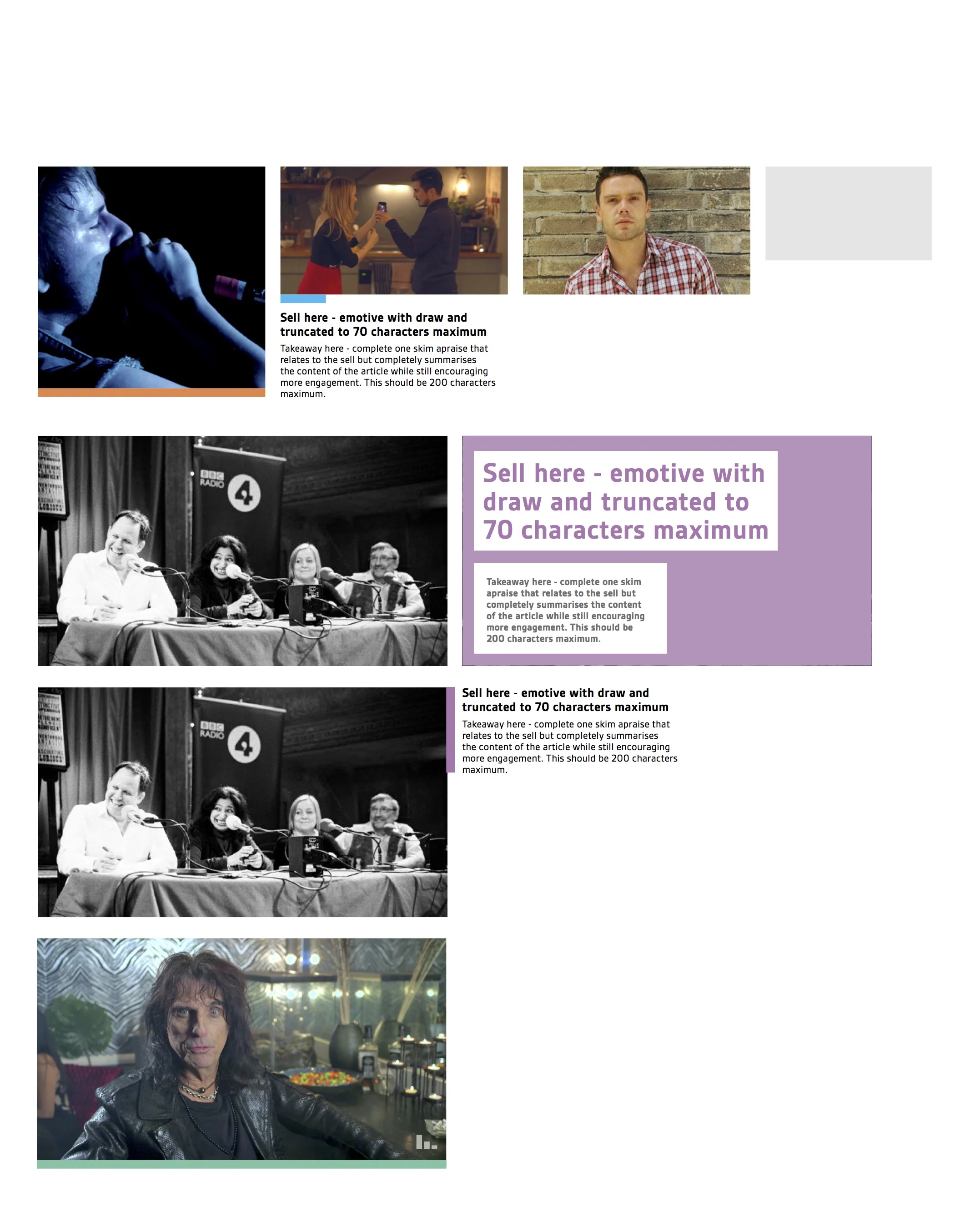


Do I really need an entire app to make a simple restaurant reservation?

A simple question with an overly complex answer.
Sean Rose at Slack raised an interesting topic recently. ‘Do I need an entire app to make a restaurant reservation?’.

It’s a topic that in many ways questions the dictum of ‘a good product does one thing well’ — which is a theory I’ve heard rolled out more than a few times in product discussions and pitches. I’ve been considering this topic for a while myself. I mean, surely if a good product does one thing well, then a better product does more than one thing well?
The rise of web and app products, focused on singular task focused user experience are on the increase — especially in the home delivery food category (and especially in London). Hungryhouse, JustEat, Dine In, Deliverance, Room Service, Deliveroo and recent grocery focused newcomer Hubbub (there are many more) are all fighting it out to become the easiest way to get the food you want delivered to your door when you want. But with the ubiquity of messaging apps (WeChat, Messenger, etc) and social network superstructures (Facebook, Pinterest, Instagram, et all) which users spend so much time inhabiting and communicating within, the question becomes, ‘Why do I need an app or web destination to order takeaway food?’. Or to phrase it without the reference to food: ‘Why do I need an app or web destination to perform a single task?’
Of course, as a user I should be able to just ‘do’ in any superstructure I care to use, device I happen to own or ecosystem I choose to inhabit. I should be able to use WeChat to order pizza, ask Siri to book cinema tickets directly in the iOS or awkwardly half-shout “OK Google!” to verbally book a cheap flight. This makes logical sense. As a brand or product attempting to do one thing well with the minimum amount of user inconvenience — why wouldn’t you focus on text or speech inputs within ecosystems that your users find comfortable and — more importantly — already inhabit? Placing services central to existing busy user environments ultimately makes for a better experience; but there is a cost. That cost is the removal of the function apps perform in the propagation of their own internal experiences and branding. From here the rabbit hole widens — with the removal of individual internal experiences we begin to see the homogenisation of experiences, the functions of user interfaces becoming unilateral and consistent based only on user demand, behaviour, deep linking requirements and SEO.
But is this not what User Experience ultimately strives for as a discipline? Hang on — let’s entertain this thought process for a bit: if the core of usability is to create an environment which completely supports the wants and needs of it’s users (and let’s suppose that deep-linking exists to primarily serve the user), then the homogenisation of design — the destruction of it’s variants, the individuality of the experience with it’s inevitable undesirable learning curve — is flattened into consistent default states and gestures. Extending this user focus, the ordering of a pizza should therefore be the same as paying a bill, the same as accessing insurance documentation, the same as booking a hotel, the same as commenting on a media post — and this lateral consistency will inevitably be built and propagated in a user environment that is most available, most accessible and most adopted as the default by the majority of users. This, however, suggests the sacrifice of individually designed spaces at the cost of improving access to users. It forces everything to behave the same because this consistency of behaviour is what the user craves in the efficient performance of basic daily tasks.
So what of design? In a possible future of consistent experience, where to create difference is to provoke unnecessary confusion, does the design control and design decision reside with the designer of the most popular superstructure, ecosystem or device? Does this make Apple your designer? Is the Head of UX at Facebook directly controlling your user experience? Is the ultimate attainment of the user centric designer to now create, as Le Corbusier expressed, “machines for living in”? The mention of Le Corbusier, by the way, is no pointless design-wank addition — the truth is Modernist designers have always strived for a machine-like aesthetic, of creating systems based in geometry and function. It’s a perfectly valid question to ask — can Facebook’s GUI guidelines or Google’s Material Design both be seen as “machines for living in?”.

Some focus on Material Design. It is a supremely functional and structured language. It is infinitely scaleable and proportional. It is also incredibly well documented and resourced — hard to question in it’s logic and easily adopted regardless of the design literacy of your team. It’s easy to communicate to others and quick to implement at the front end. It is very impressive in it’s scope. Yet there is certainly the feeling of the manifesto in Material Design; Google stating in their introduction, “We challenged ourselves to create a visual language for our users that synthesizes the classic principles of good design with the innovation and possibility of technology and science”. Of course there is a clear query about what qualifies as ‘the classic principles of good design’, yet the stated intention of the design being presented beyond this opening statement, focusing on the ‘possibility of technology and science’ is certainly a form of modernist trope. This is a design manifesto that looks to the machine and the user of the machine in synthesis, where ease of use is intertwined with ease of load and where reactions and decisions are influenced by computed animations and calculated movement. Time in this language is infinitely measured. Errors by the user are failures. Clarity of imparted information is the ultimate attainment. This is not a design language for the playful, the artistic or the inquisitive. This is not a design language to generate abstraction or to express emotion. This is, however, a design steeped in ‘the classic principles of good design’ — which appears to be a recently established shorthand for ‘Dieter Rams’s Ten Principles for Good Design’, a guidance famously, by proxy, attributed to Apple and therefore the creative direction of Jonathan Ive.
Rams is becoming the greatest known mid-century modernist (possibly via the sales of iPhones and Netflix documentaries) and it is well deserved, however it is worth considering that despite Rams reacting against “an impenetrable confusion of forms, colours and noises” by creating the ‘Ten Commandments’ (as they have come to be known), Rams was truly reacting against a more pressing and insular question that all designers ask of themselves — ‘is my design good design?’ The by-product of this question for Rams formed itself into ten self-facing principles which, many years later, seemingly by osmosis (and possibly via Dribbble) have developed universal appeal as a broad public soundboard for designers desperate for validation in an age of disruptive digital focus and vast technological change. ‘Good design’ in these terms however is forever an utopia, a perceived perfection of form and function, which, because of the imperfection of humans — is always unattainable (as anyone who has watched user testing will attest). Nevertheless, utopia is easier to digest and build with a code of conduct or blueprint — or manifesto. This line of thought has other problems too — we aren’t asked to consider if ‘good design’ makes people happy, or is what the user wants, or empowers the user, or if it builds communities, or educates. This is a design language that creates form and function but not emotion and reaction. This is a design language that excludes the messy nature of human interaction and replaces it with white space and order.
Should there be a reaction against this form and function? My suggestion is that it is inevitable. A good example of this reactionary movement is being seen in Editorial Design, which historically has been an experimental space, from the Bauhaus to the Avant-Garde. Editorial Design has certainly seen an increased injection of the post-modern and avant-garde over the past few years, to the point where trends have formed and been collectively followed. The work of Mike Miere (forging a beautiful/ugly aesthetic with 032c) M&M Paris (creators of the beautiful Missoni print campaign) and Richard Turley (creating chaos from order in Bloomberg Businessweek) have shown that function doesn’t have to be created through standardised templates and overbearing consistency.
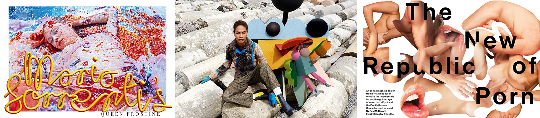
Left — Mike Miere for 032c Magazine. Centre — M&M Paris for Missoni. Right — Richard Turley for Bloomberg Businessweek
A communication can be complex and emotional. A design aesthetic can be disordered and misunderstood. Error can create beauty. Each example listed here (and there are too many more to mention) cause an emotional reaction. Each example raises the question ‘is this good design?’. Each example challenges the user in some way (as an example, here is Michael Bierut reacting to Mike Miere’s design treatment of 032c in Design Observer).
So, inevitably returning to the initial premise of ‘Why do I need an app or web destination to perform a single task?’ — the answer is, of course, complex. Sean Rose is right — for the most part, removing tasks from closed app environments and placing them central to social network superstructures, devices and ecosystems makes complete logical sense for the user. But this has to come with a caveat — to enable the machine at the expense of the human is to undermine the power design has as a human construct. A future design language should facilitate the humans that use it, not the machines that support and underline it. It should embrace human needs, build communities and enable education. It should entertain mistakes. It should be based in emotion. This is a Humanist design.

Apple, distributed media and the struggle to keep news content relevant

Apple’s newly announced News product seems to focus on design and ‘premium feel’, but it’s a product with the fight for relevancy at it’s core. Is it a concentrated distributed media play or just the democratisation of design tropes and a way to polish the usual recycled content?
Previously I talked esoterically about design in terms of distributed media strategies — specifically in terms of design existing within ‘superstructures’ (thankfully it was short in length). ‘Superstructure’ was used as an artificial edifice with architectural language to describe the reality of how content is presented by the major social networks. The Facebook ‘Timeline’, however, is a superstructure in the purest sense of the word — if the underlying structure of the Timeline contains multiple posts from multiple destinations, each with a degree of freedom prior to algorithm, the Timeline that most of us are faced with in our interactions with Facebook has a degree of freedom of zero. The posts within the Timeline exist within a time period and fall within this natural time coded hierarchy. But the Timeline itself sits as a superstructure, above the baseline of the reams of data, algorithm and product Facebook produces, with the single role of enabling consumption. My argument in terms of superstructure adoption was — why build a new superstructure to contain your content? The process of building new websites, marketing them to users, building communities, enabling tribes, all while attempting to elicit social network shares from them (via clunky APIs and modals) seems almost as prosaic as trying to accurately recreate a print magazine page on a tablet. There are counter arguments to this of course — some content should remain in a curated experience or branded space. There needs to be a solid brand presence to maintain editorial or brand trust. I get these counter arguments and indeed the products they produce are often highly convincing — the current app industry looks profitable and influential and by it’s nature encourages walled gardens and the proprietary control of users — the more we know about the user the more we can enhance the relationship with the user, therefore the more we can monetise the products. Yet I’ve seen very few content brands develop walled garden products with any significant level of profit or established user relationships. Walled garden products — unless they do one thing incredibly well or solve a broadly felt user requirement — tend to suffer from discoverability and (if a user ever finds it in a store or home screen) significant adoption. It’s worth pointing out that Apple in iOS9 seek to change this discoverability issue with app-level SEO, but the effectiveness of this remains to be seen (set your email filters NOW, however, for an inevitable plethora of companies touting to sell you access to that SEO ‘goldmine’).

American Trends Panel Results via Pew Research Centre
Jumping back to superstructures, we’re seeing specific news products loosing out to a growing Millennial and Generation X need to discuss and consume (in this illustrated case - politics) in a distributed media environment. This illustrated superstructure is Facebook, but delve into the demographic, alter the editorial topic and it could be any number of growing superstructures currently filling the home screens and being adopted by millions of users.
Famously at the back of the adoption curve is Apple, who have now unveiled a new distributed media channel which should be ignored at any brands peril. Not because of the design or the user experience, but purely on the basis of discoverability and sheer number of home page installs. Sure it looks pretty enough, and from what we can tell designers will get a few more tools to play with in the coming months, but this is a distributed media play at it’s core. Yes it’s RSS focused. Yes it’s lean. But it’s also a highly complex experience based in a Natural Language Product and algorithm that don’t prioritise search, but rather discovery through relevancy. Apple News brings distributed media directly into the iOS with all that entails — better discoverability and functionality, yes — but more important, user relevancy. Natural Language opens the playing field. Where once the distributed model relied on the opaque nature of Facebook’s News Feed algorithm or that of Google’s PageRank, with Apple it’s — potentially — more to do with language. The input in iOS9 of a keyword will display related contacts, web searches, apps, locations — and related News articles.

Apple News Producer articles via Apple
So in a distributed media model, we’ve gained another channel — but we’ve gained a channel with a robust user experience already in place and the promise of design tools and options to share beyond the walled garden. Will this become the gateway for editorial brands to begin to consider fully distributed media models? And will this create new tools for designers and experience makers that could influence the other superstructures Apple is now squaring up to? Of course we won’t know. What we do know is Apple’s want to create a ‘premium feel’ to it’s News content as shown in their recent Keynote - but how well this will sit with Millennials is an unknown. Apple News is an interesting development that creates relevancy, transparency, permeability and discoverability across news content and it’s operating systems beyond the basic algorithms — and that is a very Millennial construct, if not a worryingly iOS centric one. The Apple News articles themselves however, with their focus on animation, print hierarchies and page furniture look distinctly aimed at the Baby Boomer, and while Apple could create the democratisation of New York Times ‘Snowfall’-style experiential editorials, the question remains — ‘is there actually a user need for it?’.

Giving up control might just make you design better experiences

Publishers created branded websites to accompany their print offering with varying success. More recently we saw the rise of the web native publishing brand. Now the increased size and reach of social networks has lead to web ‘superstructures’ that bridge the gap between the open web and the closed app. What does that mean for design and user experience?
The touted phrase ‘Google is your homepage’ hasn’t generated a significant effect in web design or architecture. Complex navigation hierarchies still pervade, content models are still entwined with ownerships, brands and egos, unrelated and related content maintain their silos. User Interfaces, still apparently determining success, are discussed as if destinations, places users covet — a place for the user to arrive with a task, get lost in and digitally cavort through like a laughing model skipping through a field of corn selling dandruff shampoo. But what is ‘news’? What is ‘opinion’? What is a ‘feature’? Can a ‘feature’ be ‘news’? Can ‘opinion’ also be a ‘feature’? All relevant questions that in reality none cares about beyond legacy navigational structures — certainly not now share is becoming increasingly central to most user flows.
‘The share is your homepage’ has generated the need for a myriad of animated share buttons to be present on any given web page, along with relentless calls to action to ‘share this’ or ‘follow us’. These — for the most part — bloated share buttons cramp the users experience — at best they delay load times and throw the user to a clunky API login screen before the share can happen or the comment can be added. Sharing content can become a sub-standard experience — a designer can create a glorious responsive web experience that encourages sharing, a journalist can create beautiful narratives that everyone is desperate to discuss, but at the point of share or comment this experience vanishes into a mess of frames, windows and text input fields for any chosen social network. It becomes easier to share via copy and pasting a URL into a native social media app, which on mobile becomes a slightly fraught experience of tap gestures, selection dialogues and fine finger control. This newly shared content links back to the web page from where the share was actioned from, so that glorious responsive web experience full of beautiful narratives ends up inside a user interface web view (which you have no control over the design of) linked from a timeline structure (which you have no control over the design of) inside, say, a Facebook app (which you have no control over the design of — unless you happen to work for Facebook). So what is a good user experience in this scenario? Well, logically it would make sense to remove the copy/paste actions, sign-in forms and windows and let the user access the content directly — and use that platforms native share functions to do the share process. But this of course means to the designer that the user experience and the responsive layouts they’ve worked hard to build and test are redundant in the face of a default. The default for Facebook, for Twitter, for Tumblr — the default font, the default responsive behaviour, the default layout and hierarchy, the default player style, the default minimums and maximums that each network is built upon. To the journalist it means that the long form narrative might not work on Twitter, that mid-form text might behave better on Tumblr than Facebook and an infographic might have to co-exist as a still image, a GIF and possibly a video on YouTube. But none of this matters. What matters is the user can easily read the content they wish to read and share it using a default behaviour they are comfortable with within a network they wish to actively inhabit and curate. Should we as content creators and designers be trying to remove people from the networks they inhabit to impose on them our hierarchies of content and our user flows? Should we be disrupting a users consumption and imposing new behaviours just to register a click, a visit or a metric? Can we instead create experiences within the networks the users inhabit and focus instead on engagement — on experience? Certainly Facebook think so with Instant Articles. While the media industry wrings it’s hands over the perceived benefits of increased engagement compared to the loss of control it causes them, the user at the centre of it all doesn’t care. They still want to read, comment, browse and share without having to learn anything new. This isn’t the users fault, but their default. As Nir Eyal suggests, “products that require a high degree of behaviour change are doomed to fail” and he is correct. Design isn’t always about determining new behaviours, new frameworks, or controlling hierachies.
A loss of control is central to this and designers are often those who perceive that loss the most. In this new environment there is no style guide, no discussions over hierarchy, no discussion over user flows, user interface gestures, tested button styles and menu actions. This is an environment where the product is already built and you merely inhabit it — in design terms these are unstyled pieces of content, or as Koolhaus would have it, “orphaned particles in search of a framework or pattern…subsystems only without super structure”. But in this environment there is design, and it’s a design that matters. It is not a design of controlling behaviours but a design of embellishing the users experience. It’s one of imagery, movement and colour. One of pure communication within a rigid existing superstructure. A design based on the most stringent of briefs. A design that requires personality and strength to differentiate itself from the identical superstructure that surrounds it, frames it, supports it and enables it.
In a time of flat design, homogenised user flows, user interfaces and behaviours where everything faces the reality of becoming a doppelgänger, a copy or a pastiche, design now exists in the details. The crop of the image, the edit of the 15 second video, the animation that causes a communication, the simplicity of making imperceptible financial figures into a narrative that is easily understood. This is a lean design that focuses on communication and emotion, that accepts the superstructure that surrounds it but still strives to create something beautiful and useful within constantly fluctuating and strictly imposed minimums. This is a design that can really make a difference to the user, rather than building another superstructure, another waste of design effort, more junkspace. Koolhaus speaks of design as delivering results, of solving the underlying problem not just creating a surface aesthetic, “Design isn’t the veneer but the foundations beneath. Design is solving a problem at it’s core not re-imaging or re-designing”. As the behaviours and superstructures around our content become default, become broadly adopted and established, why build something on the same principals, the same behaviours, over worked with a thinly established and awkward veneer? We can embrace the superstructure yet design within it — and it’s here that real results can be found.