Rob is a product and multidisciplinary design leader with over 20 years experience building things you’ve probably loved.




























Building for small business through data-driven account-tech
Small business has a big problem. They’re high risk. They’re so high risk that the majority fail within five years of incorporation. The reason that the majority of small businesses fail is complex. Some simply fail because their owner isn’t good at business. Some fail because the market rejects their offering. But if you have a business that is viable - and you have some business acumen then your biggest risks are - making bad decisions and a lack of access to capital.
Most business owners make bad decisions, not because they don’t seek out good advice - but because they don’t have the right numbers in front of them to make a good decision.
Most business owners lack access to capital because, as a whole, small business is high risk. For a bank or lender, the general risk is often not worth engaging with. For a viable business, they lack the ability to de-risk themselves from their contemporaries. Risk is a numbers game, and the house always wins.
Quota was founded to resolve that weighted bet, and it resolves it through providing small business owners with SPOT - a single point of truth in their business data, that can be verified by banks and lenders and underwritten by accountancy professionals.
Accountancy professionals are uniquely placed to validate small business data. They’re also uniquely trusted by banks and lenders. Accountancy professionals are also in a race to the bottom - stagnant pricing and the threat of AI is undermining their business models, and their only respite is to move up the value chain towards offering services that mom and pop bookkeepers cannot offer.
So the problem space Quota finds itself in is rather unique and multi-sided. It serves the small business owner, it serves the lender. But it also serves the accountancy professional. And it is the accountancy professional who ultimately drives Quota - in both its legitimacy and reach - to the small business owner and the lender.
Quota is a heavy data product. It’s also a finance product. It’s a product where precision wins and errors can cause real life pain. It relies on complex data connectivity with dynamic ledgers and bank APIs, and it requires incredibly deep categorization models to provide the insights required by those making large capital decisions.
In short, Quota is Bloomberg Terminal for SMB. But it’s a Bloomberg terminal simultaneously used by a highly qualified accountancy professional and a business owner with a financial knowledge largely limited to ‘number go up’.
My role on Quota was broad and it encompassed leading Product and Design from the position of co-founder.

Quota allows Accountancy professionals to quickly onboard businesses through automatic connections to QBO and Xero.

From there, Quota automatically maps the history of the company using a proprietary codec called QCS. QCS is a complex beast of a codec that required very stringent information architecture. That architecture then is able to generate a parser logic, which can be leveraged by AI query engines.

This complexity is hidden in Quota - the categorization, the logic paths - to generate a smooth onboarding experience where the Accountancy professional is able to input, connect, sync and categorize any small business in under four minutes. Quota is also able to handle interdependency between types of businesses, industries and connected businesses, such as franchises and groups of companies.

This means for the Accountancy professional, businesses can be compared, reports generated and up-market advice created at-a-glance. However the big win for most Accountancy types is the way which, thanks to the QCS codec, any business on the platform is instantly compiled. A compilation in most industries is the financial standard for investment of any type, and for most Accountants, a compilation is (a) time consuming to produce (b) has very slim margins and (c) is immediately out of date at the point on compilation. Quota provides real time compilations for every connected business.

QCS also powers the finite details behind equations. It’s able to show past and future trends per equation with tabular detail.

For analysts who require additional details into individual numbers and QCS outputs, X-Ray mode provides the granular breadcrumbs. With X-Ray in QCS the analyst is able to leverage QCS to ‘no code’ the ledger. The AI agent QAI also leverages this X-Ray layer, able to allow for general prompts by both the Accountancy professional and small business owner.

What’s fascinating about Quota, and QCS as a codec in general is the power that exists within the codecs ability to find patterns within the abstracted data - and for that I thank the analytic mind of my PM Jay Dort. This allowed us to build smart budgeting tools based on prediction models, effectively running spread-bets against a company ledger, and allowing QCS to amend its variables when the budget was made actual.
The most interesting thing for me with Quota was the creation of flows. In product design and product generally, we talk about flows in terms of usability and execution. What you can see. What is tangible. What is human. In Quota those flows are the data itself, and the usability is determined by the way by which that data is not only presented but how that data is referred to, architected and made accessible in a variety of deep-use cases. The product challenge then becomes understanding the data layers, understanding where the leverage is and understanding what is possible.
In many ways QCS - and Quota - is a pure design product, but a design product with no true visible render. Where the aesthetic is the function and that function can be anything.
I intend to write more about QCS and Quota in the near future.

Building and incubating Products for capital-G-Good with MTR Labs in Hong Kong
The first half of 2020 sucked - I think everyone can agree on that. Projects got derailed, paralysis kicked in, diaries emptied, products died. In the second half though I’m trying to make up for that a bit - I’m excited to be working with MTR Labs in Hong Kong who have started a new incubator focused on Products for Good, with a focus on investing in Green issues, Transit technology and more. It’s early days but I’m excited to see what gets built and I’m happy to be lending my product skills to a new cohort of entrepreneurs. Thanks to Gene Soo who is always a pleasure to work with on basically anything.


Launching a rewards network for people under 30 that raised $60M in one year

As VP Design at Verve, I oversaw a lot of product elements, comms and users. Verve itself as a Saas is a complex beast - it allows you to sell event tickets to your friends to get rewards. This sounds simple enough, but with events spanning from sports to travel to festivals, with ticket integrations like Ticketmaster, See Tickets and more - and multinational e-commerce - US, UK, Germany, Belgium to name just a few, the amount of possible user interactions become huge. A user booking a sports ticket for 3 friends and wanting to choose where they sit is vastly different to someone buying a festival ticket and needing the tools to sell 30 more.
The one consistency across the Verve universe was the concept of rewards. You sell X tickets, you get Y reward - it became core to the user interactions on the site, and we saw it becoming a core driver for both acquisition and retention. Your average Verve user sells a few tickets and will probably earn themselves free access to the event - for these users this is realistically their end goal. Free is a great driver and for many it allowed them access to events they usually couldn’t otherwise afford. What we noticed though was there was a growing super user group who didn’t stop at a free ticket. They wanted more. They leveraged their social networks like an influencer, and had generated an extended reach. We wanted to build a product that could harness this super user behaviour and turn these self-made ‘influencers’ into acquisition channels. We did this through the creation of Pollen.
If Verve was a Series B, 200 headcount, in-rev company, Pollen was a pre-seed startup. We had user data, 100 users and some limited resource to hit MVP.
My role as Design Leadership in Pollen was possible due to the amazing work of Antony Shaw and Peteris Bikis. Hire those guys. They’re very very good.
The Problem
Can we take the power users we have on our existing platform and, through a combination of behavioural nudging, CX support and exclusivity, deliver a rewards network that enables higher sales per user, higher retention, better network driven promotion and cheaper acquisition? To solve this our definition of success would hinge on a few key metrics - on the quantitive side we’d look at GMV, NPS, Campaigns Joined (a user must join an event campaign to sell tickets for it) and Dwell Time (time spent inside or discovering a campaign). Qualitatively we’d look at the feedback we’d get from the CX teams, the semantics of the interactions, and we’d run face to face events to align to our testing - at the events our users were selling for. This last point was key to solving the desire lines in the product, as we saw event attendance as the last part of the user flow.
Pre-MVP
Because Verve is by nature a white label platform - it allows clients to rebrand their Verve site to match their event of campaign - we began initially by using this as the basis for what we were now calling Pollen. This allowed us to first of all test the flows we already had created in Verve, and work out which would be repurposed, but it also allowed us the ability to begin approaching the market with something to show. If Verve is a single sided marketplace through it’s white labeling, then Pollen, with it’s own branding would be a double sided marketplace - we needed users and events to transact at the same time. Without events we couldn’t get users, without users we couldn’t get events.

Reutilising existing flows and product elements was key in initial acquisition
This pre-MVP approach allowed us to begin building acquisition channels and gave us the breathing room we needed to begin brand and product scoping without blocking operations and sales. It also allowed me to quickly create pitch environments for client side partners.
Brand is everything
Building brands for the under-30s market is easier than it’s ever been in terms of broadcasting, but tougher than it’s ever been in terms of communication. Channels like Instagram, Snap, TikTok have given brand and content publishers the ability to reach people visually, way beyond the known limitations of Facebook. Paid acquisition is more impactful, and the organic story features with a focus in video and image get significant reach if done well. In researching these channels heavily with agency The Big Thinks, we defined some key focuses for communication:
Authenticity - Facebook has killed trust, and users are more cynical than ever before. Truth is king, and it has to look genuine - no gimmicks, nothing that can be conceived as BS, transparency is key, be bulletproof, but not to the point of being arrogant.
Don’t look like a pyramid scheme - Seriously, open up your Facebook and find one old school friend not trying to recruit you into a dubious scheme selling protein or moisturiser or something. Users are tired of this ‘friend drag’ and see right through it - in fact this came up again and again in our qualitative research. If it’s too good to be true it usually is, and the people your want to acquire will write you off as a scam. If your friends is offering free tickets on your feed and all you have to do is ‘click here’, people turn off.
Vibrancy - Seems obvious but not to be overlooked. Vibrant content really stands out and can act as a Trojan horse for complex messaging and boring terms and conditions. It’s actually hard to find good, vibrant content - people talk about their content or story being vibrant, but in truth it rarely is. Just because something is colourful doesn’t make it vibrant, and maintaining vibrancy from acquisition to process to retention is unbelievably hard to do.
Elevation - AKA ‘aspiration’ in some circles, but rarely is UX or CX ‘aspirational’, so ‘elevation’ it is. Elevation is usually the missing piece in product and brand flows, and it’s the oil in the engine. You can ‘nudge’ users and force desire lines, but elevation is more effective if it’s baked into the DNA. It’s the ‘too good to be true’ with real Authenticity and ‘not looking like a pyramid scheme’. It’s also incredibly difficult to define and needs to be user led.
I’m not immune to the brand think cynicism and it’s sometimes hard to type brand think into product design without feeling a little like you’re talking fluff to logic, but time after time I’ve seen products fail over and over again due to a lack of foresight and ‘feels’ when it comes to user acquisition. Acquisition is a lifeblood, yet it’s often talked about in terms of part of a paid strategy and usually nothing more. If you want to encapsulate a true sense of usability and elevation in a product, you have to have some mind in brand and marketing. This blending of the marketing and product, the ‘cross-pollination’ if you will that I was able to place into the teams at Pollen, in retrospect, was key to its organic success. Why? Pollen never lied, and its marketing and voice never wrote a cheque it’s product, CX and real-world presence couldn’t cash.
If Marketing and Product converge (which they should) on one action it should be ‘managing expectations’. Marketing should not be acquisition at all costs, nor should Product be ‘execute flows on the acquired user, everything else can be dealt with by CX’. One of the biggest issues I think we solved at Pollen was applied constraints. While it’s easy to promise the earth and tell the stories you want to seal the deal, it creates a falsehood where the brand overtakes the product and disappointment or suspicion gets seeded in the community. If there’s one thing to be learnt from Fyre Festival, it’s probably that.
The outcome of this Branding period was Product was educated enough to consult on imagery and copy for campaign, organic and paid. In fact post-MVP at Pollen saw Product Design working directly on Marketing campaigns alongside Marketing Designers with equal positioning.
MVP - There’s an app for that
You don’t need an app for that usually. In fact an app usually slows things down when trying to find the thing you need to build. In the case of Pollen however we wanted to build an app because our data told us to build one. In Verve world, where the web is accessible to everyone, an app isn’t a priority (it’s something that’s always in early stage development at Verve, but never ships). Pollen needed an exclusivity angle and using React Native allowed us to make an exclusive container for Pollen while keeping web on target. There are pros and cons to React Native, I’ve read them all. Pollen was the perfect React Native candidate.

Pollen MVP powered by React Native
If Verve was single campaign driven (one user, one festival), then Pollen was Multi-Campaign driven. This created a lot of complexity in both our user testing, but also in our personas and known quantitive data. Verve had been built and tested on a single campaign approach, focused flows, simple checkout - in fact simplicity was the 100% focus with Verve.
Pollen was very different. It was a discovery product first, with user choice and communication coming at the top of the funnel, leading to multiple checkout flows, options and end goals. If a Verve user had one definition of success to manage (sell X tickets, get Y reward), then there were potentially unlimited defined successes in Pollen, with different actions delivering different rewards at scale.
To navigate this we couldn’t equate X=Y anymore. We had to develop a different system for rewards based on a framework that could adapt to different values and different frequencies. If selling 5 tickets in one campaign as a Verve user equates to 1 free ticket as a reward, what is the reward if a Pollen user sells 1 ticket in 5 different campaigns? Do they get a free ticket? And if so, for which campaign? What if the campaigns are priced differently? Does a $400 holiday score more highly than a $10 gig ticket?
We began to build a rewards system that assigned point values to sales, weighted towards cost of sale. A user sells a holiday - 10pts, a user sells a gig ticket - 2 points. This made logical sense. Something costing more is harder to sell, therefore would get more rewards. We created Blue, Gold and Black statuses, each requiring a certain point value to access. Each ‘tier’ entitled the user to a range of rewards they could claim relating to their interests. The limitations of this system however began to show itself immediately in testing with users.
Reward behaviours
In testing rewards behaviours we began to realise that a weighted point based system wasn’t elevating our users. There were a few reasons for that. The logic of more cost equating to more reward makes sense (AMEX has built an empire from this dynamic) but for Pollen users the dynamic was too capitalistic. What we were doing was equating an experience someone was having with the cost of its purchase, which is to say that something that costs more MEANS more in our ecosystem. That just wasn’t the case. Our users saw straight through it - they saw money meaning access and immediately we began to loose authenticity. Money meaning access is something we’d originally sought to avoid with our users - those under 30 for the most part don’t see their personal wealth as an elevating element. We saw claims of unfairness, of ‘so if I’m rich I get more stuff’, of ‘this isn’t for me, because I can’t afford a holiday’. The reward behaviours we began to see positively emerge were non-hierarchical - every sale gives you a something towards a reward. And it was this non-hierarchical reward structure that unlocked the retention model we were looking for.
What we discovered was that ‘fandom’ played a large part in retention. In the world of ‘fandom’ someone who sells 5 tickets weekly to a club night has more worth than someone who purchases one large ticket item. In turn that ‘fan’ has more leverage with their network through constant broadcasting, making them effectively a micro-influencer within their domain.
‘Fairness’ in this world then becomes less about spend and more about usage. It’s less AMEX and more Foursquare. Removing money as a contributing factor began to make the reward dynamic more trustworthy, and more accessible. It removed the unnatural calculation of cash vs points.
We switched the tier access in Pollen to ‘amount of sales’ rather than ‘sales amount’ for MVP and it immediately opened up the concept of value to the users. Value that wasn’t monetary. Value that was calculated by the user, not Pollen itself.
Aiding Discovery
The quickest way to gain a user and retain them in Pollen was to give them the opportunity to discover new and exciting things, but more importantly let them find things they were looking for. With a marketplace built for scale, there’s only so many items you can place in a carousel before the intent to search is lost. We began with a powerful search tool front and centre in the UI, with predicative search display and the added options to request a search item if none was found - this allowed us to poll our users in real time.

The smart search feature in Pollen
For many products (such as Citymapper) search is bread and butter. It’s the 99% use case. In Verve world, search was non-existent, so integrating search into the product was a big deal. In fact it was such a big deal that multiple revisions of the discovery product were trialed before we tackled search being given such prominence in the UI. Search really began to take centre stage (and become more smart) when we finalised the first quarter of MVP trials in London. Pollen was expanding quickly and was showing astonishing GMV values, and the pressure was on to begin rolling Pollen into the US as soon as possible.

Adding location switches into Pollen
Much like Citymapper, we added a city switcher into the product which put more and more pressure on search, along with hyper-localised discovery. The back end required work - more tagging, more controls and the partner requirements equally grew as we added new locations. We also began reworking our initial MVP style guides to incorporate geographies. The UK is largely a single territory clubbing / festival market, with hyper-local users attending hyper-local events, save for annual festival pilgrimages. Stylistically and semantically its London - sorry to say that, but its one city that aligns the country in ‘how things look and feel’. The US is vastly different. We found our users travelling from NYC to attend a Diplo event. People from LA travelling Okerchobee, people from the east coast making the a pilgrimage to Coachella. Would someone in London use the city picker? Probably not. Would someone in NYC? Most definitely.
The more time we spent with our users on the ground in the US the more we realised that culturally the geographies were very different. Can we display an event in London the same as in LA or NYC? This opened up design framework discovery and a focus on an ever simplifying style guide.
Management
One consistency across all the locations we added was the core functionality of sales management. With users selling tickets and experiences across multiple events, locations and dates, to multiple friend groups, through WhatsApp, SMS and email - we needed a robust sales flow that would be easy to use and not require large amounts of CX spend.

Sales management in Pollen
Integrated into that sales management was SMS flows, allowing a user to send their friends checkout links and tickets, along with ‘sales links’ giving the user the tools to pitch their friends events they wanted to sell from within the app interface. These integrations were significant complexity - event discovery through to event selection through to adding friends, pitching and checkout - and getting them operational across multiple ticket providers in multiple currencies in different geographies was an impressive feat to achieve for MVP, but it was so core to the product experience that they couldn’t just be a redirect to mobile web. React let us build cross platform delivering consistency in our flows and user data.
What now?
Pollen continues to grow. In fact what was an MVP in one territory now controls the majority of collegiate travel in the US and Canada and continues to dominate in Europe. That growth was so strong that Pollen - in the space of two years - replaced Verve as both the core product and the core brand - and now leads strategy. Verve is no more - Pollen took over, and seems to be continuing to ‘pollenate’ within the experience and events market year on year.

Pollen continues to dominate
Update
In October 2019, Verve raised $60M in Series C financing with Kindred and others on the strength of the Pollen marketplace - and in turn rebranded Verve to Pollen. Pollen now leads the influencer sales market in both EMEA and the US, and through M&A owns the lion share of student travel in the US.

Citymapper Smartbus - the world’s first 5000lb 50mph beta release

I’ve written and talked quite a bit about Citymapper’s Smartbus project and my role in it - including all the ‘official’ writing I did about it on the company Medium blog and in the press. But I wanted to give an overview of the project / product in one space because it’s such a vast project / product - and one I keep forgetting the sheer complexity of. So while this serves as a nice portfolio piece, sure, it’s also a static reminder for me about what I did for the entirety of 2017 and why I should be constantly in awe at what we achieved - especially over the first 4 months.
Before Smartbus was SimCity
SimCity started life as a MapBox map with some simple data overlays. The idea was born of a hack in the FE team to figure out how to overlay some of our live app and open source data and make sense of it. We wanted to investigate transit products, but we didn’t even know if there was even an opportunity - mass transit dynamics are complex, subsidised and buried in policy. This means that even calculating a basic business model is complex as everything is in constant flux and renegotiation.

SimCity with Journey Duration data overlaid
We started building a basic web app that would allow us to overlay user centric data onto maps. If the business models are complex and subsidised by price, then you can always compete on the singular level playing field - quality of UX. With UX our main play we began to look at population density, A to B desire lines and where the black holes exist in a cities infrastructure - black holes though politics, restrictions, funding or lack of density. Mass transit is for the masses - this means its focused on scale and broad strokes. A smaller operation could exploit those gaps, compliment the existing network and still remain competitive.

SimCity with Journey Duration data cross-referenced with live transit links
We ended up after about 4 weeks with a product that did some pretty cool things in multiple city environments (not just London as shown here). Using various live data overlays and historical archives, you could choose a time, day and place, draw a transit route you liked the look of - and the product would auto route your selection via GPS, chose the best stops and stations for peak traffic at the time and date provided, and show you your competitors.

SimCity in action - a hyper powerful Saas that allowed route planning combined with live transit and app data
You could plot a route, save a route and analyse it using algorithmic processing of millions of known and projected data points based on known human movement. From this we were able to calculate projected passenger numbers - by stop or station.

SimCity’s brains - predicted route analysis could be then be calculated in minutes via algorithmic processing
Combining live and archived traffic data we could then predict the P&L - along with labour and machinery costs - of running any transit route it the city. From this we could rank routes by user need or profit potential, make quick changes and tweaks, and use the analysis tooling and infographics to understand the stop-by-stop dynamics in terms of passenger potential vs cost. A shorter route is cheaper to run in fuel and depreciates assets less - it also costs less in labour and has a higher frequency (which passengers love) - but it limits its profit potential and reach, while also reducing the chance of that route joining two areas of a city that actually need to be connected.

The SimCity ranking system
We build many data analysis tools and infographic overlays to our data. But this was an internal tooling system, not a commercial Saas - and as such it was allowed to be quick, clunky and navigated by feel. This was very much a service design led project with some limited usability considerations.


We had now analysed thousands of routes, and worked out where to throw our chips. We had a route. We just now needed to work out how to build a bus.
Project Grasshopper begins
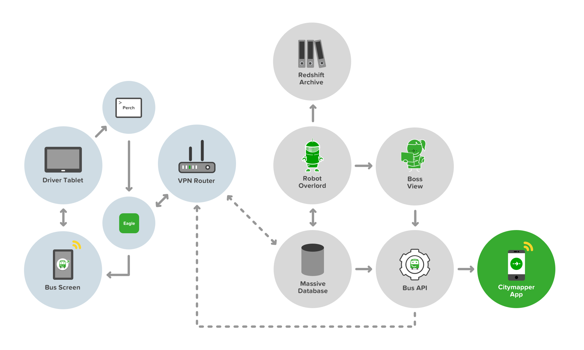
The full development stack of Smartbus from API to App to Bus to User
Building a Bus API isn’t easy. Neither is placing a server on a bus to facilitate that API. Buses are not really cutting edge tech - they’re cumbersome, heavy duty and - well - not a Tesla. We also wanted to deliver a Smart element to the buses. Sure, the bus was running on a Smart route thanks to SimCity, but we wanted to make the bus smart too. There are two key Smart innovations in this stack. Well, three - thought the third really sowed it’s colours later in the game.
The first is the concept of ‘Bus as a Platform’. The bus provides data of it’s whereabouts and behaviours, traffic and timings, passenger numbers and payments - in real time - to both the controller (i.e us) and to - and this is key - other buses. Smartbuses on a route are like an integrated mesh network - aware of each others status and proximity and able to self-predict their ETAs and passenger demand. This means they can talk to each other - and tell other buses to slow down or speed up depending on the current demand.
The second concept is the bus talks to the user. It shows transparent ETAs, location, other connecting nearby services, other Smartbuses, and even when to get off the bus (more on this later). The bus also talks to the driver. It shows the ETAs of other buses, how long to wait at stops, and it delivers simple information and two way communication to the driver about shift changes and start times.
The third concept is the bus talks to the Citymapper App, and therefore the user via their mobile screen and audible / haptic notifications. But it also responds to user inputs on their device too. It’s a personalised feedback loop, and one that benefits all the other buses in the mesh and therefore all other users of the network.

The first ever Smartbus rolling off the production line and straight into WIRED magazine
Other than the cutting edge tech, the bus needed an exterior and in interior refit. 3 buses in total and a lot of vinyl and signage. Most people know how to use a bus. It’s a lizard brain dynamic. But paint it green, change the payment terminal, add some screens…and it breaks something. The silhouette is changed. The UX shifts, the trust dissipates and new storytelling is required. Not everyone uses tech products, and mass transit caters for everyone - not just transit app nerds. The questions that were naive edge cases in development are no longer edge cases but massive critical issues. Should I get on this bus? Is it safe? Where is it going? Is this replacing my usual bus? How much does it cost? Will it tell me when to get off? How can I pay? Can I bring my dog on?


The integrated Smartbus screens providing live location and ETA data via live Bus APIs and app data
The driver UX is also critical in terms of usability and trust. Can they operate this bus safely? Is the screen a distraction? How do they reboot a Smartbus? How do they answer passenger questions? What does their uniform look like? How do they deal with platform bugs? What happens if the payment system fails? How do they communicate a problem? How do they change shift? Where do they pee?

Smartbus driver control systems delivered via Android tablet

The Smartbus driver control system user view
The bus controller ‘Boss View’ UX isn’t critical, but at scale it’s hugely important. Where are my buses? Are all my drivers on the road working? How can I contact my drivers? Are my buses bunching up? How bad is the traffic? Should I reroute a bus to avoid traffic queues? Who needs to go on a break? Has a driver exceeded their legal driving time? Is this route profitable today? How much am I burning in costs?

The Smartbus Boss View, allowing network controllers visibility over their headways
All of these questions are moot unless someone actually gets on a Smartbus of course. No passengers, no action. This meant using the bus to tell the story externally to potential passengers, making it look accessible, but also making it look trustworthy.

Smartbus rolls out through Southwark, London
Hark, Bigger buses!
Smaller buses are agile, but they also hold less people. Less people means lower demand routes, and lower profits. We spun up a fleet of six large buses with the goal of making the Smartbus scale.

A bigger Smartbus used to test a bigger revenue model

Smartbus interiors on a 5x scale
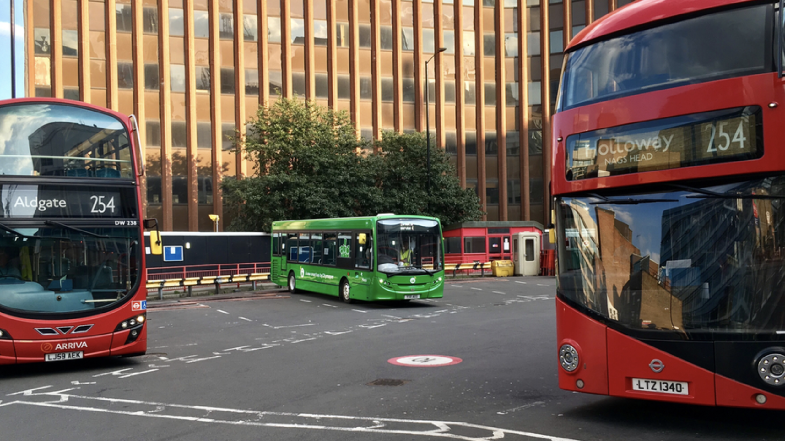
Smartbus rolls out on it’s new routes in East London
Higher frequency routes and more passengers means communications and payment UX becomes a critical part of the user onboarding flow. If the bus stops to onboard 10 passengers, to maintain the frequency of the service, the payment transaction process and boarding needs to be completed as quickly as possible. If it takes 10 seconds per passenger, each asking questions about how to pay and what to pay - that’s 100 seconds per bus stop, which totally derails the other buses frequency and schedules. It also annoys passengers being onboarded - and also annoys existing passengers with places to be.

Payment UX is crucial in transit, along with payment wayfinding

Transit payment communications and touch points are critical in passenger flow dynamics
Much like the smaller bus we needed the UX and storytelling to extend to the exterior of the bus - making it look accessible, but also making it look trustworthy.

External communications to aid with navigation, trust and passenger payment dynamics and flows
The bigger format of the larger bus allowed us to use large 40” OLED screens to expedite that communication and storytelling. However the time a user has to see these screens is limited - at the bus stop as they board, as it travels by at 50MPH, or if it’s stuck in traffic from the sidewalk.


We chose four in-flux screen states that allowed for a consistent narrative - location, payment, user benefits and at-a-glance plain language destination. The left side of the screen remained static, containing the crucial information relating to cost, route and route number.

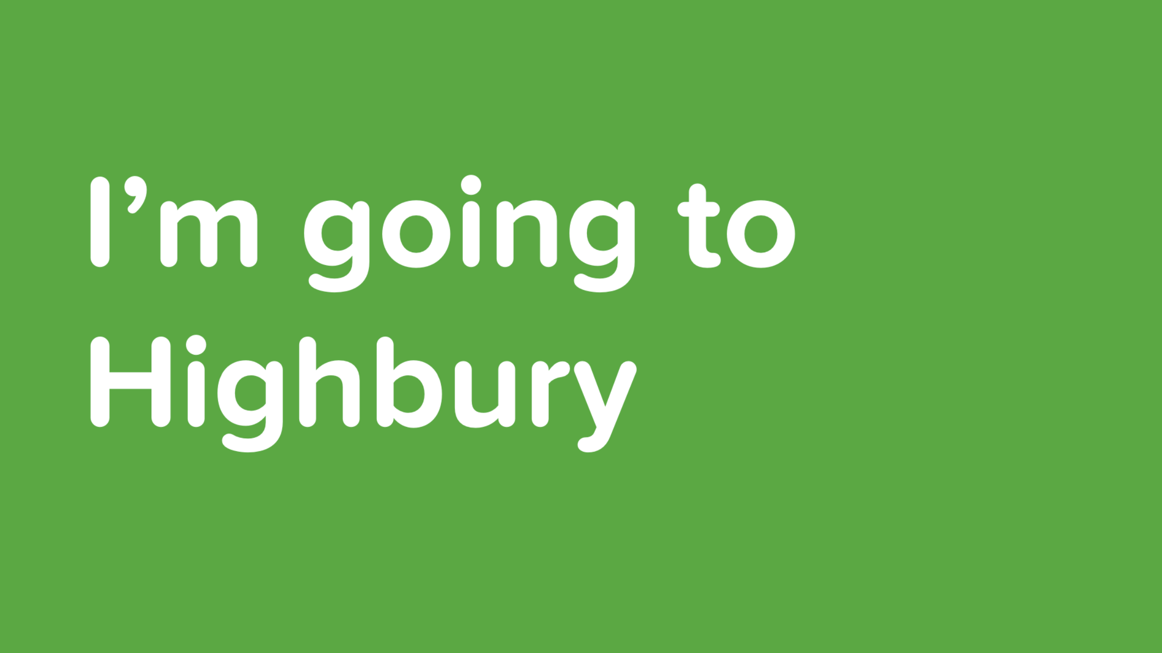
Our internal UX also got an upgrade. We were able to improve on our Bus to User feedback loops and allow users to interact with the bus platform. With Busmoji we were able to give users a personalised experience - using the Citymapper App, the user chooses their route as they would normally. On boarding the Smartbus, the app signs them a Busmoji. When it’s their stop, the bus reminds them by showing their emoji on the bus screens. Great for drunk passengers - even better if you’re not sure of when to get off or have forgotten the name of your stop.


There’s so much more to talk about with Smartbus and it’s UX, but context is really key. Context of politics, context of legal limitations, context of public services. Here’s some other articles I’ve contributed to or written relating to the Smartbus universe:

Making student travel visually not suck and scale across multiple destinations

I never intended to visually design Spring Break. It just kind of happened. It’s not my normal design brief.
Student travel is a money-making beast. It’s a billion dollar market with a guaranteed influx of new users every year. But because every year this new influx of thousands of students hits campus with zero previous experience of what it is to ‘Spring Break’, student travel providers are pretty lazy when it comes to trying to move things forward. To progress. And as such, everything is just a bit…well…tacky.

And because it’s a bit tacky - no designer wants to tackle it. I love a challenge which others won’t touch with a stick. For more context, we’d recently acquired a millennial / student travel company, and we had three months to roll out live campaigns.
I’m going to go through the iterative process of tackling this project from start to finish, so it’s not all portfolio - there’s some duds here, and I’m going to show them. I should also point out that my role in this project was as Design Leader, overseeing Product, UX and Marketing, so many other talented people with specific skills worked on these over numerous revisions (hence I’m showing you process and not a link to some shiny Dribbble account).
A look at the current market

The current market in Spring Break world is pretty grim. It’s cartoon-y. It’s cheap. What’s crazy about that however is the cost of actually going to Spring Break - students are paying $800-$3000 for a one week vacation all-inclusive with flights.

An example of existing artwork for Spring Break Cabo San Lucas, 2018
There’s also the additional complication of Sororities and Fraternities - large family style travel groups who seem to not only have large amounts of money, but also transcend trends. Investigating trend within Greek groups opens up levels of inner hierarchy, and history - these are establishments where you gain societal status, not where you gain cool. To that extent understanding the current output of Spring Break providers makes some sense - cheap, quick, fun. But our research showed that whether it was Greek groups, Sports groups or just random large groups looking to Spring Break they were all unified around Trust, Transparency and Value for Money. Taking this into account we can begin to build our mood - it’s got to be clean, trustworthy and high value - and in the student / socially-led world this is an easy find. But while these students are driving the decision making and narrative, it’s not usually them paying for it - the decider is mom and dad. So if you want to scale the stories you tell, want to increase the experiences you offer and, by proxy, increase the cost of your packages - you have to get mom and dad onboard, because they hold the AMEX.
Beginnings

Early discovery into new textures

Early discovery into type
Normally with Marketing Design I’d begin with a moodboard, some brand analysis - but with this project we knew we were dealing with complexity. 50+ schools, 10+ destinations, merch, staging visuals - not to mention social media, UGC and below the line campaigns. A quick calculation early on revealed that per-destination a campaign might require 200+ assets for below the line use, including variants of those assets across an average of 10 different schools. That’s a lot of assets, and with a high-growth strategy involving HTML and SEO, this means multiple variants of variants, A/B testing and constant key word changes.
We’re a remote / distributed team, with the bulk between London and Los Angeles, and stakeholders in Las Vegas. This meant two things. Firstly we’d use an asynchronous tool to coordinate our design process. Secondly, with the complexity and timezones in play, we’d need to change our working practise to not require stakeholder approval for every asset variant.
We created a Campaign framework that presented parent key art to stakeholder, with cascading variants from the parent key art being asynchronously available and editable. For this we chose Figma, which not only allowed us to sync our critique with our Product Design and CX teams, but also allowed for asynchronous feedback from stakeholders along with shareable permalinks.

Our Figma templating for the Marketing framework - 10 destinations ready to export in multiple formats
Scalable Design - V1


To scale the design with the amount of variants in the brief we immediately moved away from bespoke illustration or specific key photography and began to look at montage styles and design frameworks based around core patterns, rhythms and devices. One clear device was gradients - they were flexible, allowed us to chose complimentary colour-ways per destination, would scale to partnerships and brand guidelines, and could be used across multiple brand touch points from web product to merchandise to CSS. Another clear device was emojis. Emojis allowed us to quickly add mood or a sense of social to the campaign. The reason this was strategically important was that with a new influx of students every year, and the average college student last only four years in their degree, the ability for us to re-use photography from the student trips wasn’t a long-game solution. Sure when you’re 22 us using you in a poster campaign is cute - you and your friends, drunk, enjoying the sun. It’s a slightly different story when you’re 25 and trying to lock down that finance job. This meant we were largely reliant on UGC and social imagery to fuel our content pipelines, and with that comes lower quality, shaky footage and ‘embellishment’ (be that Insta-Gifs or general LOLz). You can deny that reality by heavily polishing your content or having a high refusal rate - or you can lean into it and make your professional content look as accessible and as fun as the UGC. We chose the latter. By combining UGC with stock imagery you achieve an unusual look - neither appears what it was. The UGC looks punchy. The stock imagery looks relevant. It also most importantly looks truthful.
Another range of devices we utilised was a mixture of in-destination specific stock imagery (locations, buildings, mountains), in-country specific stock and vector imagery (flowers, tropical fruit, palm trees) and experientially specific imagery (pool floats, surfboards, boats, fruit). There’s a few reasons for these using devices which are beyond general aesthetic. We used experiential imagery to ‘shortcut’ the destination - what you see is what you get - if there’s a boat, there’s a boat party, if there’s water there’s a beach, if there’s a pool float there’s a pool. But we also used this imagery to bypass restrictions - the boat party supplier wasn't confirmed, so a cartoon boat fills in, you can’t advertise alcohol to under 21s in the US, but in Mexico you can drink it and it’s part of your holiday package - so we show cocktail fruit, ice cubes and bubbles.
We also introduced patterns into the designs, although they play a largely supporting role - this is a ‘unknown unknown’ scaling element. Do we need staging backdrops? What colour are the tote bags? These patterns were our backup if all else failed. A consistency in the framework foundation - spots, stripes, circles, squares - a bread and butter element that we treated like a Swiss Army knife in case the on-site experiential got tricky.
Scaleable Design - V2


Our designs were rating well in user testing, however our stakeholders wanted more options relating to ‘premium destination’ feels - with more a focus on the destination itself. We began by breaking down the framework approach to its components and simplifying our approach. Could we make an impact with UGC and without UGC? Could we keep stock elements as destination-specific triggers? How could we make this feel more tropical and more luxurious?
We began using less vector and more photography in our foundation to ‘luxe up’ the destination IDs, and we found that in doing so we validated our framework further through it’s flexibility. We also retroactively applied our tonal changes to our existing designation designs. We still kept the UGC focus, but we offset it with more detailed execution, and developed a pictorial destination ID and a ‘lockup’ that operated better on social video stories and web page headers.
Scaleable Design - V3
One of the limitations we discovered with our UGC framework style however was how it worked with artist imagery. During our discovery of the campaign we began to look more closely at the experiential execution and the events we’d be coordinating at the tail end of the campaign when in-destination. With that came headliners for events, and with that came artists bookers and agents. We began to adopt the framework for a more typographic led approach to allow for studio quality imagery which had IP limitations attached to them, such as crop, orientation and scale.
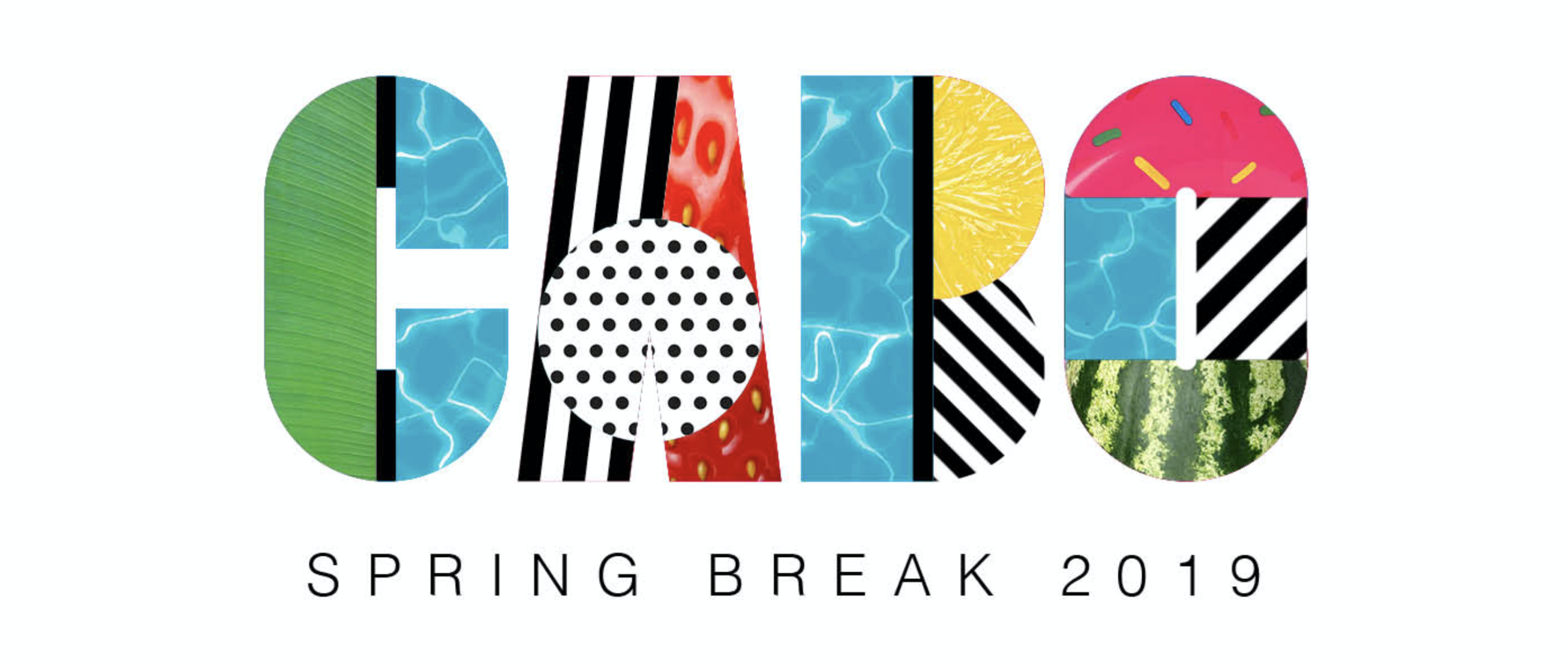

We took many of the elements and devices of the montage framework and applied them to block type treatments. This allowed us to - in a single type treatment - encapsulate a destination in a locked self-contained logo style, which made its application more scaleable across static and video backgrounds, and gave us clear options for animation.

We also began to play with other messaging, adopting the framework within other typography to experiment with storytelling, along with using it in the context of broader storytelling imagery.


Using a self-contained type-based framework allowed us to use more large scale imagery, and incorporate UGC as part of that on social with framing devices. The frames allowed us to take devices and use them to provide contextual impact while not interrupting the core imagery.
Most of our communication strategy was aligned to Instagram, and as such we had to operate between 1:1 and 9:16 formats, while also making sure that artist imagery remained uncropped and untouched.


So - does it scale? Yes it does. Does it make Spring Break cool? Not sure yet. Head to Cabo San Lucas in March to find out.

Time for that 'where should Design live in your organisation?' conversation

Where does Design live in your organisation? The answer to that is likely different depending on your Design discipline. If you're a visual Designer it's more likely you sit within Marketing. If you're a UX, UI or Product Designer it's more likely you'll sit either in Engineering (if you're working in an early stage company or on an Engineering-heavy product) or in Product (if you're working in a later stage company or a consumer or customer focused product). It's highly unlikely - whatever your discipline - that you'll sit in a Design vertical that reports directly into leadership.
There are a range of options when considering where to place Design in an organisation, and the most obvious places are within existing 'leadership' verticals. Most organisations tend to have one or more of these leadership verticals, which are headed by someone who reports into - so that's nearly always one or a combination of; Product, Engineering, Marketing or Operations.
There's a long history of Designers bemoaning the need for Design verticals, and the need for a 'seat at the table' - whatever that really means. In truth, there are some good arguments for placing Design in it's own vertical, just as there are good arguments for placing it inside other verticals - however in most organisations, Design is seen as incumbent and a service of larger needs. The reasoning here is that most organisations are founded and focused on solutions - on an engineered / technical solution, a solution to a customer need or problem, or a brand / communications / content solution. In these environments, typically, Design is seen as an executor of strategy, not the creator of strategy. In engineered solutions, Design might build patterns that allow check-out processes through payment integrations. In customer / product solutions, Design might craft and test empathetic and user focused flows. In brand or content solutions, Design will visually execute narratives and stories. In start-up organisations, these various solutions usually play out through the early stage hiring of a generalist Designer with a singular focus on execution. Later that organisation will employ a vertical leader - who then is charged with overseeing the Designer. The Designer then ends up working within that vertical.
One reason that Design performs these somewhat subservient roles is, in most organisations, Design is not really that tangible. There are many other reasons, sure, but it is very rare that Design's impact in an organisation is measured beyond basic output. Engineering can use uptime stats, Product can use bounce-rates, Marketing can use KPIs and click-throughs, views and likes. However, even beyond these basic metrics, it's rare to even see Design represented in higher level strategic metrics such as OKRs - or for those who don't operate OKRs - basic quarterly strategies.
Why is that? Is it because Design is just perceived as a subjective output by non-Designers? Or is it because Designers do a bad job of making Design non-subjective? If it's the latter, then it's hard to blame them when you look at the details. In larger organisations, Design discipline can incorporate UX, visual, animation, commission, narrative, copywriting, experiential, editorial, photography, video, branding, agency management - there's likely many more. Aligning these hugely varied roles, and with them their varied outputs, and often an orgs vastly differing opinions on those outputs and their 'perceived value' - makes managing the full gamut of Design a highly complex proposition. So complex in fact that it's very rare to find a Design leader who not only operates with this level of breadth, but also is even permitted that level of remit.
Even in smaller orgs you'll likely have a combination of visual / brand and product focused design roles. The complexity in leading or coaching even those two disciplines can be vast - running critique across visual and brand, coaching those skillsets - yet also running equivalent critique in UX, UI, user behaviour and research and coaching a completely different range of skillsets - is one hell of a context switch.
So surely with such a context switch, and with such a level of complexity, it makes complete sense to align design disciplines with their relative organisations.
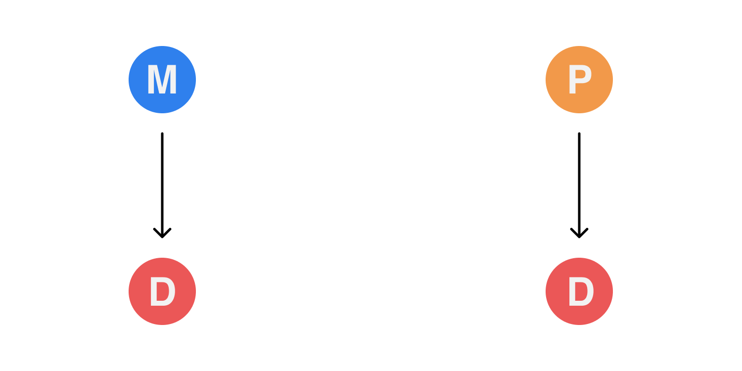
The case for Design inside existing leadership verticals
Most organisations will likely run Design in some variant of this model. In a typical scenario Design sits inside Marketing and inside Product. In Marketing the Design team will be represented by a Creative Director (or equivalent leader) who reports to the VP, Head or Chief Marketing Officer. On the Product side, the Design team, most likely made up of Product Designers, will report to the VP, Head or Chief Product Officer.
Pros
Splitting Design disciplines into their relevant verticals means that the Designers inside those verticals have a distinct culture and context that's aligned with their output. In Marketing, Design will entirely cohabit with visual, story and content, and the workflows and strategies day-to-day are likely understandable within that ecosystem. In Product, Design will cohabit with research, community, and product owners - their workflows aligned to Engineering and will likely incorporate agile practise.
The benefits of these focused contextual ecosystems is the ability to quickly mobilise teams and get shit done. From a Design management point of view, line management and coaching is easier as the disciplines are inter-connected and share a common base. Design as a service in these environments also means that Designers can coordinate with their relevant peers to get behind broader reportable metrics and outcomes.
Cons
With Design inside verticals, Design does, however your look at it - become a service, and the position of Design within that vertical can become quickly determined by the approach to, or understanding of, Design by that vertical leader. This means that, even with a Design management layer below that vertical leader, the Design environment, or the concept of Design, is set culturally by either the leader for Product or Marketing. With that leader usually not being a Designer, there is then a conflict in communication, leadership and coaching as the vertical lead tries to manage a discipline they don't fully understand, and they will likely form desire lines in communication with other Product people or other Marketers.
This disconnect means that a Design leadership role within a vertical requires constant mediation of communication, and also the upward management of both design expectation and design education. For verticals that don't support a Design leadership role, the onus on design culture, leadership and coaching inevitably falls on the vertical leader, and in those environments the success of design falls on that leader having either the experience of understanding of design to maintain the status quo and both enable and coach the design talent in that vertical to a high standard. In verticals that don't recognise Design leadership, typically the chance of attracting talent drops, as does the chance of retaining that talent.
Another issue with this model is that is silos Design within verticals. In some organisations this has limited impact, but in organisations where Marketing is a key player in driving and on boarding users into Product, those silos can quickly begin to show themselves. Issues like copywriting, brand appropriation, tone and consistency can suffer, and those issues can be difficult to solve as Design fails to form the core linkage and the success relies on the two vertical leaders not only communicating at the right level, but also aligning their Design services to execute on the same strategies through varied disciplines - disciplines that the vertical leaders won't effectively understand in any great depth.
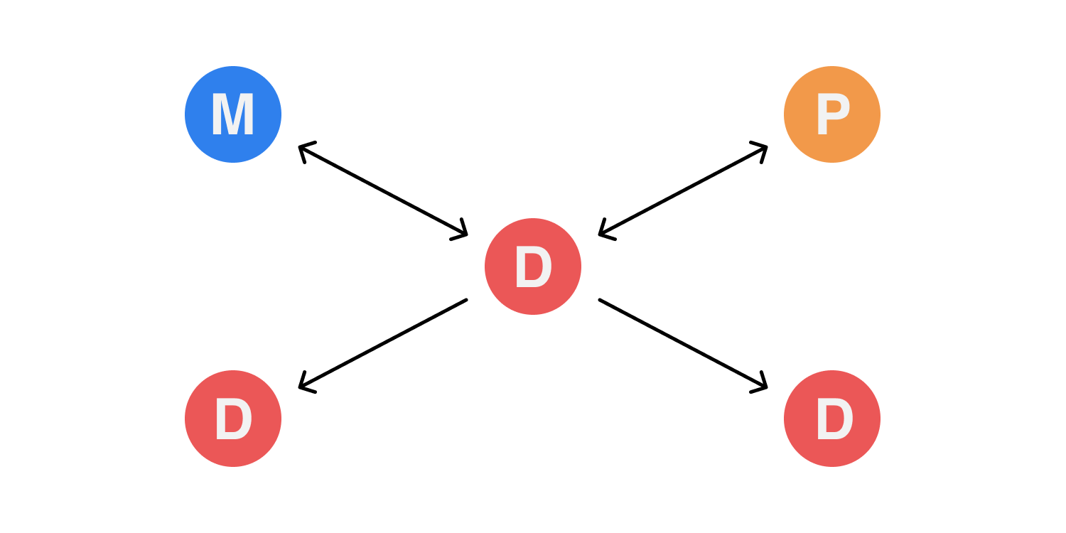
The case for Design inside existing leadership verticals, with joined Design leadership
This effectively places Design within the leadership verticals (as in the previous case), but assigns a Design leader to oversee and lead Design cross-vertically. In this instance it's likely that a VP or Senior layer is created that reports to both the Marketing Lead and the Product lead with the intention that the VP / Senior can coach within both verticals and manage up to both vertical leads. On paper this look best case - the VP oversees the Design leader in each individual vertical, and provides context and communication between the two Design teams, while also maintaining a cross-vertical Design culture and apply consistency in output.
Pros
The VP / Senior layer applies increased communication around Design and because of this there is an increase in culture and consistency. In organisations that require a blurred line between Marketing and Product, or Product and Brand, this layer brings a lot of impact into the quality of the various Design outputs. There is also an increase in Design education, and while the VP / Senior coaches the various Designers in their cross-vertical team, there is the opportunity for the vertical leads themselves to gain insight into Design, and it's requirements beyond the various in-vertical outputs. In reality the VP / Senior role provides a Designer who is not a direct contributor, but has the oversight to provide advisory - their abstracted role gives them space to think and balance requirements, which while key to coordination of staffing and communication, provides the vertical leads with cross-vertical Design strategy which they can incorporate into their own vertical leadership.
Cons
The VP / Senior removes the need for vertical leads to manage and coach Design inside their verticals, but it places the VP / Senior in a relatively tough position, executing against dual strategies and acting as a singular conduit. With any organisational setup which relies on a singular linkage, that linkage inevitably becomes a point of weakness. The VP / Senior is responsible for not only Design culture, but for bridging disciplines, cross-criticism, cross-context and for coordinating strategies from two verticals, which often might have competing needs. The VP / Senior is therefore beholden to the clarity and reality of the individual vertical leaders strategies, without a direct strategic input of their own. Depending on the organisation and it's complexity, this can place the VP / Senior in a position where they are largely reactive in their execution, advisory for decision making, as they attempt to weigh up, from line managers, the best decision to make. This can of course be mitigated by either 'managing up' to those leaders, or applying a communication strategy that attempts to align the two channels - however it's highly likely that the VP / Senior will, purely through he nature of the contextual differences of the various verticals - find themselves between a rock and hard place. They may find that the vertical leaders default to - or subconsciously - revert to line managing within the vertical, effectively cutting off strategic input and making the VP / Senior contextually irrelevant. This isn't inevitable, but the VP / Senior is one layer of management more than the 'get shit done' scenario described previously, and unless they find themselves involved in every decision in every team, align to every strategy and understand every context - they may find themselves in danger of becoming redundant or - worse - part-informed and therefore ineffective.

The case for Design existing as it's own vertical
Much is made of this ideology in Design circles, likely because it oozes control and enablement. But to execute this type of organisational change requires more than simply placing Design in a vertical - and this is why it's such a rare entity.
There is also quite a bit to be discussed about Design taking on such a heavily contextual role and - as is often the case - such a janitorial one. Most vertical leads are operational roles at their core and are focused on strategy, insight and alignment. Design not so much. Designers, regardless of their leadership component, usually try to incorporate some element of independent contribution to their day to day. That might read like a cliche, but it's largely a by-product of Design as a discipline. Because Design is a craft, it is taught, learnt and gained through the process of doing. Its ultimate execution may be quantitively or qualitatively led, but the process of Design, the thinking, the skill, the coordination of thought and action, is directly empowered and built through contribution. Managing contributors then can be difficult, especially if the Design leader does not have the necessary insight or knowledge into that craft. That insight and knowledge allows for hiring, coaching, enablement, context and better communication cross-discipline. To that point if a Design leader is to run a Design vertical, then to perform better than a Marketer or Product leader, they have to provide value to the organisation - through that insight into craft - by building strategic tangibles. If that sounds familiar, then it is - most Engineering teams mirror this to some extent. Where Design differs from Engineering, however, is in the sheer scale of disciplines it represents, and therefore the sheer amount of context required by Design leaders of a wide variance of craft.
In truth, however, the reasons that Design isn't often seen in its own vertical is more to do with how it's perceived - and that perception is driven by Design's need for the individual contributor and the practice of craft. Craft doesn't seem strategic, it seems reactionary. It doesn't seem inclusive, it seems closeted. The decisions made in the process of crafting a Design solution are not easily exposed or understood by others - and this is largely proven through the presence of subjective critique around Design. Subjective critique is usually the sign of miscommunication, or a misunderstanding of either how Design critique works, or where Design is placed within the organisation. Either way it's usually a symptom of a lack of Design education being delivered into the organisation.
Design existing as its own vertical solves this to a point. It creates a level hierarchy for Design to coexist alongside Product, Engineering Marketing and Operations - and with that, craft, critique and Design education is brought into definition across the leadership.
Pros
With Design reporting into the leadership level, there's a clear acknowledgement that narrative, craft, aesthetic and usability are accepted as being on par with - and also form part of - the strategy of the organisation. With Design able to operate inside - and independently - of other verticals, end to end narratives, consistency and creative innovation can now exist cross-discipline and there is the opportunity, depending on the Design leadership, to have huge wide reaching impact and penetration across the whole organisation. Design therefore becomes, rather than an occasional empathetic workshop facilitator, a thought leader with the ability to move into any vertical. Design is placed in a position where its hard-won skillsets related to problem solving and diligence can be refracted back onto the organisation itself - this isn't a Design thinking exercise design to empower the executive, but rather a constant revision of service Design within the organisation - Design begins to Design the organisation as a whole. Design talent becomes easier to hire, develop and retain, as thought leadership and Design strategy resonates within the organisation, rather than just in 'maybe one day' Medium posts, 'attract the talent' organisation blogs or 'big sell' conference stages. Design talent onboard into a vertical of their own, able to discover new disciplines, talk a common language and culture and therefore create more meaningful critique. Storytelling improves, Design quality improves, and the organisation shifts positively through the hard-won Design skills of the Design vertical becoming part of the organisations DNA. The organisation now approaches its problems using Design as a peer and trusted advisor.
Another benefit is within the Design leadership and management of the vertical itself. A dedicated Design vertical allows for management structures to be created that are perfectly suited to a variety of Design disciplines. Design management in this environment becomes less about assigning management layers to cross-communication roles with other vertical leaders, but allows the Design vertical to appoint management structures that encourage coaching, contribution and skill transference with the Design culture.
Cons
With Design having a broader remit, and encapsulating a wide variety of disciplines, there is a real pressure on Design leaders to oversee not only multiple disciplines, contribute and coach, but also lead design on an organisation level. Depending on the complexity of the organisation, those skillsets and disciples could be so diverse for some Design leaders that they become unable to effectively embrace those disciplines and skillsets effectively in the Design vertical. Additionally the sourcing of such a diverse Design leader can be a very difficult thing to do, especially for organisations that might not be renowned for their Design output. It may also be the case that in some organisations, hiring the required level of generalist to lead the Design vertical might actually handicap the organisation if they have strong requirements in one specific Design skillset. This could see a Product focused organisation with a more limited Marketing remit struggle to hire a generalist Design leader when they really need to hire a hyper-skilled UX Design leader - how does a leadership team hire the right Design leader to run a Design vertical when they might not be qualified enough to hire the right Design leader?
There are other downsides of course, and they mainly involve elements of disruption. The cultural shift for some organisations to bring Design into the leadership is just too vast for them to actually action. Changing perception of Design can be a tough thing. Giving Design the room to form its leadership role can be seen as high risk - and the reality of there being few organisations that have moved Design into leadership, the lack of 'proof' in wider business culture of it having true impact - means that for many, Design as its own vertical has a big question over it's added value.

Leading Design in remote and distributed teams isn't rocket science

If you have remote team members in your organisation — whether they’re designers or not — or if you have distributed offices in more than one city — then realistically you’re touching some of the issues associated with asynchronous or remote working.
Even if asynchronous or remote working is completely culturally abstract in your organisation, you’ve never considered it, there’s only four of you in one tiny office who always lunch together — or even if it’s something you personally detest the idea of and have sworn off it for the remainder of your career because reasons — you’ll still encounter some of the issues asynchronous or remote teams deal with.
This is in part because support for remote and distributed work is an inevitable end game for future businesses. The era of the ‘big city’ being essential to success is waning, while the empowerment of the provinces and a cultural drive to embrace a better way of living and working is in the ascendance. The fact is major cities are where they are due to their geographical relation to rivers, line of sight communication, rail lines, harbours and established trade routes.
These things are no longer deciding factors in your global design strategy. We have the internet now.
The good news is - it's a Design problem
In most orgs, regardless of size, design is the core power that binds development, marketing, sales, brand and business stakeholders. Effectively its role is to be the central, lateral communication channel. It defends the user, it actions and commissions research, it discovers trend, it crafts solutions, it communicates — and all of this affects the entirety of your products community, yet also the organisation itself - including the inevitable bottom line. Even if your org as a whole hasn’t realised this superpower design has to effect change, then even getting your design org to — at the very least — communicate effectively with each other, with minimal friction and shared knowledge - can only be a good thing.
I once worked in an org that was proud of it's 'low bus number'. This meant that a small group of employees had a huge amount of knowledge and therefore context - and therefore responsibility - and if those precious few employees were run over by a bus - the company would fail overnight. It was seen as a privilege to be one of those few chosen employees. To me that displayed pointless risk, and it was, as you'd expect, needlessly stressful on those precious few. It meant they couldn't take holiday, work flexibly or easily delegate. It also meant that every communication had to travel through them, every decision validated by them. This created a communication and knowledge fiefdom where knowing basic things to get a job done could often involve something of a knowledge quest for anyone 'normal'. So why did that org try to encourage a culture of 'low bus numbers'? Well, all ego aside, it was easy. It was easier to synchronise a few people than constantly synchronise everybody. It was trickle down communications - and if you're knowledgeable in any way about the realities of economic theory - you know that trickle down doesn't really trickle down. It just creates silos and vacuums.
I’ve seen several orgs struggle with these kind of synchronous / asynchronous communication and transparency problems, and the good news is there is an ever growing industry of cute sounding, pastel coloured products dedicated to solving the majority of these problems from $5 per user per month. In reality though, as you've no doubt deducted from the fact that 'low bus number' organisations actually exist, reliance on tooling is doomed to fail without a large cultural shift towards accepting remote and asynchronous concepts as being a positive and progressive development in the workplace.
One of the many reasons orgs struggle culturally with remote or distributed work is an existing regressive or inert culture of managerial control often founded in a requirement to 'be present' (aka Presentee-ism). This often flows from senior leadership, but it can also creep into teams as cultural regression - through poor hiring, org restructuring, poor cross-org communication or underdeveloped and unadaptive culture. In all these environments, as you'd expect, change is going to be hard. However design orgs are well placed to drive, mitigate and communicate change - it’s a service design problem at heart - and designers are perfectly equipped in solving these knotty human problems with a reasonable level of empathy and an elegantly crafted solution. Let's be honest - isn't every Design leader at some level re-designing the org that they sit within anyway?
I'm not going to list the full benefits of embracing remote and asynchronous work practise - I feel we're all aware of them by now and they're well publicised. Certainly if you've been trying to hire Designers lately you'll know of the talent demand for such environments. There's a reason for that. However it's worth noting that remote and asynchronous work practise can often be misinterpreted - it is not just about people 'working from home' - rather it's a practice that respects peoples choice of environment, cadence and personality. While there are many who work from their home office and shun the two hour commute and higher house prices, there are an equal number who work in co-work spaces, alongside other mixed discipline colleagues, or simply tour between clients and offices. In truth you just don't have to all work from one office to benefit from such crucial things as top global talent sourcing, quick scaleability, simple holiday / sick day logistics, open knowledge share, diverse global culture, hyper flexible working hours, clearly defined goals, roadmaps and documentation - and the most impactful - self-curated focused work environments. Designers are a wonderful mix of introversion and extroversion and need both periods of group discussion and periods of absolute focus. Giving them the power to curate and design these environments on a personal level is very powerful.
If you're ready to take on the challenge of building a distributed, remote or asynchronous-positive Design environment - here’s some hard-won personal opinion on some next steps, pitfalls and quick wins.

Sweat your workflow
Do the level of discovery and critique you’d do on a new product or feature launch — on your current and future workflows. Design has one of the more complicated workflows in an organisation, primarily as the work produced is often incredibly varied in scope and often open to subjective feedback.
Do you currently work face to face and have quick discussions over the desk? Great — but you need to work out how that scales in a remote environment. Sure you can FaceTime someone and have that conversation, but in a remote environment that conversation, those decisions — those actions — are outside of the team, and the rest of that team loose precious context on your decision making. Because of this, any new workflows for design need to be transparent, basic and heavily contextual. This initially seems like a large upfront investment of time — documenting all conversations and workshops, running regular all-hands meetings and recording them, coordinating time-zones for group chats — and it is.
But the benefits you gain from this investment are ten fold. It’s easier to track changes and decisions, it’s easier to onboard new staff and contractors, it’s easier for staff to take holiday, it’s easier to align stakeholders — because it’s all there for everyone to see.
Transparency of information and knowledge is your friend, and creating systems and workflows that encourage transparency and open discussion are critical to success. Making these systems and workflows asynchronous is an additional superpower, allowing offline thinking, reflection and considered commenting possible. Synchronous environments empower the extrovert and the quick-thinker over all others - don't discount slow thought, complex contexts and the power of writing as a way of structured thinking.
In my experience I’ve found a some key areas that aid this.
Firstly you need a solid accessible environment to create centralised documentation. This is playbooks, ‘why we did what we did’ and outcomes. A single source of truth. This environment needs to be easy to use and low friction otherwise it’ll never gain traction in the team if documentation is seen as a chore. You’ll also need to set expectations on the standard of documentation, where it lives, responsibilities for updating it, and who sees what and when.
Secondly you need a clear approach to workflow. I’ve placed Kanban into Product and Marketing teams with equal success — just remember it has to have maximum clarity and minimum friction — and you’ll need to, again, set expectations. Creating workflows like Kanban relies on each designer taking on some project management responsibility to maintain clarity at handover.
Thirdly, communication cadences are crucial. When do you run a crit? How do you run it? What are the timezones in play? What are the skillsets of the attendees? How do you keep your team in sync — especially if they’re cross-discipline?
Fourthly, you’ll need to focus on the design process itself and the resulting taxonomies. How do you create a brief? If no-one is there to crowd round your screen to make quick iterations — how do you do this? When you’ve created something incredible — how does it get signed-off? How do you collate and distribute stakeholder feedback? When it’s signed-off, where does it live and how can others find it?
For me I’ve found solving these problems as a team and getting buy-in on a team level the best approach. I’ve also found that (with one critical eye on tool-creep) that giving designers a choice over the tools they personally use to solve these problems to be beneficial in allowing a constant peer review of new and emerging solutions.
Treat this like a range of design problems. Get your team to work on them as a whole, and be sure to bring in all the skillsets relevant to that discussion. Have a video editing team? Copywriters? If they touch your org creatively, involve them at the kick-off discussion. Retrofitting other workflows is both painful and usually causes a lot of resentment.

Consider your whole design org
And by that I mean — not just the Product Design team. It’s easy to see Product Design, with its proximity to development and agile practise, as the perfect starting point for building a remote playbook. But think about Marketing Design and broader Creative teams, and their unique requirements. Sure they do a lot of print, video or social — but a successful design org is one that is sync, creatively, cross-discipline, and you should consider the same remote needs that a Product Designer would have applying to a graphic designer crafting MPU Advertising. In my experience it’s ‘all or nothing’ — but there are huge benefits. If your Product Designer is building a product onboarding feature, and they can see the Marketing output and message for the product in real time (and vice versa) I defy anyone to say that this level of dual asynchronous context is a bad thing. At their core, Product and Marketing design are 90% about communication of story — so if those two teams aren’t on the same page…what chance does the end user or customer have in understanding the story you’re telling?
Communication, Communication, Communication
You’re not going to be sitting next to each other — and if you are, others who won’t be sitting next to you will need to be looped in. Begin by treating any significant offline conversation as a sort of taboo — ask yourself if any element of that conversation is critical for group understanding. The worst phrase you can hear uttered in remote teams is ‘I wasn’t aware of that’. People being unaware of critical information (even if you don’t consider it critical) is incredibly dis-empowering and quickly causes silos which inevitably devolve into cliques, and before you know it you have low bus numbers. Your role is always to prevent that from happening. To solve for this, choosing your communication cadence is critical — and that cadence can be split into online and offline comms.
Online Comms (Synchronous)
This is primarily video calls. Zoom and GoToMeeting all have good cheap tools for teams and using it effectively means making clear diary touch points in your regular weekly workflows, and remembering to record and archive meetings for those who cannot attend. I’ve found having a general all-hands design meeting mid-week to be a good ‘go round the room’ opportunity to catch up and listen, and another weekly critique-specific session to be pretty much optimum. Any more than that and you begin to get meeting fatigue and attendance will drop — your designers will be having numerous other meetings themselves inside their teams, so optimising the time you have as a group is critical. Slack is also your friend, however others have found tools such as Basecamp to be better for their workflows. Either way a continuous IM channel is critical.
Offline Comms (Asynchronous)
This is likely to be split into documents, workflow and assets. For documentation I’ve had success with Notion as a powerful centralised asynchronous document environment, however Dropbox offers it’s own version which some will prefer. For workflow, Asana has a low impact Kanban and list option for managing jobs to be done. Product Designers may prefer Jira to sync better with their development teams — the best tool here is usually the best tool for the job, and that can mean multiple tools (I run Asana and Jira) but the key is to give everybody access to everything - even if they rarely use it in their day-to-day. I’ve used Trello, Meistertask — there really is no shortage of options — however considering the workflow you apply to those tools is much more important. For asset management I've found the tool selection is usually driven by cost - the taxonomy is critical to how useful that tool is.
Sometimes synchronous can be hard if your timezones are extreme, but even in the worst extremes, there’s usually around two hours crossover during ‘reasonable’ working hours. Of course this puts pressure on those two hours of possible communications — squeezing an entire day of discussion into 2 hours is tough, but it forces focused meetings quite quickly, which is a good habit to build. Having said that, if there’s one thing that extreme timezones do beyond encouraging better meeting hygiene — it’s that they force you to discover the benefits of asynchronous workflows very quickly.
Criticism and Feedback
In remote communications environments, the process of criticism and feedback quickly becomes core to team success. Your weekly crit sessions become very important, and it’s necessary to make sure those meetings are coordinated well to create maximum value for everyone involved. There are a few tools to help with crit and feedback, but I’ve found in running remote crit that it’s important to schedule the work being critiqued in advance so everyone turns up knowing what their involvement is — and they have time to research the context from documentation before they log in. I’ve found that the designers who leverage the best critique are the ones who communicate up front what they want critique on, rather than awaiting a generic Q&A from their peers. I’ve also found making the crit session non-compulsory to be more respectful of people’s time where there is always limited space in the diary - the teams time is reserved in the diary once a week, you just need to bring something to the table.
For critique and feedback there are, again, offline and online elements. For online I’ve found Figma to be a great centralised design tool to coordinate different design disciplines (from Product to Marketing to Brand) under openly shareable transparent URLs. Invision Studio is similar, and both tools offer prototyping, presentation and support screen sharing. For offline, these tools also offer commenting and collaboration at the core of their products. I’ve found commenting and multi-user collaboration to be incredibly useful, and is something of a game changer in distributed teams. How you use commenting and collaboration in these tools however can be a contentious discussion — it’s entirely possible for 5 designers to pile onto one artboard and begin altering someones work, and the danger of ‘design by committee’ naturally increases with such powerful features. Your team needs to work out together where their red lines are in collaboration, and have awareness of how each other work, and prefer to receive feedback.

Coaching and Leadership
Remote teams need more coaching — or they seem like they need more. This is really due to you having to schedule it rather than it happening in typical daily conversation. The benefit of that though is it causes focus, and means the coaching can have more impact. Leadership also needs scheduling, but in reality remote or distributed teams need a slightly more passive lightweight form of leadership — you’re not organising group lunches and meet-ups and seminars, now your role is to make sure everyone is in the loop, concerns are addressed, communications are clear and transparent, and agreed documentation and communication cadences are being adhered to. Does it feel less social and more janitorial? Yes. Yes it does. But it doesn’t mean that it can’t be rewarding. I’ve found distributed and remote teams need more individual attention — coaching individual designers to find their leadership qualities and embrace them. Turning your entire design org into a team of design leaders is a very satisfying proposition — more so than expensing a group lunch or dragging everyone into the office via a two hour commute to attend a meeting.
Ownership
You’re not physically there, so you need to empower your team with ownership over their own work and their own ways of working. As you move towards distributed teams, so the ‘hovering Art Director’ in you has to take a back seat. Trusting that ‘things will get done to the required standard’ now becomes a key component in how you work together. Working with your team to discuss and define ownership — and then getting them to ‘own’ that ownership — is a crucial to them being able to perform remotely and build trust — both with you, and with other designers.
Turning up
You have to be face to face sometimes. Remote is great and everything, but there’s always going to be a need to spend time with those in your org; whether that’s to connect on a personal level, gain skill transference, kick-off a complex project, or just to bond as a group. Depending on your budget, those face to face opportunities might be decided for you.
Onboarding
Any new staff member will have an impact on the teams dynamic, but it’s not realistic to get the whole team together every time you hire someone (especially if your company is scaling quickly). Involving your team in the hiring process is always good practise regardless of work culture, but involving them in the onboarding is more important in environments where hanging out at lunchtime is harder to do. I've found onboarding new people through self-guided asynchronous tasks to be really useful for both manager and new starter; spin up a task board (it might be in Trello) and get your team to contribute to it (ask everyone 'what things did I need answers to when I started?'). I usually add tasks to grouped topics such as 'people to speak to', 'software to sign-up for' and 'links to key documentation'. The benefit of this approach is the new starter gets to keep this asynchronous onboarding for future referral - which reduces stress significantly in the first few weeks on the team. I also feel that turning up to meet them on their first week is hugely important. It shows you care, sure, but it removes fear in any new starter - I've flow 12 hours to mitigate that fear. Starting in any new culture is nerve-racking, so you should do your best to mitigate that worry with quick-to-access processes and be there as a friendly face to ease them in.
Leading
If you are a leader you have to pick a cadence of turning up that is optimal for your team. I’ve found something akin to quarterly useful, especially if your business runs a quarterly OKR process to define the business or team level goals. Get on a plane. Bring people together who need to be together.
Teams
Bring teams together that need to be together. That’s obvious. If you have a remote team that all work together on one product line, find a time for that group to meet in person maybe twice a year organised around what makes sense to their work. Let that team decide that cadence, and do all you can to support their choices. However as a leader, consider who from other teams should also be there — if you’re building a commercial product, is there a benefit in bringing Marketing Design and Product Design together? If Video Production is a large part of your onboarding, shouldn’t they be essential to any face to face meet up?
All Hands
Sometimes you have to bring everyone together to meet up and get to know each other. You’ve likely been working hard to prevent team silos, but even in the best case scenario, it’s likely you’ll have designers and creatives — or key stakeholders and colleagues — that have never met in person. Most companies choose to do this on an annual cadence over a one week retreat, which is great. Do it. But does your broader design team need that opportunity as well? Large retreats can be overwhelming and with so many faces, people can find it tough to connect on the things that matter. Consider the need for a smaller retreat to balance it out with a more focused agenda.
Celebrating Diversity
One of the wonderful prospects of remote and distributed teams is that the culture enables — and promotes — diversity and inclusion. The fact that the highest paying jobs and opportunities are in big cities, and the cost of education, combined with living costs vs renumeration (especially when you’re beginning your career) means that working the best jobs at the best companies in the biggest cities favours those who come from affluent backgrounds, who most likely are white, who most likely are male and who most likely have no complexity in their background. This means that there is a huge talent base internationally that cannot access the opportunities that they might be perfectly aligned to given the chance. If you have a family you care for, elderly parents, children, a non-affluent family history, or are a minority for whom opportunity is less accessible — which let’s face it is a lot of people — you can’t just up and leave to New York, London or San Francisco to throw down $3K on an apartment rental. And why should that sacrifice — or attainment — be the defining factor in your career success? Is it because the role you are qualified for, for whatever reason, requires you to be present in an expensive city, despite the fact that it — if we are all really honest — could be done from anywhere? Is it maybe because the people who run that company could / can afford to be in an expensive city and therefore presume others can?
The greatest benefit of remote and distributed teams is you can tear up the existing rulebook and look to build a different kind of org based on talent, skillsets and experience — regardless of location, background or privilege. In design, diversity is its lifeblood. Finding and solving user problems, communicating to broad ranges of people, communities and cultures — this is what design does. But without diversity in that design team, it’s just endless appropriation. The most exciting thing about the prospect of a remote and distributed future is the basic freedom it gives in team building, and the access it gives to a broader spectrum of great talent — wherever and whoever that talent might be.

Building a Design Culture - a brutally honest primer for non-Design people

So you want to build a culture of Design in your organisation. There are usually two underlying reasons why you would want to do this.
The first reason is entirely selfish - you want to attract (and retain) Design talent. Design talent will probably ask a lot of questions before considering joining your organisation, but their first two questions are usually - 'do I actually have to physically turn up at an office?' and 'what is your Design culture like?'. You want to have an answer to that last question.
The second reason is because everyone knows from Medium, InVision's $135 Million CRM strategy and a growing number of repetitive conferences - that Design thinking and Design culture is 100% the key to success in business these days. So...you know...you want to be the one to bring that magic into your business.
Makes sense. Design culture sounds sexy and exciting. It's going to be complex journey though.
Why Design cultures are hard to build
You can't build a culture, you can only tirelessly enable it.
You can't bullshit culture into existence overnight or as part of your Q1 strategy. It takes time (in fact it can take longer than a year and even longer than any single Designer or Design leaders tenure) and it needs constant gardening.
Gardening is highly rewarding but always more effort than you expect and often more janitorial than you imagine.
You have to implement culture at the absolute top leadership level so that...
...people feel empowered to embrace and personally invest in it so that....
...it doesn't feel like some shitty executive box-ticking exercise - or worse - it's actually going to be a published company OKR.
It has to be led by actual Design practitioners who are active independent contributors. This isn't a human resource thing with an attached metric, it's definitely not an executive-led employee education programme, and it's certainly not defined by the outcomes of 'workshops' and 'off sites'.
Any culture will be unique to your organisation, so you can't carbon copy some abstract Medium post into a team meeting and expect magic Design beans to suddenly start growing all around you.
There is no culture without trust. Trust takes time to build and needs consistency - consistency of people, consistency in the attitude towards Design - and consistency in how Design is communicated across your organisation. If you have high churn, regular departmental overstepping, disempowerment and a lack of Design definition - you'll struggle.
Big changes will happen. If you're fortunate enough to get a Design culture seeded in your organisation - it will change things in every area of your organisation. That's what cultures do and that’s why you wanted to build one - right? So you'll need to be thirsty for that change and all that lovely Design empowerment that's going to happen everywhere outside of your control.
It's likely your Designers have already discussed all of this already amongst themselves and have probably made some decisions. You'll need to find out what those decisions are, why they were made, and why they haven't turned into a culture you recognise.
It's more likely your Designers actually have a Design culture which you're not aware of and - wow - that's a little bit embarrassing.
If you're a Designer then you know the situation, know the blockers to culture, and know what your team needs. It's your job to figure out how to unblock that stuff and through working with other Designers figure out what that Design culture is beyond just your team. Of course, because there are Designers - boom - there is a Design culture. But you'll need to all decide if this is something you want to push and strive for in your organisation - and if it's worth it. Because in all honesty, sometimes it's not.
If you're a non-Designer - all you can do is enable. Listen to Design and use your skills to present the need for Design representation at the top of the business. Without that the culture will remain subservient and wing-clipped. Which would not only be a shame, but it's also not going to inspire others to invest in it.

How to build - and define - a Design Organisation at scale that makes sense to HR

If you’ve moved beyond hiring one or two designers in your org then you’ve begun to add complexity and additional hierarchy. Managing this transition is actually pretty tough - there are a lot of hierarchical job titles one can apply that imply progression, but most instigated design hierarchies fail to address things like skill acquisition or long term career development. Most importantly they fail to address that in creative roles there is a clear difference between leadership and management - and in creative roles, there is usually a healthy mix of natural contributors and natural managers. Design is one profession where some of the greatest talent will actively avoid people management to preserve their contributory ability, and because of this there is a very clear need to define leadership not in terms of management, but in terms of expertise and mastery.
I’ve come to remove traditional hierarchies based around management from my teams, preferring instead to create defined skills to master. Mastering these defined skills allows progression, and those skills can be gained through broader personal management or through personal contribution.
I’ve reduced these core skills down into 9 definitions, within which there are some layers (such as leadership), and it maybe that your org may have multiple layers in some core skills and not in others depending on the kind of design you execute.
These skills are learned in order (for example an inexperienced designer would begin by mastering ‘discovery’ and ‘execution’ before moving on to ‘strategy’) and can be used to define incoming candidates, but also to track career performance and progression of existing staff and even allow you to align this progression to renumeration.
For example you can apply it like this:
Product Designer - Level One - $80K
Discovery + Execution
Product Designer - Level Two - $85K
Discovery + Execution + Strategy
Additionally I’ve found using these skills as benchmarks replaces ‘time in role’ as a defining factor in renumeration or progression. This has been largely positive, allowing teams to promote high performing talent at the correct speed to prevent talent turnover - we should be progressing and pushing someone with the skills and talent rather than blindly progressing purely through time on the clock. For those who use headhunters or recruiters, I’ve found these skill definitions to be a quick and easy way of defining the standard of candidate needed by a hiring manager - especially when it’s used consistently.
Here, in order or progression are those skills and their associated definitions. They’re still a work in progress, but do feel free to give feedback on them.
The Core Skills in a Design Org
1. Discovery
The ability to use discovery tools and frameworks to understand and define the problems which have been identified.
2. Execution
The ability to create and build suitable flows, visuals, behaviours and interfaces that are the solution to the problems defined in Discovery.
3. Strategy
The ability to abstract from the defined problem, define the validity of said problem, and validate hypotheticals against relevant user research and the broader global business requirement.
4. Communication
The ability to build stories and brands beyond the user flows, maintaining consistent and trustworthy environments that are both digital and non-digital in their Execution.
5. Operations
The ability to build, create and manage service design aspects which create solutions beyond product level problems, functions that change team or company dynamics, ways of working, or ways of scaling.
6a. Leadership (I)
The ability to mentor, train or lead teams, squads, cross-team groups and thought processes.
6b. Leadership (II)
The ability to mentor, train or lead teams, squads, cross-team groups and thought processes and transfer this to other teams in the wider org. This may also involve People Management.
6c. Leadership (III)
The ability to mentor, train or lead teams, squads, cross-team groups and thought processes and transfer this to the global org changing and improving behaviours, processes and the understanding of design. This may also involve People Management.
6d. Leadership (IV)
The ability to mentor, train or lead teams, squads, cross-team groups and thought processes and transfer this to the global org changing and improving behaviours, processes and the understanding of design, including technical systems, information architecture and service layers. This may also involve People Management.
6e. Leadership (V)
The ability to mentor, train and lead teams, squads, cross-team groups and thought processes and transfer this to the global org changing and improving behaviours, processes and the understanding of design, including technical systems, information architecture and service layers beyond executional teams and squads, but rather into other departments, such as Sales, Operations, Development, and Growth. This may also involve People Management.
7. Guardianship
The ability to own experientially - and tonally - a range of product verticals with the ability to defend and communicate said experiential and tone to the broader business, partners and external agencies. The ability to become the ‘guardian’ of the product architecture / multiple brand architectures.
8. Authorship
The ability to speak, write, create and curate across all experiential and UX touch points, accurately on behalf of multiple brands and their stakeholders. The ability to become the ‘voice’ of the user and to use this voice to speak freely to develop future conversations, flows, experiences and stories, - all while gaining the trust of owners, partners and stakeholders to do so.
9. Governance
The ability to govern, protect, project and continually reassess both the Guardianship and Authorship employed across a range of product verticals and to ‘steer’ products, brands and stories using this knowledge to maintain relevance, competitive advantage, alignment to trend, alignment to research and alignment to best-in-class execution. Deep level research and the resulting working knowledge into demographic, alignment and distribution is something which is essential to governance and allows for complete ownership of stories and experiences whatever the product vertical or business requirement.

Designing a product to shake up the world of Digital Asset Management

The Problem
DAMs (Digital Asset Management systems) are pretty established these days. Once your company gets over 100 in headcount, the need to control you assets between yourself internally and with partners externally starts to become a strong need. Even more so if you’re a remote or distributed company.
There are some clear problems with DAMs though. They’re usually large and cumbersome. They have features you don’t really need. Their pricing is opaque. They’re sold as enterprise and at huge cost. They’re bespoke yet weirdly inflexible. They don’t really iterate like a Saas, nor are they as accessible or as easy to use as a Saas.

Enter Workshake. Workshake is a Saas approach to DAM technology with a focus on user experience rather than technical need. If a DAM is usually a badly skinned database built by backend engineers, Workshake is a careful crafted and intuitive product based around what people need.
The Market
DAM is a market that is growing quickly. As cloud storage solutions become lower cost and higher value per GB, there has been a significant growth the the cloud services market which is scaling to support it.


There’s also another reason for that. As companies increase their global distribution and remote enable workforce, the need to provide colloid solutions and cloud access to employees increases exponentially.

The Solution
Workshake allows businesses to consolidate all their Cloud storage solutions into one space, and use powerful search tools and meta data passporting to be able to quickly find, share and categorise their assets. Their assets exist within a solid AES 256 encrypted environment which only they can access - and control access to - through user IDs.
On synchronisation with Workshake, assets from wherever they may come from are analysed and applied meta data through a lightweight Wolfram engine that looks for format, file structure, image type, colour, existing meta, location and GPS tags, making or versioning formats and basic semantics.

The Product
Workshake operates like an inbox for your assets. Add assets or asset sources, view, browse and search existing cloud services and simply share with integrated platforms or the product’s secure external portal.

Use Case One
Here a distributed team want to share - in this case - a World file amongst themselves. Workshake allows for groups to be created quickly and simply, and for files to be made private, team enabled or all-team enabled though basic, easy to use statuses.

Use Case Two
Here a team want to share a file externally with a client or partner and wish to do so through a secure and trustworthy portal.

Use Case Three
Here an agency has uploaded some imagery - both photo-based and graphic. Workshake uses Wolfram Engine to analyse the basic properties of the asset to automatically assign editable meta data to the asset to aid in its retrieval. The user can also add additional meta data, or edit and correct existing meta data. In the case of the image, this analysis includes location tagging, colour extraction, and some basic image recognition to aid in it’s retrieval - is there a tree, it there sky, are there people, is it a portrait. In the case of the graphic, this analysis includes typographic suggestion, file size, letter recognition, colour extraction and file type. The reason this is applied is to expedite retrieval. Often we don’t remember what an image is called or where it is located, only that, “It was a picture in a park I took last year of some flowers”. Workshake allows you to search using these parameters.

Use Case Four
Here a user has created a document in Workshake to share with their team. As the user types, Workshake analyses the semantics and the imagery being uploaded and applied automatic, editable meta data to aid with its retrieval. The user can also add additional meta data, or edit and correct existing meta data.


Meetings mean time, time means money; so I build a product that times meetings

The best products are built from identifying real problems. In a previous role (no names mentioned) I ran a product line and associated team doing pretty deep and complex work, however it often felt we were executing that deep and complex work despite the negative cultural elements that surrounded us. There were pressurised long hours, expected attendance, clock watching, micro-aggressions and micro-management. So far so uncultured start-up I guess. I won’t delve into that culture too heavily here - except to say that it’s the opposite of what a good work culture should be, I’m thankfully out of it, and I’ll never return to it regardless of the equity thrown my direction.
That aside, the one element of this company culture I truly detested was unplanned, unstructured and un-time-boxed meetings. I’m not (at least I don’t think) arrogant enough to describe my ‘time as money’, but I do consider myself experienced enough to consider flagrant and mandated bad use of my time disrespectful. And I’m not talking about the kind of meeting which is ‘hey, could we all meet and have a chat about some ideas I’ve had’, which, you know, often are unstructured and wavering meetings, sometimes seemingly with no end - but sometimes there is a need for those meetings which become a rolling critique or discussion, specifically if the focus is there in the room and there’s a clear need and everyone is engaged.
The fact that my team invented a side-app to cope and expose the futility - and cost - of the meetings we encountered, should probably be proof that they weren’t those meetings. No, these were undirected ‘hey come into this room now’ meetings which often roped in 10 to 20 participants and could run from 2 to 4 hours on a bad day. If you were super lucky you could claim ‘something urgent came up’ and find your way out of them - but that was rare.
And so a product was born. Born from the question, “Hey there were so many of us stuck in that meeting and it was totally pointless - I wonder how much that just cost?”. A very valid question, specifically if you’re in the process of burning venture cash in search of a market fit, and time is described as ‘runway’.
Designing this product was pretty quick and scrappy. React Native, some quick sketches, a few conversations, empower the front end designers and embrace the feature adds that magically appear. Let’s not call this a portfolio piece, but let’s call it a useful and fun product. It’s a product that everyone who sees it says ‘Man I wish I’d had that on my phone in this meeting I had the other day’.
It’s simple. So simple that you show it to someone and they immediately go ‘OH!’ and grab it from you. It’s probably the only product I’ll ever make that will be so simple and have such an immediate reaction.
Simplicity aside, there’s some cool features in the product though. The great thing about these mini-features as they came from - clearly - a passive aggressive moment, probably in a two hour meeting.
Yes, you can share the scary multiplying cash value by hitting the link icon - send it to whoever, however to show the futility of your meeting existence. Yes, you get a report on the total bill due from your wasted group session, but with the added value of being told that the meeting cost the same price as a thing you’d maybe like.
In seriousness though, the app does provide shocking value in the moment. Using it in anger to disrupt pointless meetings, and claiming that time back to yourself is a glorious outcome. Using money as a metric also seems to be a metric everyone can understand.
Now all I need to do is work out how to get it to track my personal social media ‘burn’.

Because Design principles are important and so is communicating them
I’ve created Design Principles for many of the projects and orgs I’ve worked with, and implemented them often in different ways. Implementation often depends on how the org communicates design internally, or where design sits in the orgs DNA. Here are the Design Principles I recently created for Verve and it’s associated product lines. It was designed to be broadly applicable, from conceptual through to customer experience - and designed to be adopted by the entire org. These principles are pretty typical in terms of solid principles - they cover experiences, tone, inclusivity, detail and end-to-end expectation - and also maintain relevancy beyond the design department.
Most important they’re also understandable by non-creatives - and because of this (and the millennial nature of our org) I distilled them into GIFs and images.
Often designers create rules and silos to empower themselves in an org, to make themselves appear important or to ‘land grab’. That’s usually understandable - it’s nice to define your own patch and defend it, especially if your experience of design within orgs has been largely negative; design as an add-on, design as a framing device, design as ‘polish’. The problem with this however is it comes across to others in the org as a defensive, if not uncommunicative position to take.
Designers can - and should - empower their orgs by giving away their skills freely, be transparent and de-mystify their processes. By doing this design becomes an aspirational skill to be adopted, mastered and therefore appreciated by all within an org, and from that understanding a professional respect is formed. Sometimes it takes someone being empowered by a skill to realise how tricky mastering that skill is - and by proxy appreciate and gain empathy for the complexity of wearing that skill professionally.
By empowering everyone in your org to understand and believe in design and it’s principles, you bring design into the org completely - without the need for trojan horses, battle cries and those endless whinging emails no-one reads.
Our Design Principles at Verve

Cooperative AF.
Everything we design is designed with others in mind.
What we design should work in cooperation with our diverse range of products, brands, clients, users and user networks. We never design in silo and we prioritise company wide integration of the solutions we create.

Inclusive AF.
We design for everyone.
We design for users internally and externally who are global, diverse and have different objectives, expectations and needs.

Keep it simple M8.
We don’t make people think.
We design for known behaviours, default reactions and real emotions. We never get in the way of our users actions or make it difficult for them to discover or navigate anything we create.

Always Transparent. Always Trustworthy. Always.
We are clear and open about our intent.
We don’t hide behind dark patterns or create unexpected behaviours. We are always clear about the intent of what we create, and strive to represent a source of truth to our users and gain their trust.

Where the wild things are.
We design experiences in places where our users choose to spend their time.
We’re mobile first and socially focused. We work with distribution in mind and consider how and why things are shared. We make sure we have first hand experience of living in these places.

A tiny part of a big experience.
We enable people to create great experiences, but we recognise we are a small part of that.
We are a small part of our users bigger experience with their network - we recognise that and remain humble. We celebrate offline experiences not in-app experiences.

Beginning, Middle and End.
We tell well defined stories.
From our user flows to our content, we make sure our narratives are clear, structured and functional. We avoid cliffhangers and unhappy endings.

Sweat the Comms.
We are focused on the clarity, consistency, frequency and tone of our communication.
We are honest and candid in our communications and communicate to maintain expected rhythms and maintain trust - both internally and externally. Oh, and tl;dr.

Usability with all the feels.
Accessible and usable doesn’t mean boring.
Simple and easy to use design can still communicate emotion. Being ‘Accessible’ and ‘Usable’ isn’t doing someone a favour - it’s our job.

Excite. Delight. Inspiration. Aspiration.
We curate and create unique ‘wow’ experiences no matter the medium, subject, audience or vertical.
From video to CRM , from social to stage, we always strive to create ‘wow moments’ within the useable environments we design.

Why Tho.
We question constantly.
We always question the way things are done and the existing ways of doing things. Our users move at the speed of light and it’s our job to keep up.

How to give creative feedback to creatives if you're not a creative

Giving feedback can be a tough thing to do - especially within creative teams. It’s also likely that you’ll be in a situation when the person giving the feedback isn’t creative themselves, which is both intimidating for the creative and the non-creative as they try to find shared language and approaches to move things forward. Here is a simple guide to structuring that feedback and how to both prepare for - and to give it.
Things to consider when giving or planning feedback
Should I actually be giving feedback?
You should only really give feedback when your feedback or expertise is relevant
Sometimes we can find ourselves giving unsolicited opinion on things that either aren’t in our skillset or perhaps we just don’t have the right context. When this happens, our feedback becomes ‘opinion’ and unless you have been asked for an opinion (or you have asked if you may contribute an opinion) the risk of other expert feedback being confused or overlooked increases.
This is especially a problem if the feedback of an expert is overlooked or an expertise based critique gets disrupted due to a well-intended opinion.
How should I set myself up for feedback?
You should choose and create a feedback group you trust - with each member of that group having the specific expertise you need to get the job done
A Designer wanting feedback on a campaign should create a feedback group containing all the experts their campaign will touch. This may include: Sales, Marketing, and Product Line experts. They’re also likely to include another Designer to that feedback group to check their own bias and quality of output.
It’s important to balance the feedback group carefully to make sure it contains all the voices and expertise required for success - including someone from your own expertise.
Try to stay in your lane.
You should only give feedback related to your specific role in the project
This doesn’t mean that someone in Sales can’t feedback to a Designer, it’s just that the feedback should be relative. In this example, Sales have an expertise in the marketplace and with the customer or partner. Feedback should therefore be given through that lens, rather than a direct critique of the design itself - a critique which another designer would be better suited to provide.
Giving context of your role and expertise in the feedback process can open up better discussions, and allow people to learn from you and you from them.
Subjective is bad.
Without your expertise or role focus, feedback just becomes opinion
Saying ‘I don’t like’ something doesn’t forward the discussion or improve the end result - you have to show, via your expertise, why your feedback is relevant. Otherwise the person receiving feedback has to de-code your feedback - or worse - will just ignore it.
Instead of saying ‘I don’t like this’, consider reframing your feedback to reference reasoning such as “in my experience in ‘x’ market’” or “here is a relevant example of something I know works in this market”. Use this as a reference point in moving the conversation forward.
Check your bias.
Everyone has a bias
Maybe it’s personal bias like - ‘I love the colour red!’ Maybe it’s a professional bias - something you want to personally achieve, do or be involved in. All this is fine, but you should consider these biases when giving feedback. It can prevent new ideas, approaches and solutions being formed.
If everyone in the feedback group has a bias (which they will) it can cause personal opinion to cloud actionable feedback. Check your bias and challenge it - is this relevant? How did I develop this bias? Should I apply this to my feedback?
Everyone is aiming for the same outcome.
Feedback can feel like a battle of wills sometimes
Always remember - and the group should articulate this clearly - that everyone is giving feedback to make sure the end result is the best it can be. Sometimes reminding ourselves at the beginning of a feedback session of what this agreed end result / success looks like can encourage more aligned feedback.
Sometimes this can mean constructing your feedback to make sure that it is angled towards everyone finding a consensus or shared result, and sometimes this can mean compromise towards a bigger goal - it’s not about personal ‘winning’ or scoring points.
Feedback can be painful.
Often the person who has produced the work requiring feedback has invested significant time and emotional energy into doing their best work possible
It’s worth always remembering this. Accept that the person receiving feedback is likely ‘exposed’ and may take things personally or become defensive. But if they are remember it’s because they care deeply about the outcome.
Give them time to explain their thinking and how they got to where they are before you jump in with critique. Defensiveness is usually caused because someone is worried about being misinterpreted or not being able to communicate their process.
It’s not personal.
When we receive feedback it can feel personal
It’s tough - when we’re invested - to abstract ourselves from what can sometimes feel like a personal attack (especially if that feedback has been worded poorly).
Ask questions and see the feedback process as a conversation - why is this feedback phrased as it is? Can it be rephrased? What do you mean when you say ‘x’? Dig deeper and do some discovery - it’s a great opportunity to learn, but also to improve others feedback ability.
Have you considered?
If we accept that someone receiving feedback is doing their best and is working for the best result - we should be also be considerate in our phrasing
It’s very possible that many of the options you’ll suggest were considered before the feedback session, so feedback should recognise this possibility. An example of bad feedback is “This isn’t right, it should be red because that’s our brand colour”.
An example of good feedback is “Have you considered using red? It’s our brand colour”.
Asking this question allows the person receiving feedback to respond rather than defend - it maybe that they HAD considered it, and this will give you a clear reasoning as to why they then did what they did.
Be respectful.
Remember the person asking for feedback is an expert also
We should always respect each others expertise. Because of that we should never use words like ‘Bad’, ‘Weak’ or any form of negative phrasing where possible as everyone has strengths where others have weaknesses. Use the feedback process to ask questions and discover why an expert has decided on a course of action.
Feedback sessions go both ways - it’s not just a show and tell. It’s an opportunity for mindshare towards a common goal, and a way of understanding each others expertise and reasoning around topics.
Give Praise.
It’s ok to say nice things
People respond well to praise (who doesn’t like to be told they’re doing a great job?), and in exposed situations like feedback sessions, praise can be a trust building part of the feedback process. Rather than say ‘this is good’, however, say ‘this is good because ‘x’. This allows the person to understand what - to that expert - good looks like.
Explaining why something works or is good allows that person to understand this for the future and apply it to other projects - it’s a great learning tool.
Agree Actions.
Feedback without actionable results is just discussion
Make sure your feedback discussions result in tangible ‘to-dos’. Agree on those and make sure everyone in the group agrees on those next steps to ‘align’ the current presentation before the next feedback round.
Feedback gets derailed and people get frustrated when agreed feedback is ignored, or feedback is opaque and unactionable. Make sure you have consensus as a group and accountability and set a date for the next session - before ending the feedback session.
An easy to use 1/2/3 feedback framework
Ask > Discuss > Agree Action.
1. Ask (“Have you considered ‘x’? Followed by your expert context and knowledge)
“Have you considered making this red? The research we’ve done on brand suggests this colour is the best choice for maintaining consistency across this product vertical”
2. Discuss
Allow the subject of the feedback session to respond to this question and listen carefully to their reasoning. Respond to this reasoning with follow up questions if required and use these questions to frame the discussion.
3. Agree Action
Decide the best way to move forward - what will be done, when and by whom.


Ruinous Knowledge is a thing and it's dangerous

Ruinous Empathy can kill team critique, but Ruinous Knowledge can kill entire products
If you’ve researched or adopted ‘Radical Candor’ as a technique to provide high performing teams with high performing communication and feedback, you’ll know about ‘Ruinous Empathy’. ‘Radical Candor’ can be a weird fit for creative teams in my opinion, but Ruinous Empathy is one of the things I find always annoyingly prevalent. Ruinous Empathy is what happens when you care but don’t challenge — when your praise is just not specific enough to be either relevant to the person it was intended for, or it fails to allow that person to understand why the praise was given in the first place. Or equally it could be criticism that you’ve sugar coated to such an extent that it’s unclear — or worse —it’s even unrecognisable as criticism.
In reality Ruinous Empathy is something which is personally protective and ultimately selfish. ‘I’m comfortable being nice, so I won’t go beyond that comfort — even if this means both my praise and criticism becomes unclear or insincere thus devaluing my actions’. It’s a default, which is a comfortable happy place where everything is nice and, well, why change nice?
Good criticism is hard. Good praise is hard. Being constructive is hard. Not relying on ‘how things used to work’ is hard.
‘Ruinous Knowledge’ is equally personally protective and selfish. It’s reading all the research, adopting user focused emotional intelligence, absorbing personas, analysing brand impact studies; it’s talking to users, feeling their pain, building the playbook. All this is stuff you should be doing of course, but Ruinous Knowledge takes this knowledge and makes it comfortable by sitting on it and devaluing it. When the research supports the personas we’ve created — do we challenge it? When the team ‘knows the user so well on core issues’ that they make deep behavioural decisions based on past knowledge — do we question that? Do we question those who inhabit our users voices or the voices of our brands? Do we use phrases like ‘we know from past experience’ and ‘usually we’d expect’? Do we personally avoid discussing new ideas or new ways of working because we don’t have the research on hand to back it up? Do we dare to suggest we know enough about something?
I’ve been guilty of both Ruinous Empathy and Ruinous Knowledge before and they’re both good things to watch out for and attempt to professional eradicate as much as possible in your personal output — but it’s Ruinous Knowledge that makes me the most self-aware. Ruinous Empathy can make a design leader frustrating to decode, but Ruinous Knowledge can destroy whole products.

Talking Citymapper, Smartbus, China and IDEO at Hong Kong Design Week

I've spoken at quite a lot of conferences (and enjoy the design advocacy game in general), but I'm pretty sure that KOWD in Hong Kong wins the prize for best conference speaker host. I was in Hong Kong to speak about Open Data and design systems for smart cities with Citymapper, and while there got to speak with (and workshop with) some great minds from IDEO, the University of Austin and Ford Motor Group. Here’s a redux of that talk, with converted presenter notes and some key slides.

“My name is Rob I lead Special Project Design at Citymapper. My job at Citymapper is to not only lead Design, but to build global, scaleable products and experiences that make cities useable. Citymapper is in over 39 cities with millions of daily users, and the app has become known globally as the interface of choice in cities our users know well, and new cities they're just discovering.”
“I’m honoured to be invited by the Hong Kong Knowledge on Design Festival and the Government Hong Kong to talk about how we navigate complex cities.
In many ways this is a futuristic talk. Even a few years ago we wouldn’t be having this kind of open discussion. Citizens would use local knowledge to make sense of their city, and that would be that. If you were a visitor to a city, except for guidebooks, you’d never have local first hand knowledge of how to navigate a living, breathing complex city. Now we’re overwhelmed with the choice of ways to discover and understand our cities; from transit, to food, to taxis to hyper-local reviews.
So, with such a broad topic to talk about, I have to start somewhere. So I’m going to start with a fact.”

“Here’s what we know. Citizens are smart. They proudly, holistically know their city. They use apps to explore their city. They use social networks to see their cities in different ways, meet people, discuss things they love, date - and they also by doing so - change their city. Smart citizens make cities smart. Smart cities don’t exist without smart citizens.”

“Therefore if Citizens are smart - Cities are smart. Part of the user experience of smart cities - what actually makes cities ‘feel’ smart - is for the smart citizen to see the city change, but also to witness themselves change the city. Through using products like Facebook, Twitter, Instagram, Tinder, Foursquare, Yelp - and products like Citymapper - smart citizens use data to create experiences in the city, which in turn can make a restaurant successful, a bus busy, and following that logic - an area expensive to live in. This is a constant feedback loop, and a feedback loop is essential to create any great user experience. “

“This is important to note. We can build apps, we can add interfaces, but it is simply not enough to make the invisible visible. To make data visual. We cannot just provide a simple interface or design solution to a complex city - the city has to change and iterate at the same speed as the interface. How can do we do this? We can do this with open data.”

“Let’s take London and overlay the live open data.”

“Let’s add the tube network.”

“Now let’s add the rail network.”
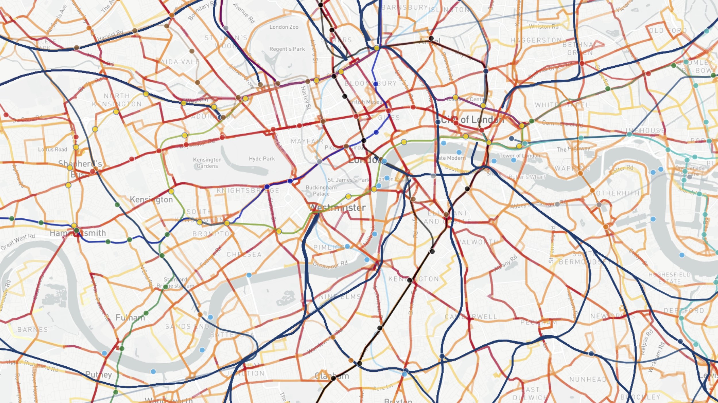
“Now let’s add the bus network.”

“Now let’s add the cab network.”

“Now let’s abstract that and play this live data over 24 hours. This is smart citizens in their city. This is their data. This is open data.”

“What open data does is allow the city to remain transparent. It allows the city to become an ecosystem in which the citizenship can build products. Products solve the problems of the city, which in turn makes the city more accessible, which in turn allows the citizenship to change the city.”

As I said just before - this is their data. It is not yours to own. It is owned by the citizen themselves - it is their data, their experiences, their interactions - but this data isn’t just ‘there’ for no reason. It’s there because the smart citizen wants and needs the city to react to them. So how does this stack up?

“Smart cities aren’t ‘Information Technology’. Nor is this an investment in infrastructure, servers and departments. Data is normalised now, and it’s been normalised by the citizen networks. Cities have to embrace this - a world of dynamic constantly augmented data and APIs - in order to embrace cultural change and the needs of the citizen. If they fail, they risk not being able to speak for their citizens, and fail to to adapt the city to their needs.”

“Unfortunately - sorry - it’s not enough to just ‘build APIs’. Or to build user interfaces for those APIs. As the smart city evolves, and as the citizens evolve, the products within the city must evolve also. An autonomous future of transit maybe inevitable, but the products that make sense of this automation, that interact with the human become more important. Autonomy and data solve the problem of the network, but they create the problem of human understanding, human interaction, and the need of the lizard brain - the default - the ‘do without thinking’.”
“Also, unfortunately - Change is hard. Allowing a change towards new systems and behaviours, such as automation - is difficult. The smart citizen wants change, but must learn how to interact with it. It is better UX to adopt existing networks - and using data - build feedback loops to allow for mutual innovation. It is not enough to just provide autonomous transit based on smart citizen data and expect the citizen to interface with it. Where is the trust?”

“Luckily we have an example of interfacing this change. The pop up has become a great form of validation in retail. It’s a way of validating business models, citizen acceptance, story telling, and a way to get the network of a city to try, test, validate and understand something. To feedback on it. To critique it. To discuss it. To see the resulting iteration. To tell a story. The citizens social network proof articulates and accelerates acceptance.”

And this brings me to Smartbus.

“Last month Citymapper began to experiment in mass transit using the concept of pop ups to validate a number of things. Theories, concepts, user experience, and user acceptance. This was a 3.7 tonne beta release that was designed as a giant feedback loop. This is because change in smart cities doesn’t happen with a big ‘wow’ product. It happens through these feedback loops and fear reduction - simplification, narrative and network acceptance. Who will get on this bus? Will they trust it? What will they think? What is it worth?”

“However, Smartbus was also a number of things. A full stack of experiments. We built tools to analyse smart citizen data, tools to manage operations, tools to aid driver confidence and communication, and tools to evaluate the vehicle performance. So…here’s what makes a smartbus smart.”
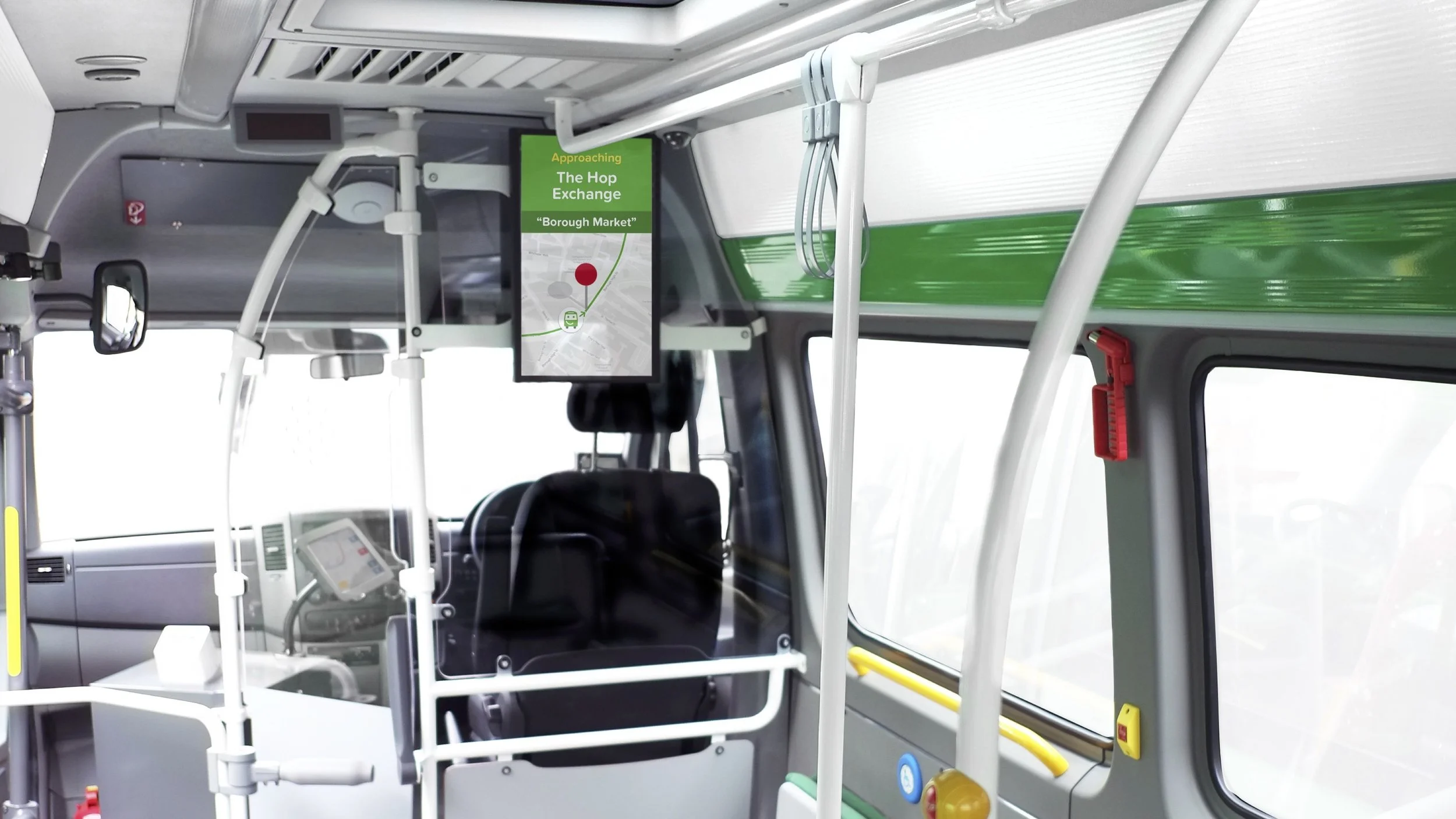
“We created interfaces to reduce fear and to inform.”
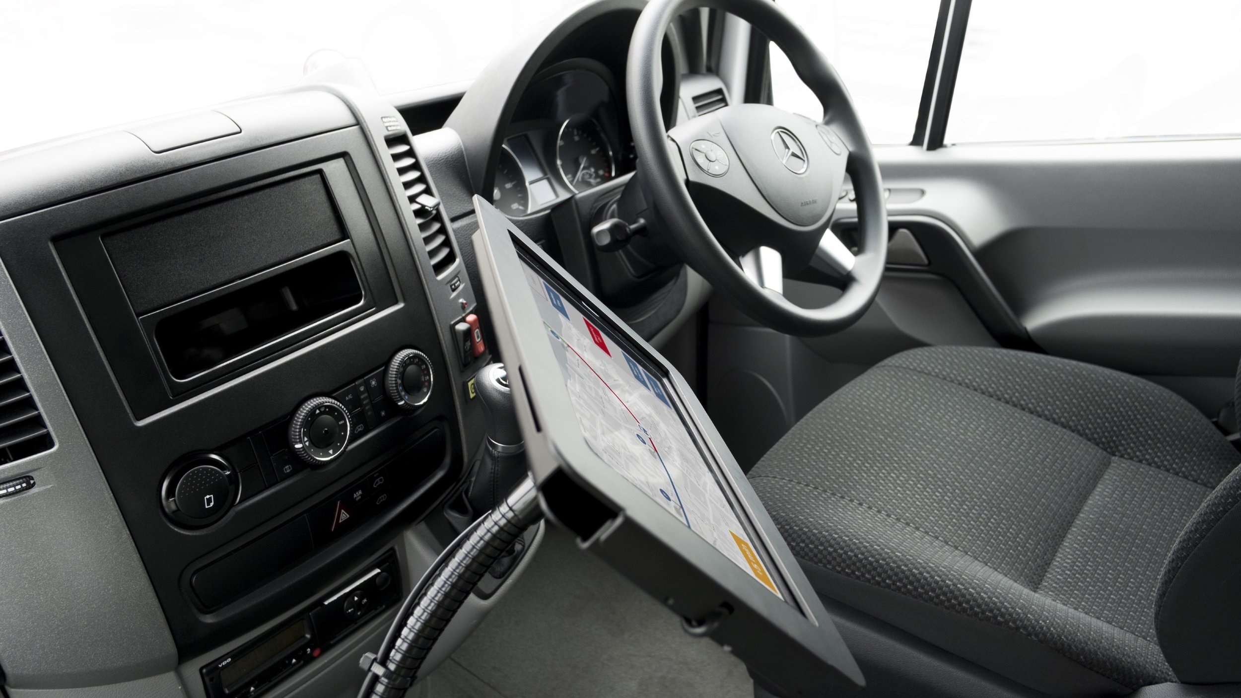
“We created interfaces to improve driver feedback, communication and customer experience.The driver is key in an non-automated world, they captain the ship, and they are responsible for the bus being on time, keeping people safe, and getting them where they want to go.”

“We showed where the bus was, where it was going, when it would get there - using live traffic data to calculate accurate ETAs. We showed the driver name, and this increased customer interaction.”

“We even were transparent when our buses got lost or weren't in operation. Honest is a great policy. If you’re using citizen data to create experiences, telling them when you get it wrong is important.”

“We developed personal interfaces for the smart citizen in our app, showing the buses in real time on a map, and giving real time traffic ETAs.”

“And we provided feedback loops for our users to suggest routes online. The reason we did most of this is because you can’t understand Smart cities with data alone. Smart citizens and products like ourselves can navigate with data, but we can’t understand the city or the unique users predicament, so we used Smartbus to begin a process of understanding mass transit better. What mass transit could be. What it could become in a smart city.
We learned some stuff too.”

“London is not a new city, but it’s one we understand best. If we had to design a future city, we could design it around transit and demand, but in London we began with a city with exiting infrastructure - in fact some of the best in the world. So if you begin with a city that has infastructure already - like you do in HK - then it is about optimising that exiting infastructure. Using the city itself and it’s citizens to develop human focused transit systems that are complimentary and are designed though human and data based feedback.”

“It’s important to recognise that cities already have a user experience, so it’s about working within that expected experience, the expectation of the citizen. Within this expected UX is the opportunity to optimise, to change, to iterate. This UX is a tangle of complex networks, nodes and varied user expectations.”

“But thats not to say that change of that user experience is impossible, it’s just hard. Transit *does* change in the smart city because of the smart citizens feedback, but infastructure cannot change or iterate at the speed of a digital product or interface - or the wants of the Smart Citizen. New roads, new metro systems, new stations - user interfaces change quicker, meaning the interface becomes more useful and adaptable than the infastructure. So what does this mean for the smart city?”

“It means that in a city where the interface changes quicker than the infastructure, that navigating and networking in a city becomes focused on the interface. And it means that the city becomes owned by the smart citizen using those interfaces. These interfaces become focused on navigation by destination. That means “Get me to there”, rather than the process of “getting there”. It means simplifying the city to destination, demand and the data.”

“But what does this change look like? We’re creating navigation, simplification, and we’re exploring on-demand transit within existing cities. If we place the smart citizen and their data at the centre of the smart city, as part of creation and execution of transit, how does this transit look? How does the city adapt?”

“This is not longer about interacting with a metro map, or trying to use interfaces to figure out navigation, or to work out where the bus goes. This is a user interface that adapts to the citizen, that takes you where you want to go. Now, I recognise there are some here thinking this is the description of UBER or similar, but UBER uses an existing system - the taxi - and layers new technology on it. But the smart city needs mass transit. Mass transit that adapts to the city and it’s citizens, not single occupancy vehicles that adapt to the needs of the individual.”


I chatted awkwardly to WIRED Magazine about the future of Smart transit & UX

Yup, a new bus. This time with better tracking, better integrated platforms and better analytics - oh, and it's going to run as a nightbus in London. I had the pleasure of talking to WIRED about it the other week here.